Academic Profile
Statistics
Similar Authors
Papers on arXiv
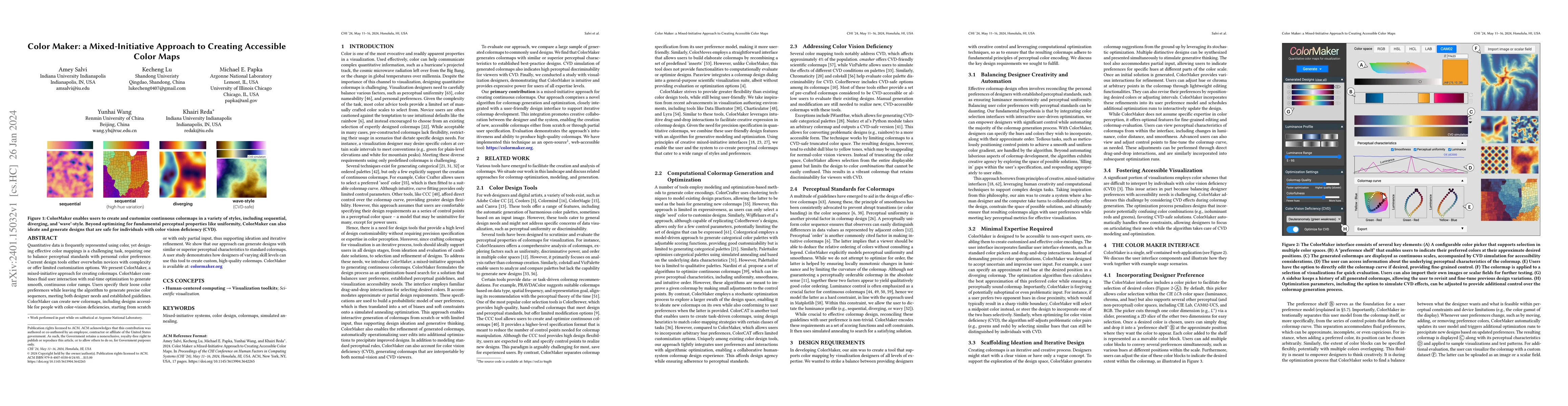
Quantitative data is frequently represented using color, yet designing effective color mappings is a challenging task, requiring one to balance perceptual standards with personal color preference. C...
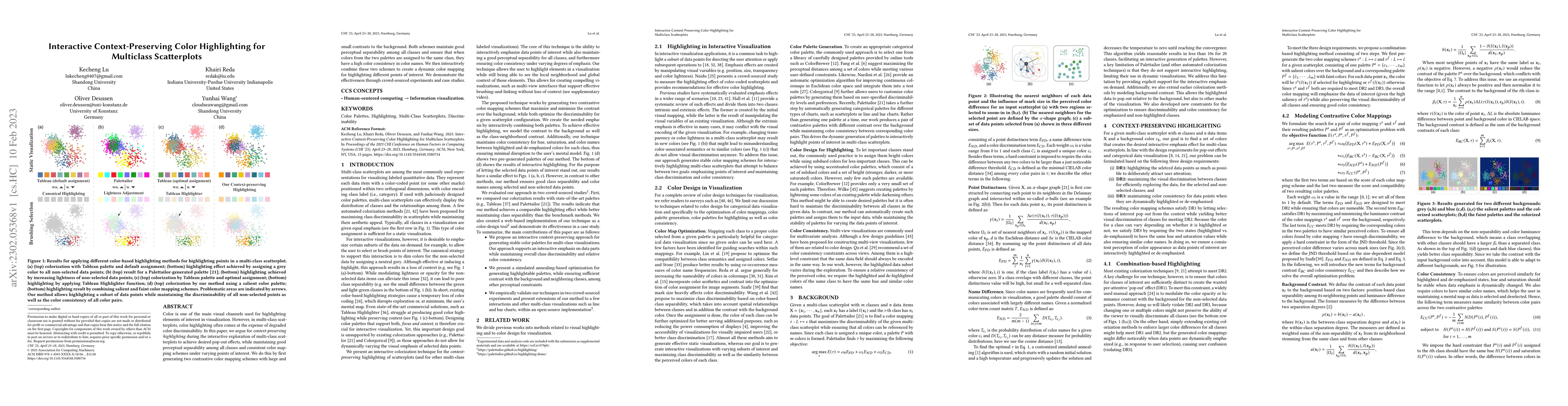
Color is one of the main visual channels used for highlighting elements of interest in visualization. However, in multi-class scatterplots, color highlighting often comes at the expense of degraded ...
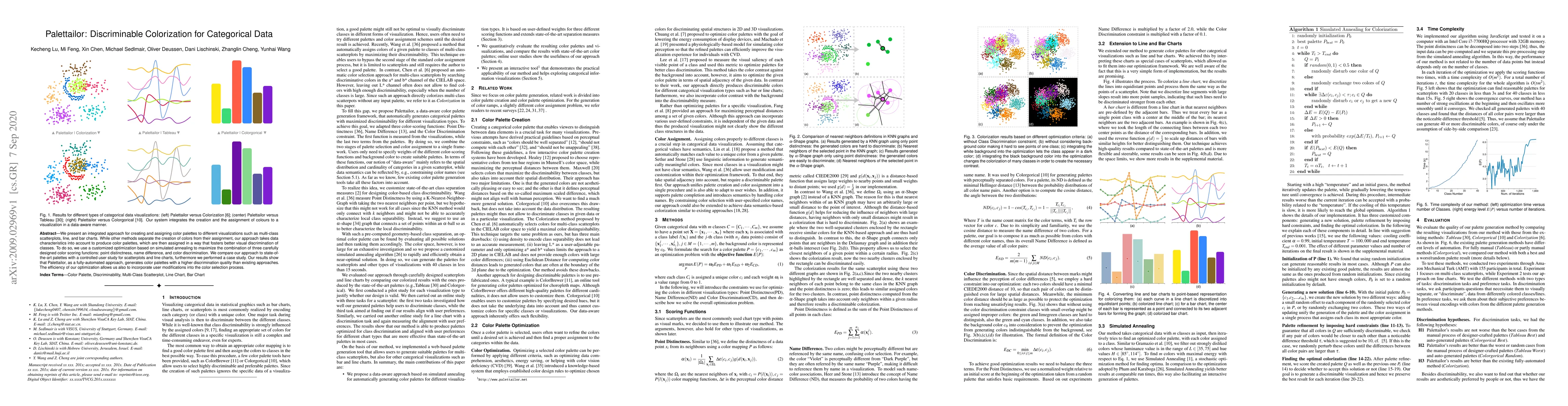
We present an integrated approach for creating and assigning color palettes to different visualizations such as multi-class scatterplots, line, and bar charts. While other methods separate the creat...
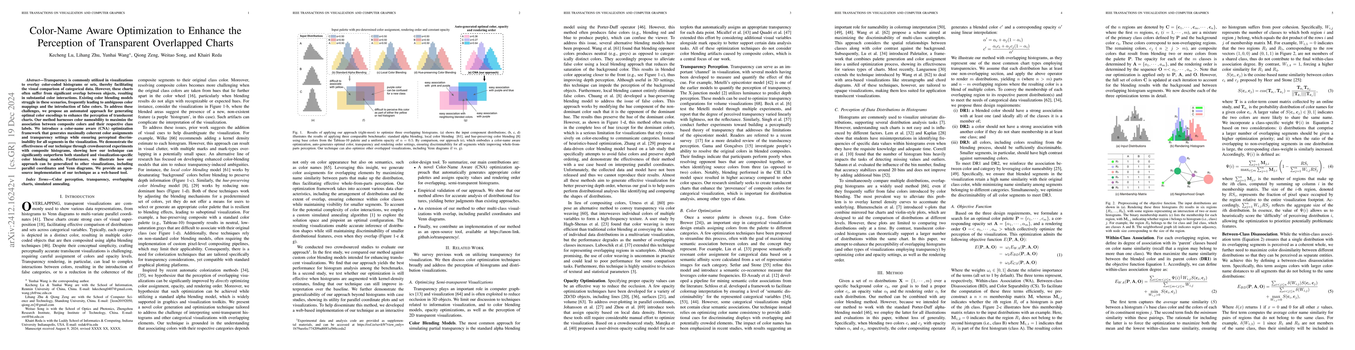
Transparency is commonly utilized in visualizations to overlay color-coded histograms or sets, thereby facilitating the visual comparison of categorical data. However, these charts often suffer from s...
We present a novel visualization-driven illumination model for density plots, a new technique to enhance density plots by effectively revealing the detailed structures in high- and medium-density regi...