Academic Profile
Statistics
Similar Authors
Papers on arXiv
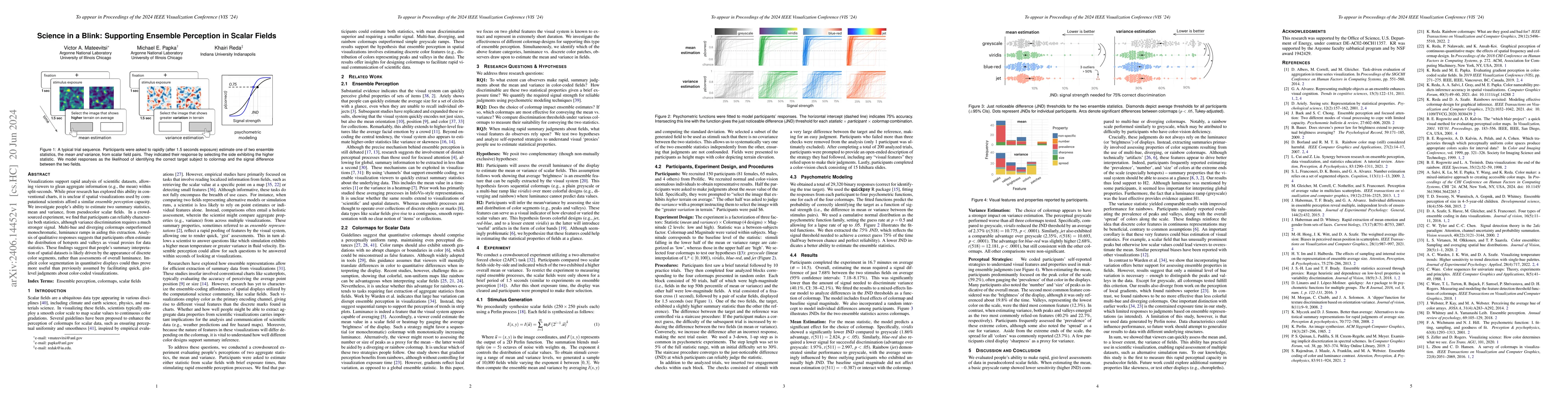
Visualizations support rapid analysis of scientific datasets, allowing viewers to glean aggregate information (e.g., the mean) within split-seconds. While prior research has explored this ability in...
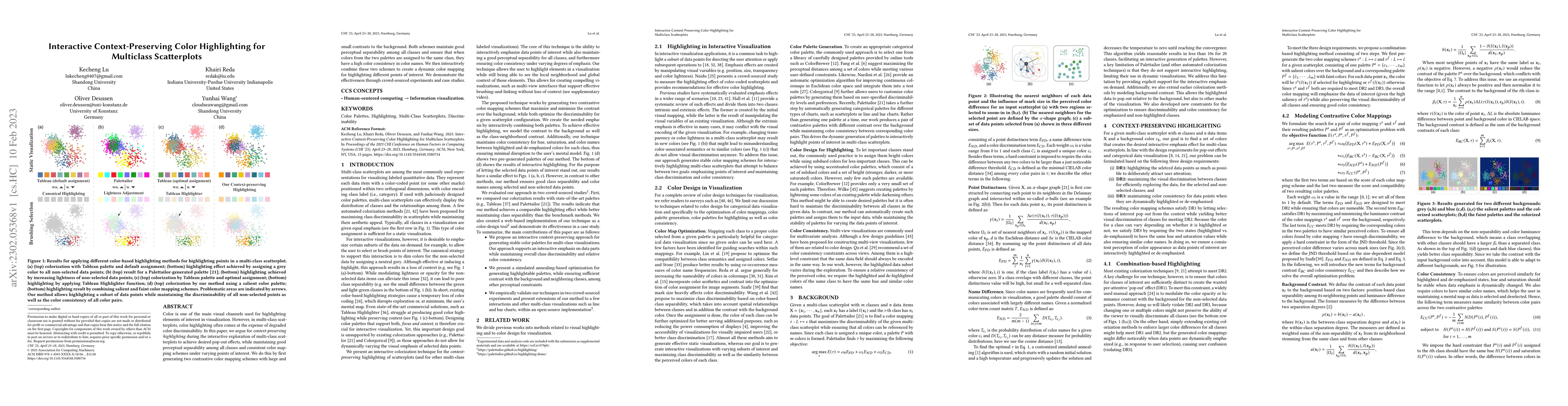
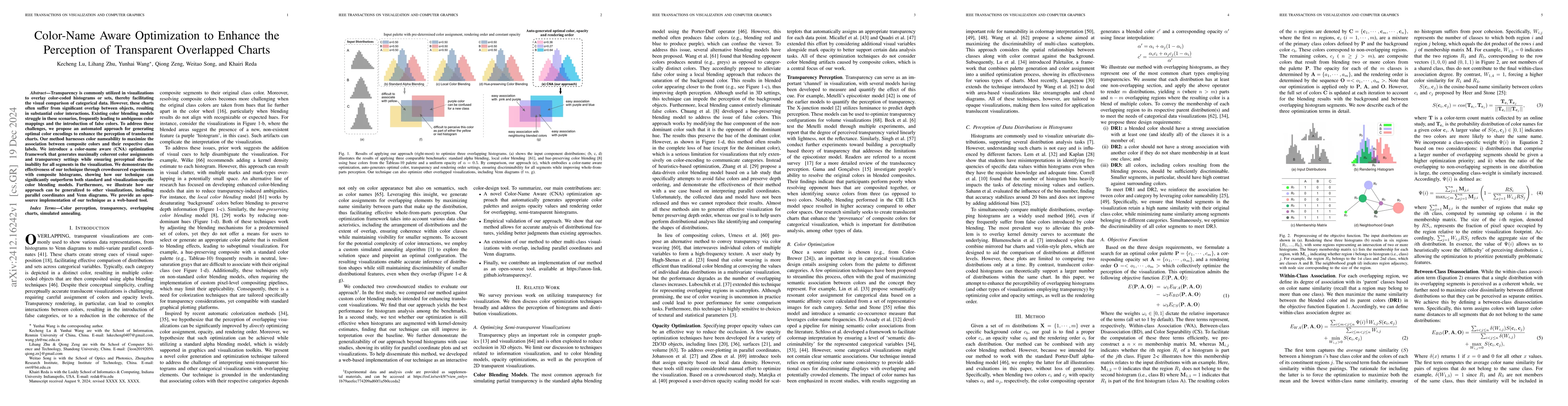
Quantitative data is frequently represented using color, yet designing effective color mappings is a challenging task, requiring one to balance perceptual standards with personal color preference. C...
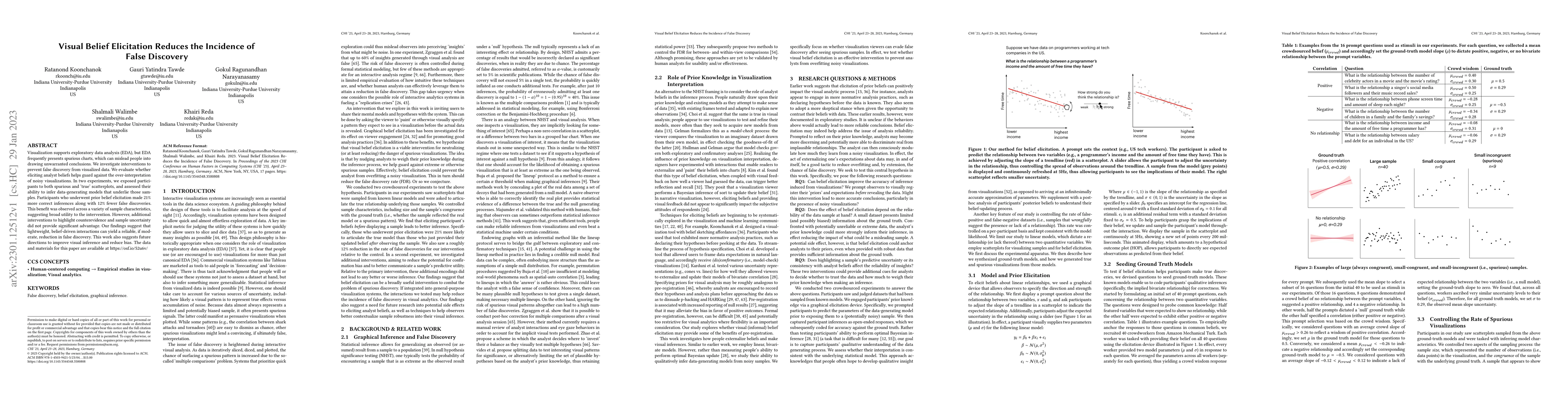
Color is one of the main visual channels used for highlighting elements of interest in visualization. However, in multi-class scatterplots, color highlighting often comes at the expense of degraded ...
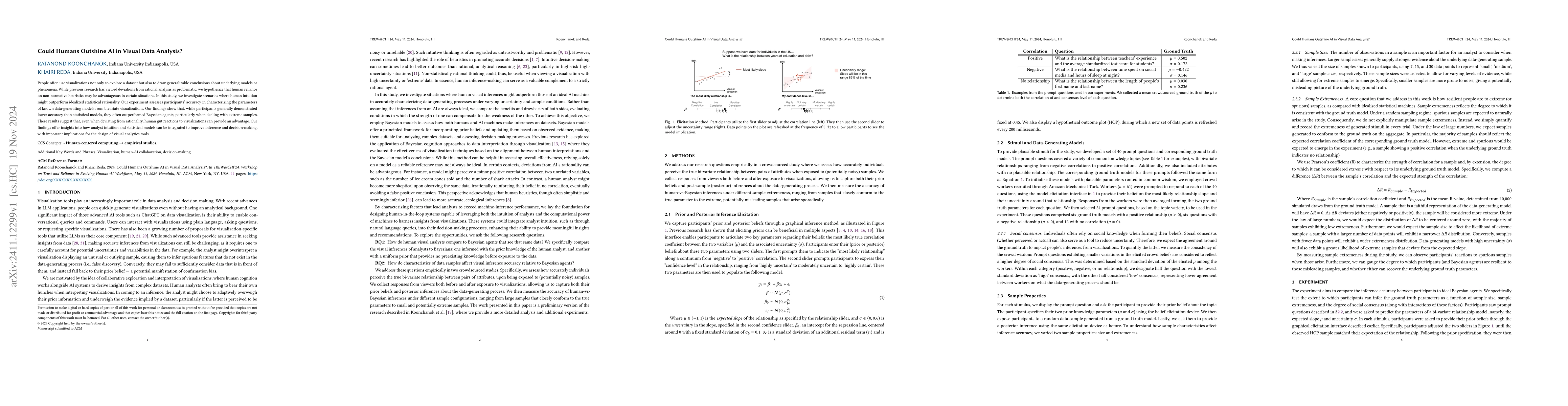
Visualization supports exploratory data analysis (EDA), but EDA frequently presents spurious charts, which can mislead people into drawing unwarranted conclusions. We investigate interventions to pr...
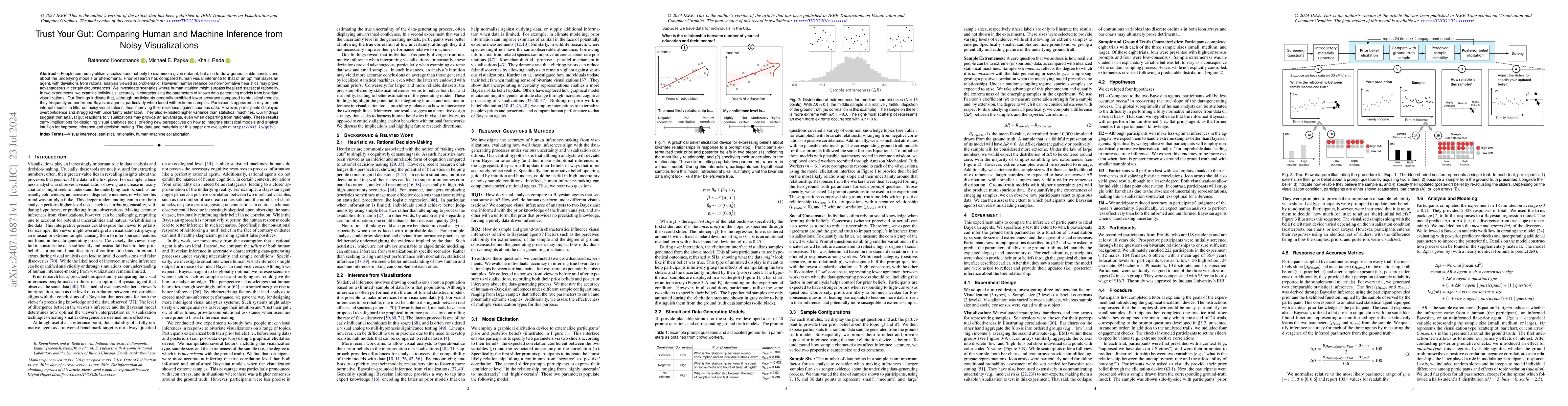
People commonly utilize visualizations not only to examine a given dataset, but also to draw generalizable conclusions about the underlying models or phenomena. Prior research has compared human visua...
People often use visualizations not only to explore a dataset but also to draw generalizable conclusions about underlying models or phenomena. While previous research has viewed deviations from ration...
Transparency is commonly utilized in visualizations to overlay color-coded histograms or sets, thereby facilitating the visual comparison of categorical data. However, these charts often suffer from s...
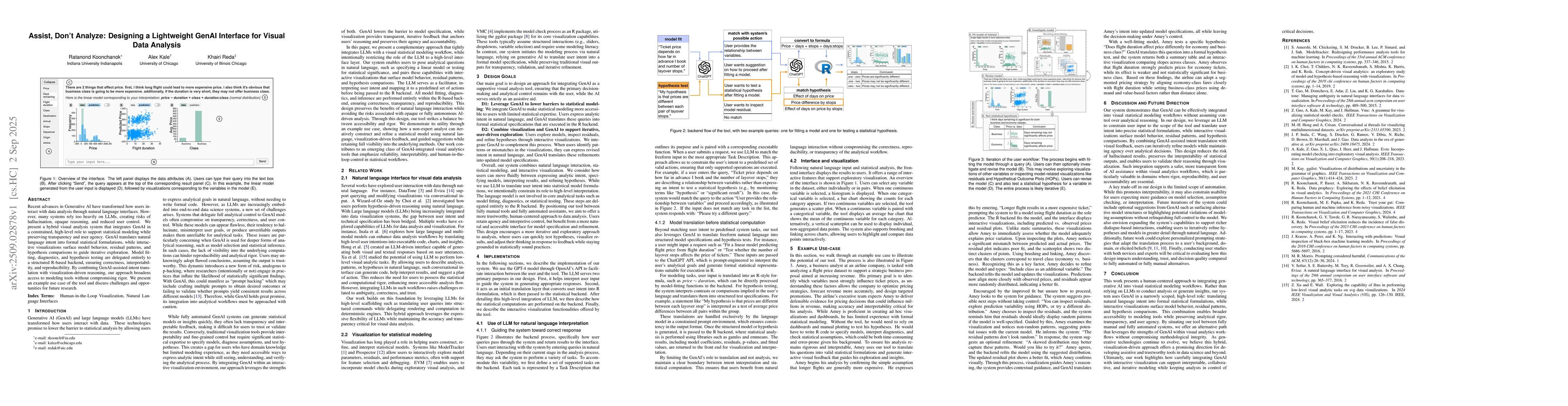
Recent advances in Generative AI have transformed how users interact with data analysis through natural language interfaces. However, many systems rely too heavily on LLMs, creating risks of hallucina...