Academic Profile
Statistics
Similar Authors
Papers on arXiv
People routinely rely on data to make decisions, but the process can be riddled with biases. We show that patterns in data might be noticed first or more strongly, depending on how the data is visua...
Reading a visualization is like reading a paragraph. Each sentence is a comparison: the mean of these is higher than those; this difference is smaller than that. What determines which comparisons ar...
Data visualizations present a massive number of potential messages to an observer. One might notice that one group's average is larger than another's, or that a difference in values is smaller than ...
When an analyst or scientist has a belief about how the world works, their thinking can be biased in favor of that belief. Therefore, one bedrock principle of science is to minimize that bias by tes...
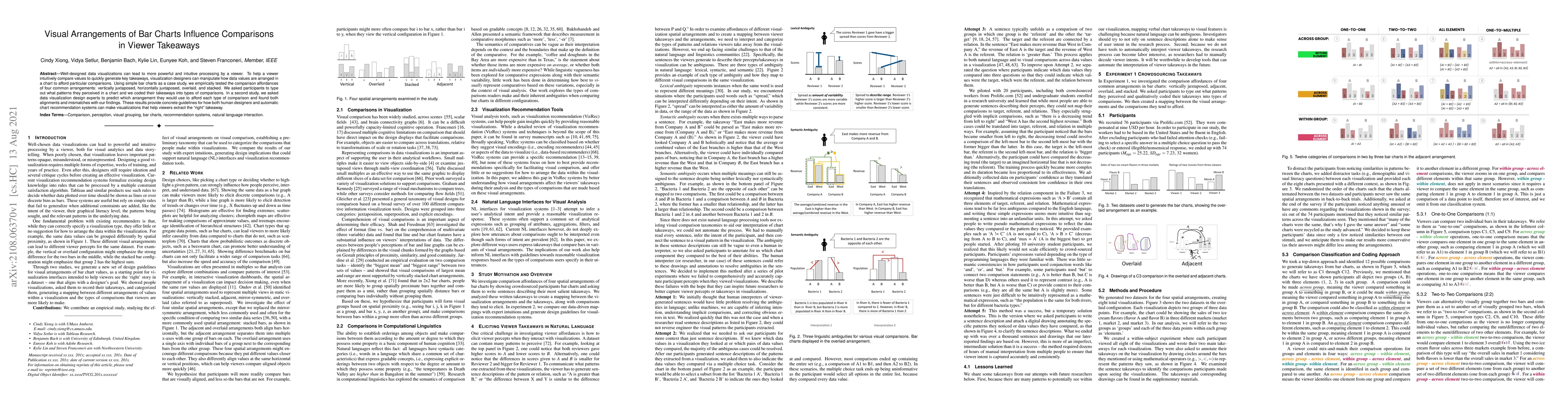
Well-designed data visualizations can lead to more powerful and intuitive processing by a viewer. To help a viewer intuitively compare values to quickly generate key takeaways, visualization designe...
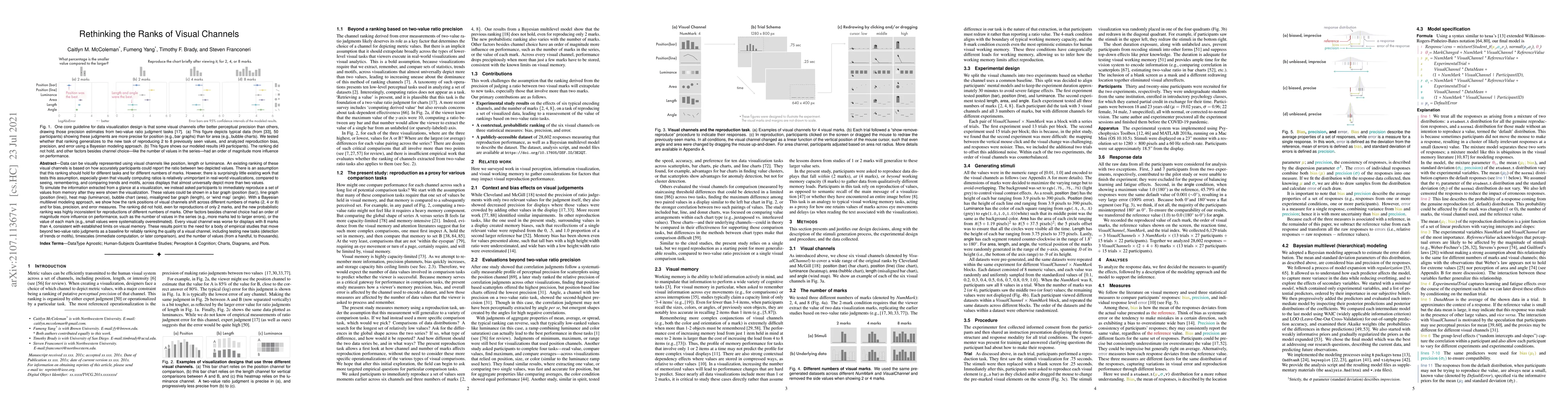
Data can be visually represented using visual channels like position, length or luminance. An existing ranking of these visual channels is based on how accurately participants could report the ratio...
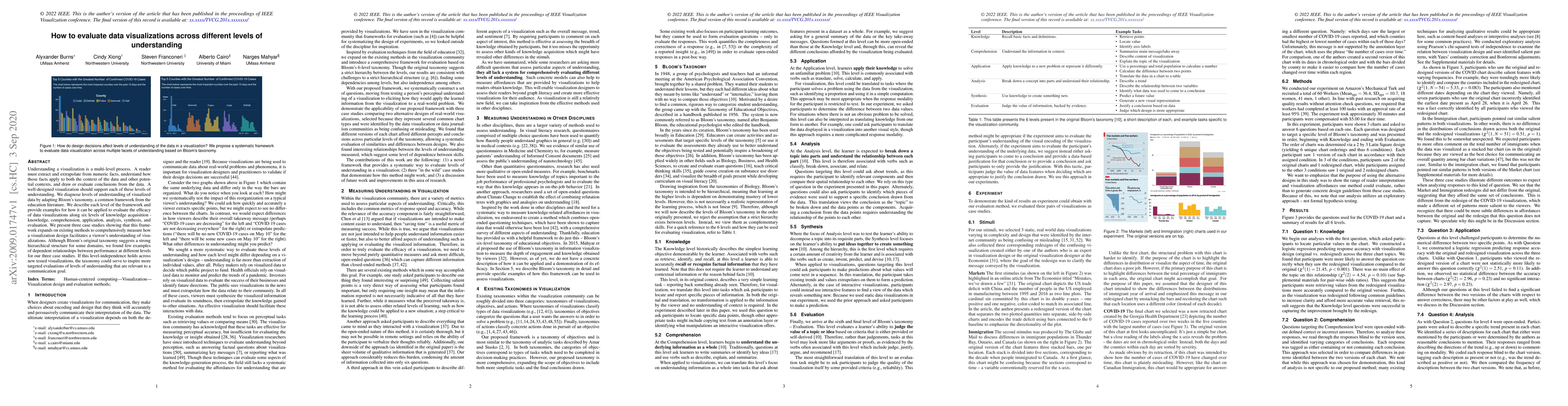
Understanding a visualization is a multi-level process. A reader must extract and extrapolate from numeric facts, understand how those facts apply to both the context of the data and other potential...
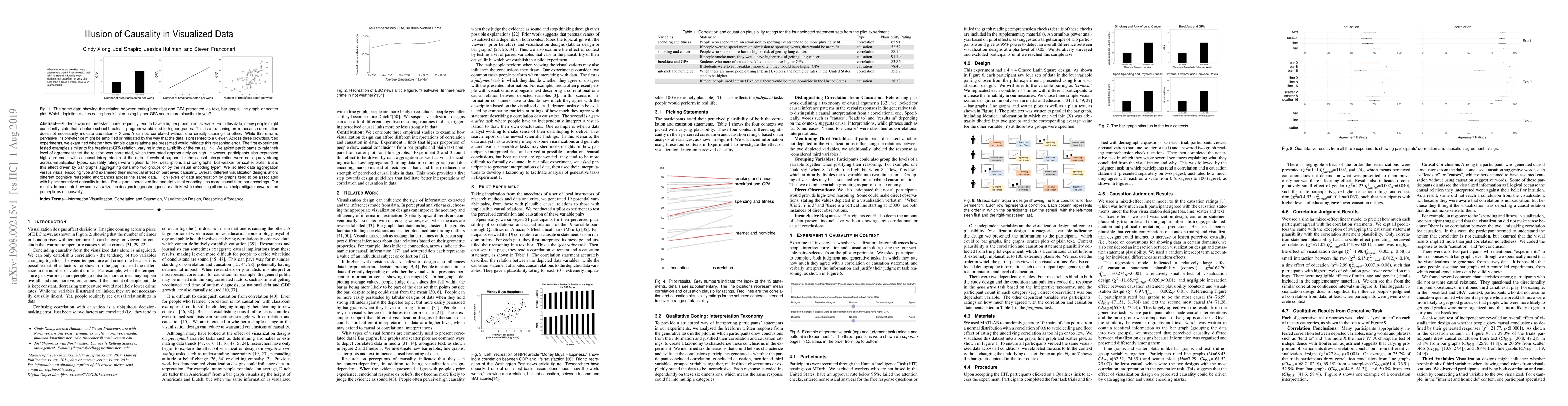
Students who eat breakfast more frequently tend to have a higher grade point average. From this data, many people might confidently state that a before-school breakfast program would lead to higher ...
In visual depictions of data, position (i.e., the vertical height of a line or a bar) is believed to be the most precise way to encode information compared to other encodings (e.g., hue). Not only a...
Bar charts with y-axes that don't begin at zero can visually exaggerate effect sizes. However, advice for whether or not to truncate the y-axis can be equivocal for other visualization types. In thi...
Sine illusion happens when the more quickly changing pairs of lines lead to bigger underestimates of the delta between them. We evaluate three visual manipulations on mitigating sine illusions: dott...
Making sense of a visualization requires the reader to consider both the visualization design and the underlying data values. Existing work in the visualization community has largely considered afford...