Publication
Metrics
AI Quick Summary
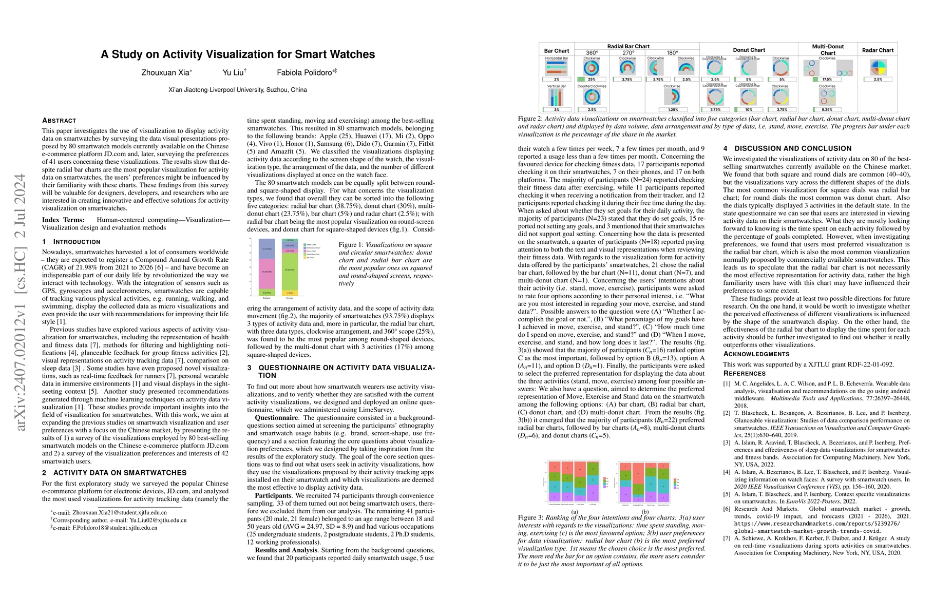
This study surveys data visualizations on 80 smartwatch models and user preferences from 41 users, finding that radial bar charts are popular but user familiarity may influence preference. These insights are crucial for smartwatch designers and developers.
Paper Preview
Abstract
This paper investigates the use of visualization to display activity data on smartwatches by surveying the data visual presentations proposed by 80 smartwatch models currently available on the Chinese e-commerce platform JD.com and, later, surveying the preferences of 41 users concerning these visualizations. The results show that despite radial bar charts are the most popular visualization for activity data on smartwatches, the users' preferences might be influenced by their familiarity with these charts. These findings from this survey will be valuable for designers, developers, and researchers who are interested in creating innovative and effective solutions for activity visualization on smartwatches.
AI Key Findings
Get AI-generated insights about this paper's methodology, results, significance, and more — seven facets brought into focus.
Impact
Paper Details
Authors
PDF Preview
Key Terms
Citation Network
Current paper (gray), citations (green), references (blue)
Display is limited for performance on very large graphs.
Discussion 0