Publication
Metrics
Paper Preview
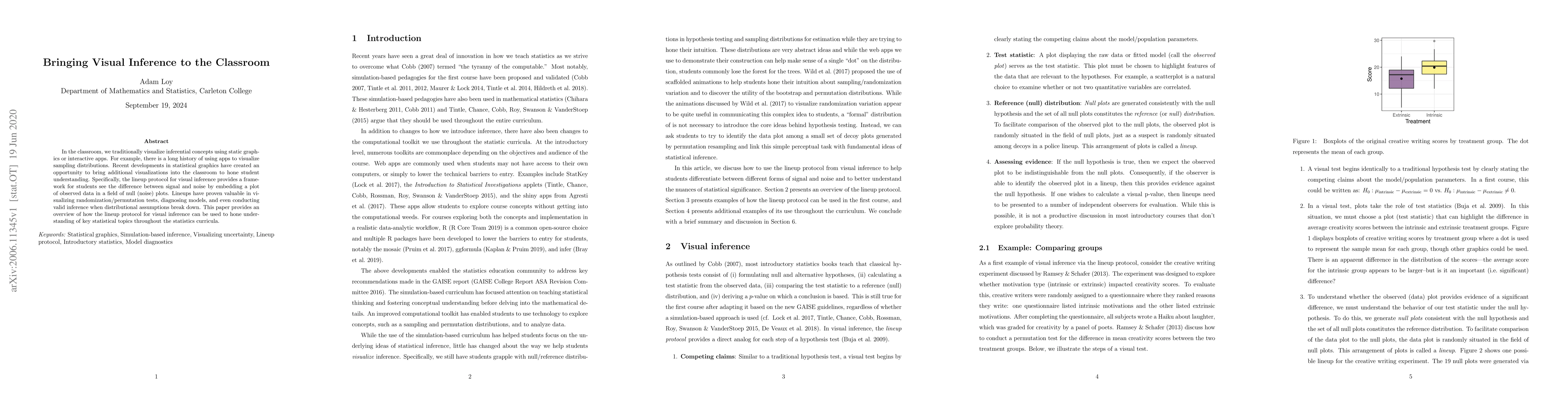
Abstract
In the classroom, we traditionally visualize inferential concepts using static graphics or interactive apps. For example, there is a long history of using apps to visualize sampling distributions. Recent developments in statistical graphics have created an opportunity to bring additional visualizations into the classroom to hone student understanding. Specifically, the lineup protocol for visual inference provides a framework for students see the difference between signal and noise by embedding a plot of observed data in a field of null (noise) plots. Lineups have proven valuable in visualizing randomization/permutation tests, diagnosing models, and even conducting valid inference when distributional assumptions break down. This paper provides an overview of how the lineup protocol for visual inference can be used to hone understanding of key statistical topics throughout the statistics curricula.
AI Key Findings
Get AI-generated insights about this paper's methodology, results, significance, and more — seven facets brought into focus.
Impact
Paper Details
Authors
PDF Preview
Key Terms
Citation Network
Current paper (gray), citations (green), references (blue)
Display is limited for performance on very large graphs.
Discussion 0