Clustering-informed Cinematic Astrophysical Data Visualization with Application to the Moon-forming Terrestrial Synestia
Publication
Metrics
AI Quick Summary
This paper introduces a visualization pipeline called \texttt{Estra} to create cinematic astrophysical data representations using visual effects software Houdini, enhanced by machine learning clustering. The method is demonstrated using Moon-forming synestia data, highlighting physically meaningful structures through color-mapping informed by clustering in temperature-entropy phase space.
Paper Preview
Abstract
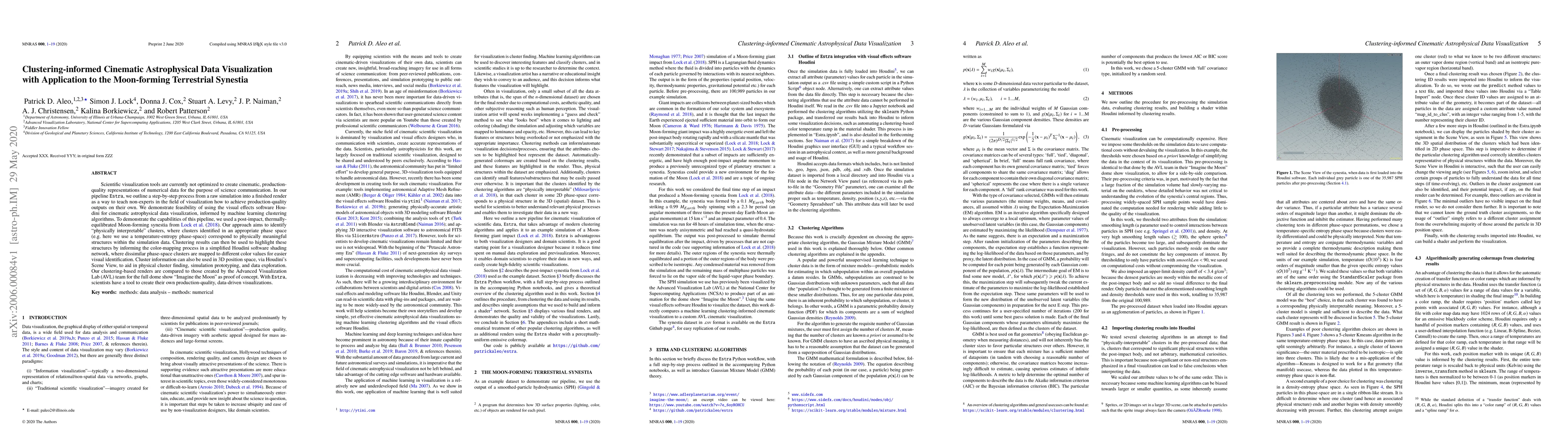
Scientific visualization tools are currently not optimized to create cinematic, production-quality representations of numerical data for the purpose of science communication. In our pipeline \texttt{Estra}, we outline a step-by-step process from a raw simulation into a finished render as a way to teach non-experts in the field of visualization how to achieve production-quality outputs on their own. We demonstrate feasibility of using the visual effects software Houdini for cinematic astrophysical data visualization, informed by machine learning clustering algorithms. To demonstrate the capabilities of this pipeline, we used a post-impact, thermally-equilibrated Moon-forming synestia from \cite{Lock18}. Our approach aims to identify "physically interpretable" clusters, where clusters identified in an appropriate phase space (e.g. here we use a temperature-entropy phase-space) correspond to physically meaningful structures within the simulation data. Clustering results can then be used to highlight these structures by informing the color-mapping process in a simplified Houdini software shading network, where dissimilar phase-space clusters are mapped to different color values for easier visual identification. Cluster information can also be used in 3D position space, via Houdini's Scene View, to aid in physical cluster finding, simulation prototyping, and data exploration. Our clustering-based renders are compared to those created by the Advanced Visualization Lab (AVL) team for the full dome show "Imagine the Moon" as proof of concept. With \texttt{Estra}, scientists have a tool to create their own production-quality, data-driven visualizations.
AI Key Findings
Get AI-generated insights about this paper's methodology, results, significance, and more — seven facets brought into focus.
Impact
Paper Details
Authors
PDF Preview
Key Terms
Citation Network
Current paper (gray), citations (green), references (blue)
Display is limited for performance on very large graphs.
Discussion 0