Publication
Metrics
AI Quick Summary
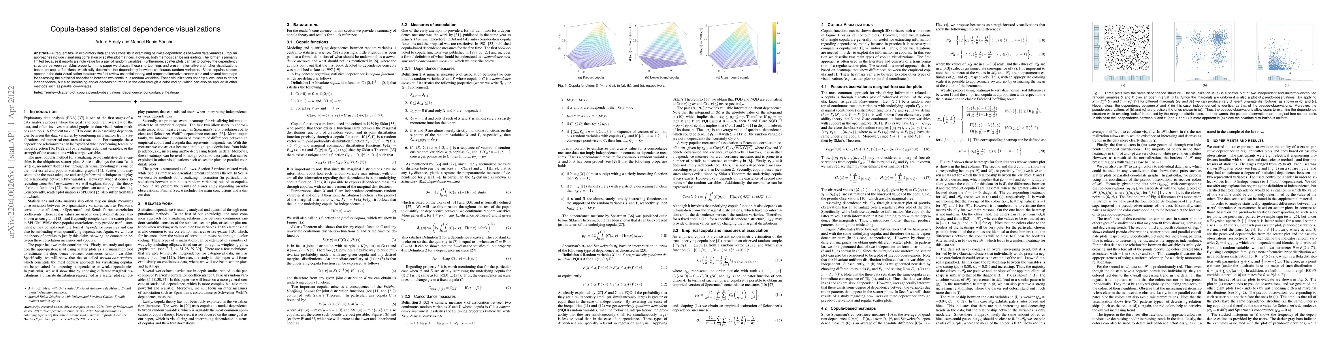
This paper proposes new visualizations to show statistical dependence between continuous random variables using copula functions, offering a richer alternative to traditional correlation and scatter plot methods.
Paper Preview
Abstract
A frequent task in exploratory data analysis consists in examining pairwise dependencies between data variables. Popular approaches include visualizing correlation or scatter plot matrices. However, both methods can be misleading. The former is primarily limited because it reports a single value for a pair of random variables. Furthermore, scatter plots can fail to convey the dependency structure between variables properly. In this paper we discuss these shortcomings and present alternative and richer visualizations based on copula functions, which fully determine the dependency between continuous random variables. Since copulas seldom appear in the data visualization literature we first review essential theory, and propose alternative scatter plots and several heatmaps for assessing the statistical association between two continuous random variables. These visualizations not only allow users to detect independence, but also increasing and/or decreasing trends in the data through a color coding, which can also be applied in other methods such as parallel coordinates.
AI Key Findings
Get AI-generated insights about this paper's methodology, results, significance, and more — seven facets brought into focus.
Impact
Paper Details
Authors
PDF Preview
Key Terms
Citation Network
Current paper (gray), citations (green), references (blue)
Display is limited for performance on very large graphs.
Discussion 0