This paper reviews various data visualization techniques for summarizing and interpreting quantitative information in political and social sciences, emphasizing the importance of these methods to overcome human limitations in processing large datasets and to facilitate multidimensional analysis. It covers traditional charts and diagrams to advanced statistical methods for visualizing complex multidimensional tables.
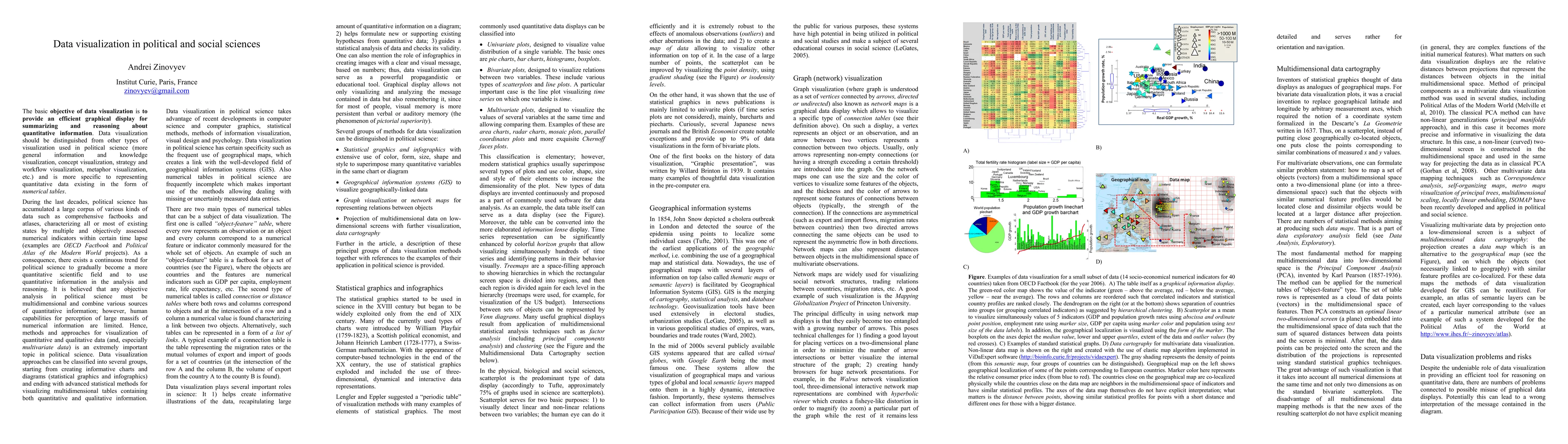
The basic objective of data visualization is to provide an efficient graphical display for summarizing and reasoning about quantitative information. During the last decades, political science has accumulated a large corpus of various kinds of data such as comprehensive factbooks and atlases, characterizing all or most of existing states by multiple and objectively assessed numerical indicators within certain time lapse. As a consequence, there exists a continuous trend for political science to gradually become a more quantitative scientific field and to use quantitative information in the analysis and reasoning. It is believed that any objective analysis in political science must be multidimensional and combine various sources of quantitative information; however, human capabilities for perception of large massifs of numerical information are limited. Hence, methods and approaches for visualization of quantitative and qualitative data (and, especially multivariate data) is an extremely important topic. Data visualization approaches can be classified into several groups, starting from creating informative charts and diagrams (statistical graphics and infographics) and ending with advanced statistical methods for visualizing multidimensional tables containing both quantitative and qualitative information. In this article we provide a short review of existing methods of data visualization methods with applications in political and social science.
This graph shows how this paper is connected to other research. The current paper is shown in dark gray, papers that cite it are in green, and papers it references are in blue. You can:
• Hover over any node to see the paper title
• Click a node to view that paper's details
• Drag nodes to rearrange the graph
• Use the zoom controls (bottom right) to zoom in/out
Title | Authors | Year | Actions |
---|---|---|---|
A Survey on Visualization Approaches in Political Science for Social and Political Factors: Progress to Date and Future Opportunities
|
Dongyun Han, A. Nayeem, Jason Windett, Yaoyao Dai, Benjamin J. Radford, Isaac Cho
|
2024
|
View Paper |
Enhancing Accessibility and Navigation of Heritage Collections Through Interactive Spatiotemporal Maps
|
P. Casanova-Salas, Javier Sevilla, Inmaculada Coma, Pedro Morillo, Mar Gaitán, C. Portalés
|
2024
|
View Paper |
Measuring Effects of Spatial Visualization and Domain on Visualization Task Performance: A Comparative Study
|
Sara Tandon, Alfie Abdul-Rahman, R. Borgo
|
2022
|
View Paper |
Cultivating Visualization Literacy for Children Through Curiosity and Play
|
S. Bae, Rishi Vanukuru, Ruhan Yang, Peter Gyory, Ran Zhou, E. Do, D. Szafir
|
2022
|
View Paper |
The network analysis of international relations: Overview of an emergent methodology
|
Péter Kacziba
|
2021
|
View Paper |
Touching Information with DIY Paper Charts & AR Markers
|
S. Bae, Ruhan Yang, Peter Gyory, J. Uhr, D. Szafir, E. Do
|
2021
|
View Paper |
Visual Analysis of Textual Information on the Frequencies of Joint Use of Nouns and Adjectives
|
A. Bondarev, A. Bondarenko, V. Galaktionov, L. Shapiro
|
2020
|
View Paper |
ASSESSMENT OF THE EFFECT OF DIGITAL INFO-GRAPHICS ILLUSTRATION ON THE ACADEMIC ACHIEVEMENT OF STUDENTS’ IN DIGESTIVE SYSTEM BIOLOGY CONCEPT IN DUTSIN-MA METROPOLIS
|
M. Omiola, S. Ibrahim, A. A. Ojeleye
|
2020
|
View Paper |
Neural-Network-Based Sensor Data Fusion for Multi-Hole Fluid Velocity Probes
|
A. Ghosh, D. Birch, O. Marxen
|
2020
|
View Paper |
Assessing perceptions and evaluating achievements of ESL students with the usage of infographics in a flipped classroom learning environment
|
Huseyin Bicen, Mobina Beheshti
|
2019
|
View Paper |
Big Data Visualization of the Alcohol Expenses in Taiwan
|
Chien-wen Shen, T. Luong, Li-An Chien, Jung-tsung Ho
|
2018
|
View Paper |
An Alternative Method and Display for Content Analysis: Textual Visualization
|
Güllü Yakar
|
2017
|
View Paper |
APPROACHES OF DESIGNERS IN THE DEVELOPED EDUCATIONAL PURPOSES OF INFOGRAPHICS’ DESIGN PROCESSES
|
Serkan Yildirim
|
2017
|
View Paper |
Infographics for Educational Purposes: Their Structure, Properties and Reader Approaches.
|
Serkan Yildirim
|
2016
|
View Paper |
Fast and user-friendly non-linear principal manifold learning by method of elastic maps
|
Alexander N Gorban, A. Zinovyev
|
2015
|
View Paper |
ViDaExpert: user-friendly tool for nonlinear visualization and analysis of multidimensional vectorial data
|
Alexander N Gorban, Alexander Pitenko, A. Zinovyev
|
2014
|
View Paper |
The Reality of Using Digital By-Product Data in Social Science Analysis--A Case Study of Wikipedia
|
Z. He
|
2011
|
View Paper |
Nonlinear Quality of Life Index
|
A. Zinovyev, Alexander N Gorban
|
2010
|
View Paper |
EMPOWERING WOMEN IN PLACE
|
M. Dolores, Pitarch Garrido, Félix Fajardo Magraner, María Dolores Pitarch Garrido, Félix Fajardo Magraner, Dolores Pitarch, Félix Fajardo
|
2023
|
View Paper |
Visual Analysis of Text Data Volume by Frequencies of Joint Use of Nouns and Adjectives
|
A. Bondarev, A. V. Bondarenko, V. Galaktionov
|
2020
|
View Paper |
Algorithms with greedy heuristic procedures for mixture probability distribution separation
|
L. Kazakovtsev, D. Stashkov, Mikhail N. Gudyma, V. Kazakovtsev
|
2019
|
View Paper |
Methods of Data Analysis
|
E. Fehrman, Vincent Egan, A. Gorban, J. Levesley, E. Mirkes, A. K. Muhammad
|
2019
|
View Paper |
Visualization Methods for Exploring Transborder Indigenous Populations: The Case of Berber Webosphere
|
Abdelaziz Blilid
|
2018
|
View Paper |
An Investigation of the Correlation Between Mental Workload and Web User’s Interaction
|
Joaquim Romero
|
2017
|
View Paper |
Effects of Infographics on Student Achievement and Students' Perceptions of the Impacts of Infographics
|
N. Alrwele
|
2017
|
View Paper |
Building Sophisticated Infographics as Effective Knowledge Visualization and Knowledge Sharing Tool
|
A. Antonova
|
2016
|
View Paper |
A study on the development of an infographic designer questionnaire and designer opinions
|
Serkan Yildirim, Gürkan Yildirim, Embiya Celik, Abdullatif Kaban
|
2016
|
View Paper |
A study on the development of an infographic reader questionnaire and reader opinions
|
Serkan Yildirim, Embiya Celik, Gürkan Yildirim, Abdullatif Kaban
|
2016
|
View Paper |
Non-compensatory Aggregation of Social Indicators: An Icon Representation
|
M. Mazziotta, Adriano Pareto
|
2014
|
View Paper |
See Blockindiscussions, Blockinstats, Blockinand Blockinauthor Blockinprofiles Blockinfor Blockinthis Blockinpublication
|
Tao Blockindeng
|
View Paper |
Dongyun Han, Abdullah-Al-Raihan Nayeem, Jason Windett, Yaoyao Dai, Benjamin Radford, Isaac Cho
Published: 2024-05-10
Lisa P. Argyle, Ethan C. Busby, David Wingate, Bryce Hepner, Joshua R. Gubler, Alex Lyman
Published: 2025-04-04
Published: 2010-02-19
Cindy Xiong Bearfield, Eli Holder
Published: 2023-09-06
Comments (0)