Intercept Graph: An Interactive Radial Visualization for Comparison of State Changes
Publication
Metrics
AI Quick Summary
The Intercept Graph visual design facilitates effective comparison of state changes by using a radial design to encode change length and filtering large changes with interactive radius adjustments.
Paper Preview
Abstract
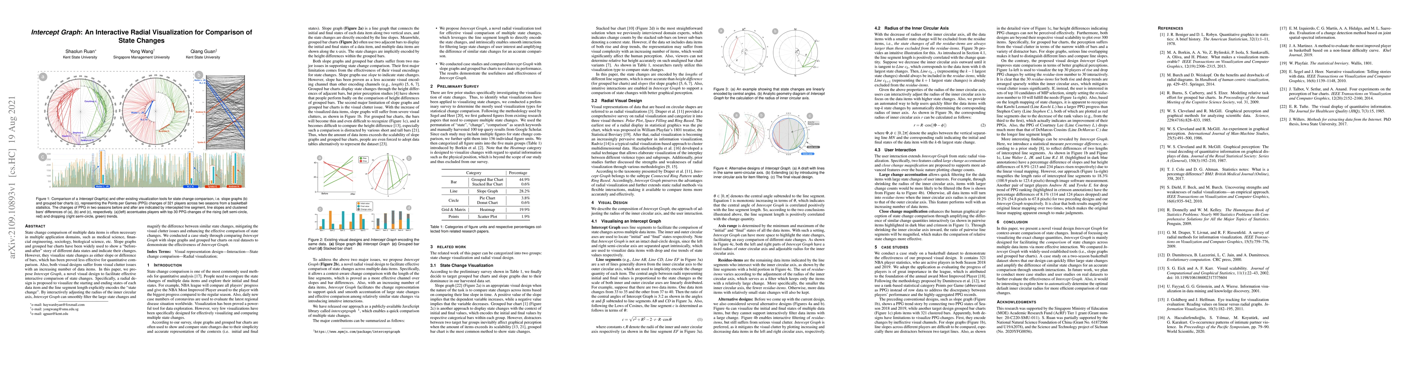
State change comparison of multiple data items is often necessary in multiple application domains, such as medical science, financial engineering, sociology, biological science, etc. Slope graphs and grouped bar charts have been widely used to show a "before-and-after" story of different data states and indicate their changes. However, they visualize state changes as either slope or difference of bars, which has been proved less effective for quantitative comparison. Also, both visual designs suffer from visual clutter issues with an increasing number of data items. In this paper, we propose Intercept Graph, a novel visual design to facilitate effective interactive comparison of state changes. Specifically, a radial design is proposed to visualize the starting and ending states of each data item and the line segment length explicitly encodes the "state change". By interactively adjusting the radius of the inner circular axis, Intercept Graph can smoothly filter the large state changes and magnify the difference between similar state changes, mitigating the visual clutter issues and enhancing the effective comparison of state changes. We conducted a case study through comparing Intercept Graph with slope graphs and grouped bar charts on real datasets to demonstrate the effectiveness of Intercept Graph.
AI Key Findings
Get AI-generated insights about this paper's methodology, results, significance, and more — seven facets brought into focus.
Impact
Paper Details
Authors
PDF Preview
Key Terms
Citation Network
Current paper (gray), citations (green), references (blue)
Display is limited for performance on very large graphs.
Discussion 0