Inventions on GUI Aesthetics
Publication
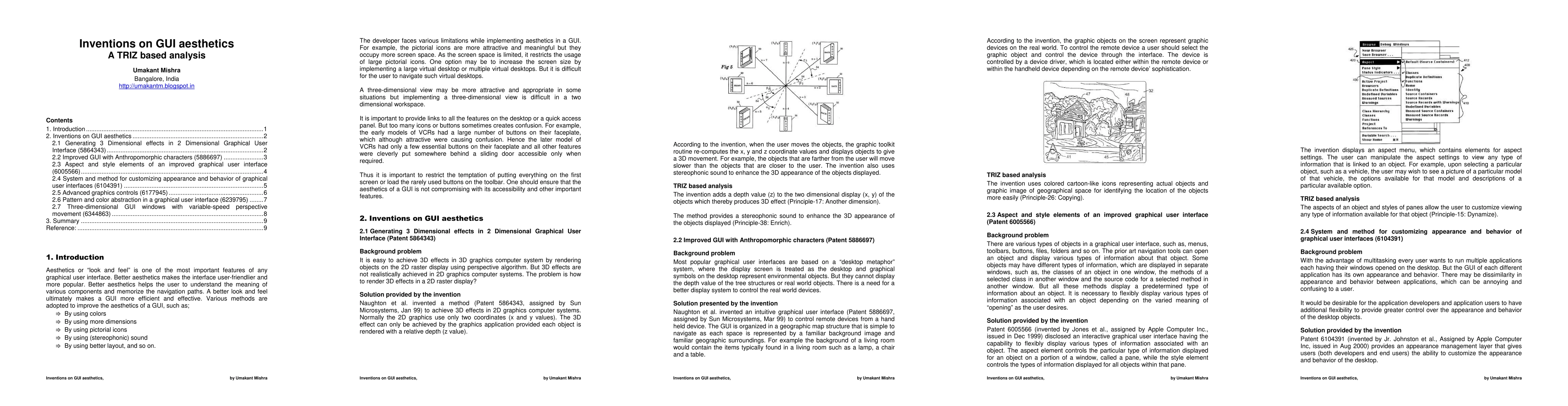
Metrics
AI Quick Summary
This paper explores the significance of aesthetics in graphical user interfaces (GUIs) to enhance user experience and efficiency. It discusses various methods to improve GUI aesthetics while balancing accessibility and functionality, highlighting recent inventions to achieve a better "look and feel."
Paper Preview
Abstract
Aesthetics or "look and feel" is one of the most important features of any graphical user interface. Better aesthetics makes the interface user-friendlier and more popular. Better aesthetics helps the user to understand the meaning of various components and memorize the navigation paths. A better look and feel ultimately makes a GUI more efficient and effective. Various methods are adopted to improve the aesthetics of a GUI, such as, by using colors, using 3D graphics, using pictorial icons, using sound etc. It is important to provide links to all the important features on a desktop or on a quick access panel. But too many icons or buttons sometimes creates confusion. Hence it is important to restrict the temptation of putting everything on the first screen or load the rarely used buttons on the toolbar. One should ensure that the aesthetics of a GUI is not compromising with its accessibility and other important features. This article illustrates some inventions made on GUI aesthetics.
AI Key Findings
Get AI-generated insights about this paper's methodology, results, significance, and more — seven facets brought into focus.
Impact
Paper Details
PDF Preview
Key Terms
Citation Network
Current paper (gray), citations (green), references (blue)
Display is limited for performance on very large graphs.
Discussion 0