Color is an important aspect of any graphical user interface (GUI). Color is
used to make a GUI attractive and meaningful. But there are difficulties in
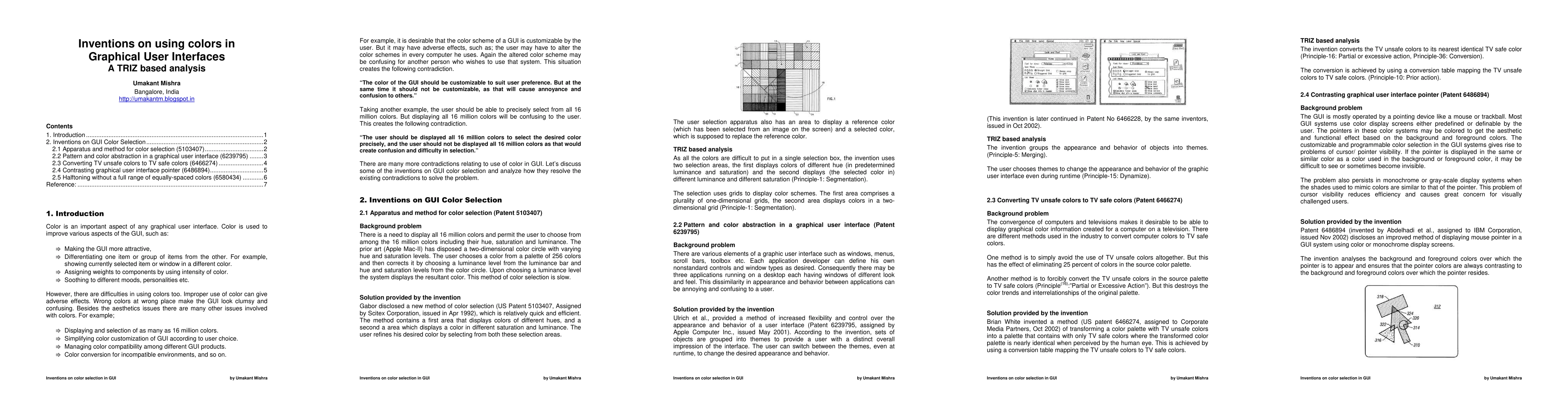
using colors too. Improper use of color can result in adverse effects. Wrong
colors at wrong place can make the GUI look clumsy and confusing. Apart from
the aesthetics issues there are many other issues involved with colors too.
One of the contradictions relating to usage of color is "The color of the GUI
should be customizable to suit user preference. But at the same time it should
not be customizable, as that would cause annoyance and confusion to other
users."
Another contraction relating to using color is "The user should be displayed
all 16 million colors to select the desired color precisely, But from another
angle the user should not be displayed all 16 million colors as that would
create confusion and difficulty in selection."
This article analyses some inventions selected from US Patent database and
illustrates how the inventors have been able to solve various contradictions
relating to usage of colors in Graphical User Interface.
Discussion 0