Needs and Challenges of Personal Data Visualisations in Mobile Health Apps: User Survey
Publication
Metrics
AI Quick Summary
This paper reports on a user survey exploring the needs and challenges of personal data visualisations in mobile health apps, revealing that users prefer bar and pie charts and favour a mix of text and charts for better understanding. The main challenges identified include excessive data display, text overlap, and unhelpful visualisations, while easy-to-read data, navigation, and quality charts are key satisfaction factors. The study proposes guidelines for visualisation design to enhance user experience.
Paper Preview
Abstract
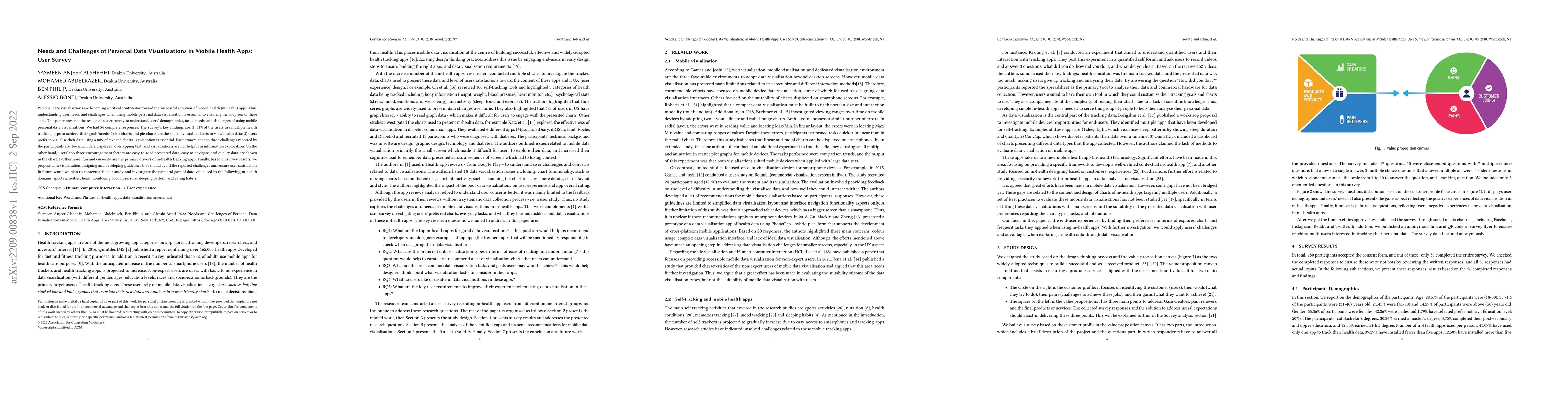
Personal data visualisations are becoming a critical contributor toward the successful adoption of mobile health (m-health) apps. Thus, understanding user needs and challenges when using mobile personal data visualisation is essential to ensuring the adoption of these apps. This paper presents the results of a user survey to understand users' demographics, tasks, needs, and challenges of using mobile personal data visualisations. We had 56 complete responses. The survey's key findings are: 1) 51\% of the users use multiple health tracking apps to achieve their goals/needs; 2) bar charts and pie charts are the most favourable charts to view health data; 3) users prefer to visualise their data using a mix of text and charts - explanation is essential. Furthermore, the top three challenges reported by the participants are: too much data displayed, overlapping text, and visualisations are not helpful in information exploration. On the other hand, users' top three encouragement factors are easy-to-read presented data, easy to navigate, and quality data are shown in the chart. Furthermore, fun and curiosity are the primary drivers of m-health tracking apps. Finally, based on survey results, we propose data visualisation designing and developing guidelines that should avoid the reported challenges and ensure user satisfaction. In future work, we plan to contextualise our study and investigate the pain and gain of data visualised in the following m-health domains: sports activities, heart monitoring, blood pressure, sleeping pattern, and eating habits.
AI Key Findings
Get AI-generated insights about this paper's methodology, results, significance, and more — seven facets brought into focus.
Impact
Paper Details
Authors
PDF Preview
Key Terms
Citation Network
Current paper (gray), citations (green), references (blue)
Display is limited for performance on very large graphs.
Discussion 0