Revisiting FunnyBirds evaluation framework for prototypical parts networks
Publication
Metrics
AI Quick Summary
This study evaluates the FunnyBirds benchmark for ProtoPNet, finding that using bounding boxes instead of similarity maps for visualization skews metric scores. It advocates for similarity maps as a more appropriate evaluation technique for prototypical parts networks.
Paper Preview
Abstract
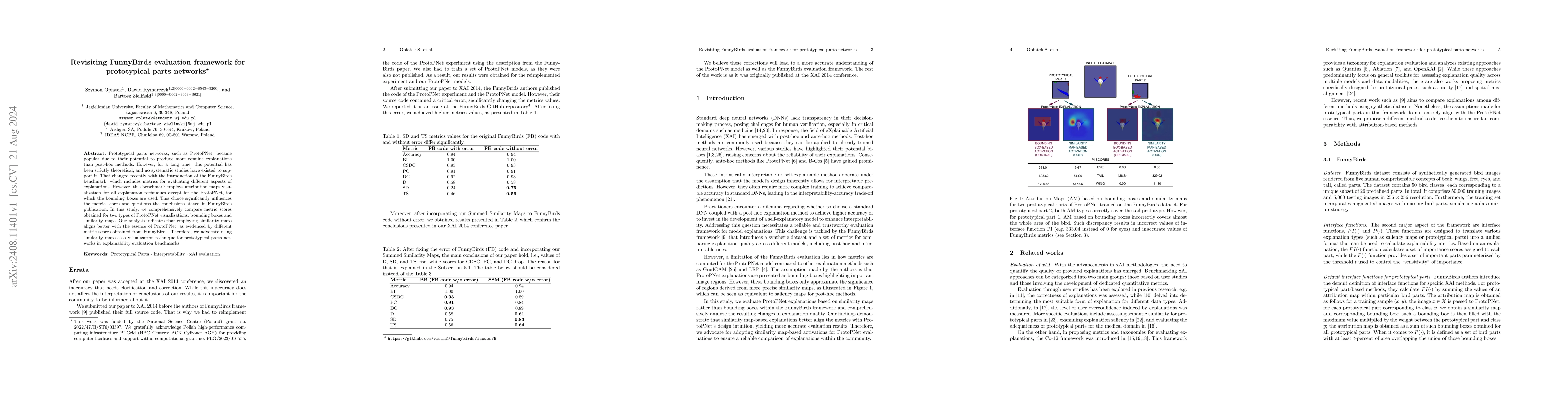
Prototypical parts networks, such as ProtoPNet, became popular due to their potential to produce more genuine explanations than post-hoc methods. However, for a long time, this potential has been strictly theoretical, and no systematic studies have existed to support it. That changed recently with the introduction of the FunnyBirds benchmark, which includes metrics for evaluating different aspects of explanations. However, this benchmark employs attribution maps visualization for all explanation techniques except for the ProtoPNet, for which the bounding boxes are used. This choice significantly influences the metric scores and questions the conclusions stated in FunnyBirds publication. In this study, we comprehensively compare metric scores obtained for two types of ProtoPNet visualizations: bounding boxes and similarity maps. Our analysis indicates that employing similarity maps aligns better with the essence of ProtoPNet, as evidenced by different metric scores obtained from FunnyBirds. Therefore, we advocate using similarity maps as a visualization technique for prototypical parts networks in explainability evaluation benchmarks.
AI Key Findings
Get AI-generated insights about this paper's methodology, results, significance, and more — seven facets brought into focus.
Paper Details
Authors
PDF Preview
Key Terms
Related Papers
No references found for this paper.
Discussion 0