ArxivLens

Quick Summary:

This study explores the use of remote Elicitation interviews to evaluate user experiences with COVID-19 maps, revealing both positive and negative aspects of this method. The findings provide insights and recommendations for conducting such interviews and designing effective visualizations for public health data.

arXiv Id: 2009.01465
Date Published: 2020-09-04
Date Updated: 2020-09-04

Categories:

Key Terms (TF-IDF):

remote (0.252)
interactive (0.244)
interactive (0.242)
remote (0.222)
pandemic (0.206)
public (0.197)
public (0.193)
micro (0.192)
micro (0.187)
wider (0.183)
understand (0.182)
user (0.179)
people (0.178)
experience (0.178)
health (0.178)
health (0.178)
understand (0.178)
experience (0.176)
user (0.175)
people (0.171)
License: http://arxiv.org/licenses/nonexclusive-distrib/1.0/

Summary:

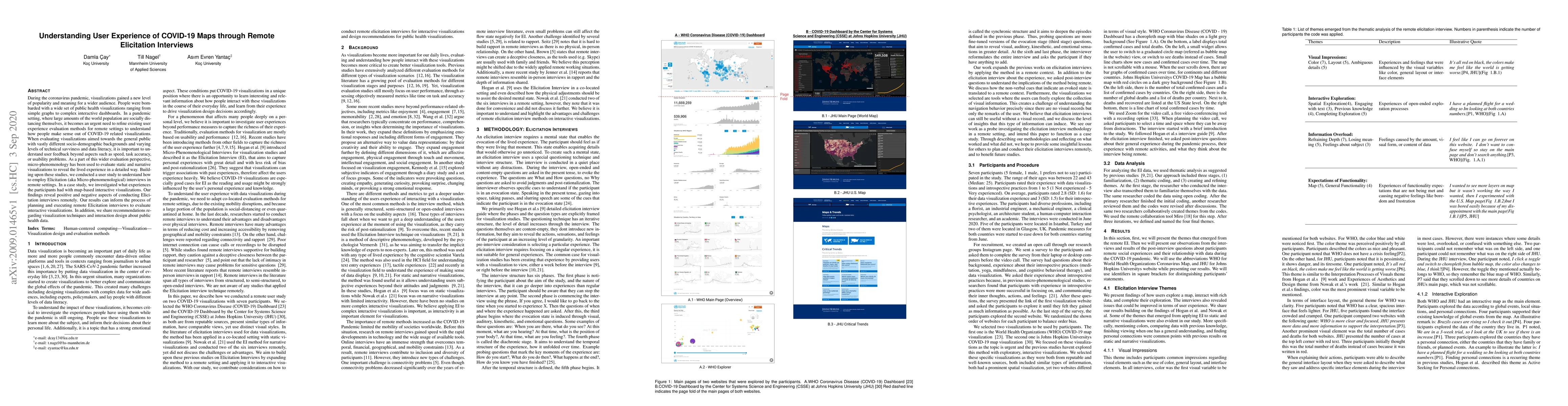
During the coronavirus pandemic, visualizations gained a new level of popularity and meaning for a wider audience. People were bombarded with a wide set of public health visualizations ranging from simple graphs to complex interactive dashboards. In a pandemic setting, where large amounts of the world population are socially distancing themselves, it becomes an urgent need to refine existing user experience evaluation methods for remote settings to understand how people make sense out of COVID-19 related visualizations. When evaluating visualizations aimed towards the general public with vastly different socio-demographic backgrounds and varying levels of technical savviness and data literacy, it is important to understand user feedback beyond aspects such as speed, task accuracy, or usability problems. As a part of this wider evaluation perspective, micro-phenomenology has been used to evaluate static and narrative visualizations to reveal the lived experience in a detailed way. Building upon these studies, we conducted a user study to understand how to employ Elicitation (aka Micro-phenomenological) interviews in remote settings. In a case study, we investigated what experiences the participants had with map-based interactive visualizations. Our findings reveal positive and negative aspects of conducting Elicitation interviews remotely. Our results can inform the process of planning and executing remote Elicitation interviews to evaluate interactive visualizations. In addition, we share recommendations regarding visualization techniques and interaction design about public health data.

Citation & Reference Network Visualization

This graph shows how this paper is connected to other research. The current paper is shown in dark gray, papers that cite it are in green, and papers it references are in blue. You can:

Current Paper
Papers citing this work (Citations)
Papers cited by this work (References)

• Hover over any node to see the paper title

• Click a node to view that paper's details

• Drag nodes to rearrange the graph

• Use the zoom controls (bottom right) to zoom in/out

Citations and References

Title Authors Year Actions
Encountering Friction, Understanding Crises: How Do Digital Natives Make Sense of Crisis Maps?
Laura Koesten, Antonia Saske, Sandra Starchenko, Kathleen Gregory
2025
View Paper
Leveraging Patient Flow Data to Reduce Hospital Readmissions: A Study Using Medical Dashboards
Santoshi Deshmukh, Utkarsha Pacharaney
2025
View Paper
Patterns of Community‐Based Data in the US State‐Level COVID‐19 Dashboards: Groupings, Inconsistencies and Gaps
Zhan Hu, Yishan Zhang, Rong Tang
2023
View Paper
Data use policies on state COVID-19 dashboards in the United States: Key characteristics, topical focus, and identifiable gaps
Rong Tang, Zhan Hu, Yishan Zhang
2023
View Paper
Who Do We Mean When We Talk About Visualization Novices?
Alyxander Burns, C. Lee, Ria Chawla, Evan M. Peck, Narges Mahyar
2023
View Paper
Corsetto: A Kinesthetic Garment for Designing, Composing for, and Experiencing an Intersubjective Haptic Voice
Ozgun Kilic Afsar, Yoav Luft, Kelsey Cotton, Ekaterina R. Stepanova, Claudia Núñez-Pacheco, Rébecca Kleinberger, Fehmi Ben Abdesslem, Hiroshi Ishii, K. Höök
2023
View Paper
Informative cartographic communication: a framework to evaluate the effects of map types on users’ interpretation of COVID-19 geovisualizations
A. Rezk, Mennatullah Hendawy
2023
View Paper
Web-Based COVID-19 Dashboards and Trackers in the United States: Survey Study
Melissa D. Clarkson
2022
View Paper
Visualization Design Practices in a Crisis: Behind the Scenes with COVID-19 Dashboard Creators
Yixuan Zhang, Yifan Sun, Joseph D. Gaggiano, Neha Kumar, Clio Andris, Andrea G. Parker
2022
View Paper
“It’s Just a Graph” – The Effect of Post-Hoc Rationalisation on InfoVis Evaluation
Rosa van Koningsbruggen, E. Hornecker
2021
View Paper
Mapping the Landscape of COVID-19 Crisis Visualizations
Yixuan Zhang, Yifan Sun, Lace M. K. Padilla, Sumit Barua, E. Bertini, A. Parker
2020
View Paper
Designing Conversational Dashboards for Effective Use in Crisis Response
Marcel Ruoff, Ulrich Gnewuch
2021
View Paper
Identifying GitHub Trends Using Temporal Analysis
T. Anderl, S. Miksch, D. Thesis, R. Leite
2021
View Paper
Enhancing users’ experiences of self-service technology: A design-oriented case study
Lina Bengtsson, Olle Bälter
View Paper
MIT Open Access
Ozgun Kilic Afsar, Yoav Luft, Kelsey Cotton, Ekaterina R. Stepanova, Claudia Núñez-Pacheco, Rebecca Kleinberger, Fehmi Ben, Abdesslem Hiroshi, Ishii Kristina, Höök, Ishii
View Paper

Comments (0)

This website uses cookies to ensure you get the best experience. Learn more