From zero to figure hero. A checklist for designing scientific data visualizations
Publication
Metrics
AI Quick Summary
This paper provides a comprehensive checklist for biologists to design effective scientific data visualizations, addressing the lack of training in this area. It focuses on selecting appropriate display types, using color palettes effectively, and optimizing figure layouts, all grounded in established visualization principles to enhance the communication of complex biological data.
Paper Preview
Abstract
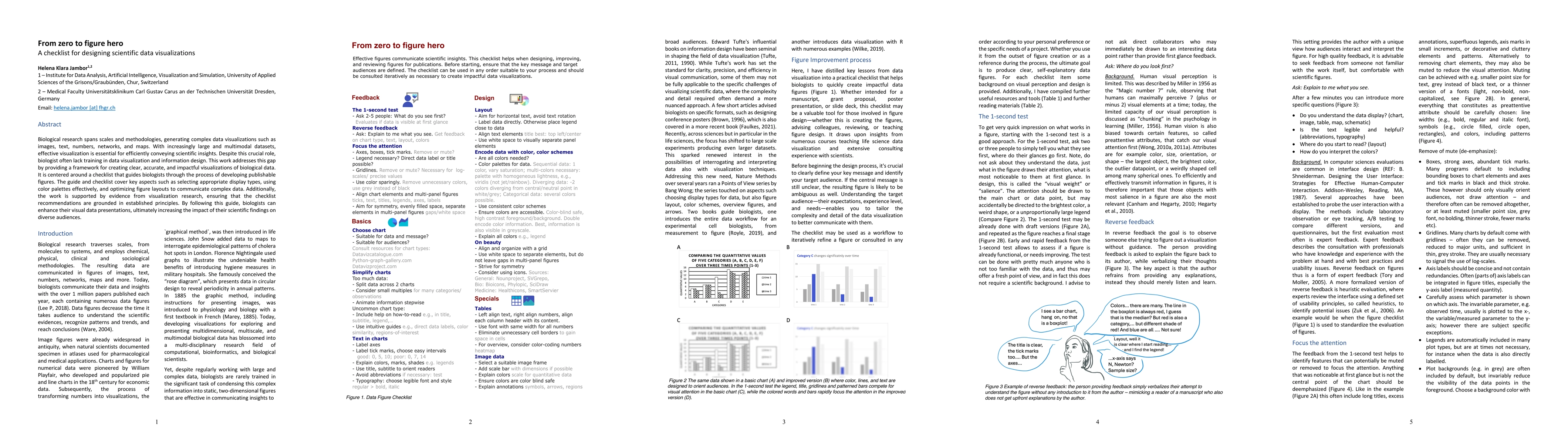
Biological research spans scales and methodologies, generating complex data visualizations such as images, text, numbers, networks, and maps. With increasingly large and multimodal datasets, effective visualization is essential for efficiently conveying scientific insights. Despite this crucial role, biologist often lack training in data visualization and information design. This work addresses this gap by providing a framework for creating clear, accurate, and impactful visualizations of biological data. It is centered around a checklist that guides biologists through the process of developing publishable figures. The guide and checklist cover key aspects such as selecting appropriate display types, using color palettes effectively, and optimizing figure layouts to communicate complex data. Additionally, the work is supported by evidence from visualization research, ensuring that the checklist recommendations are grounded in established principles. By following this guide, biologists can enhance their visual data presentations, ultimately increasing the impact of their scientific findings on diverse audiences.
AI Key Findings
Get AI-generated insights about this paper's methodology, results, significance, and more — seven facets brought into focus.
Impact
Paper Details
Authors
PDF Preview
Citation Network
Current paper (gray), citations (green), references (blue)
Display is limited for performance on very large graphs.
Discussion 0