Academic Profile
Statistics
Similar Authors
Papers on arXiv
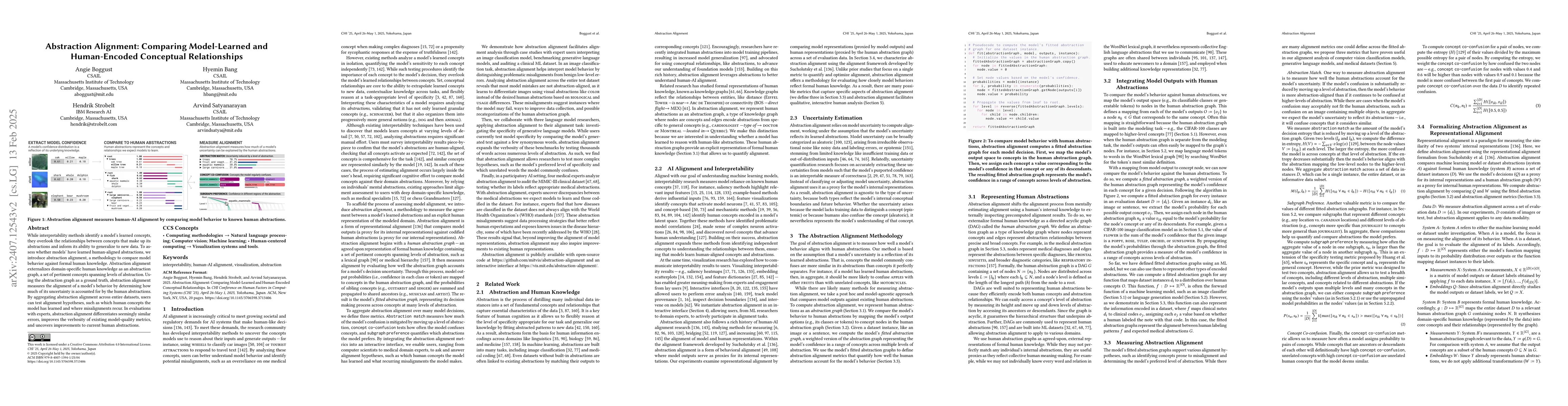
Abstraction -- the process of generalizing specific examples into broad reusable patterns -- is central to how people efficiently process and store information and apply their knowledge to new data. P...
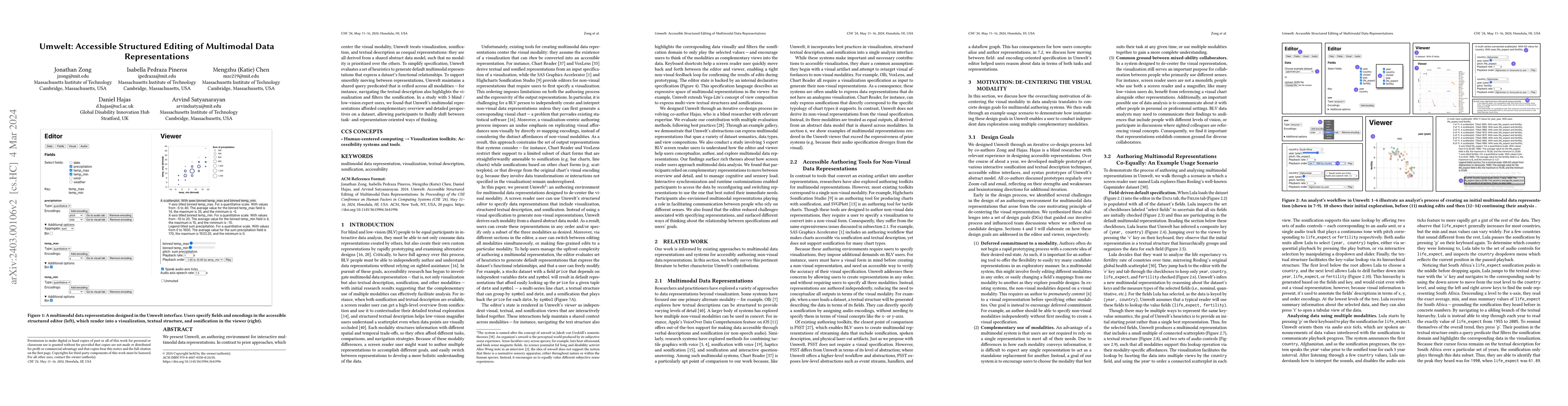
We present Umwelt, an authoring environment for interactive multimodal data representations. In contrast to prior approaches, which center the visual modality, Umwelt treats visualization, sonificat...
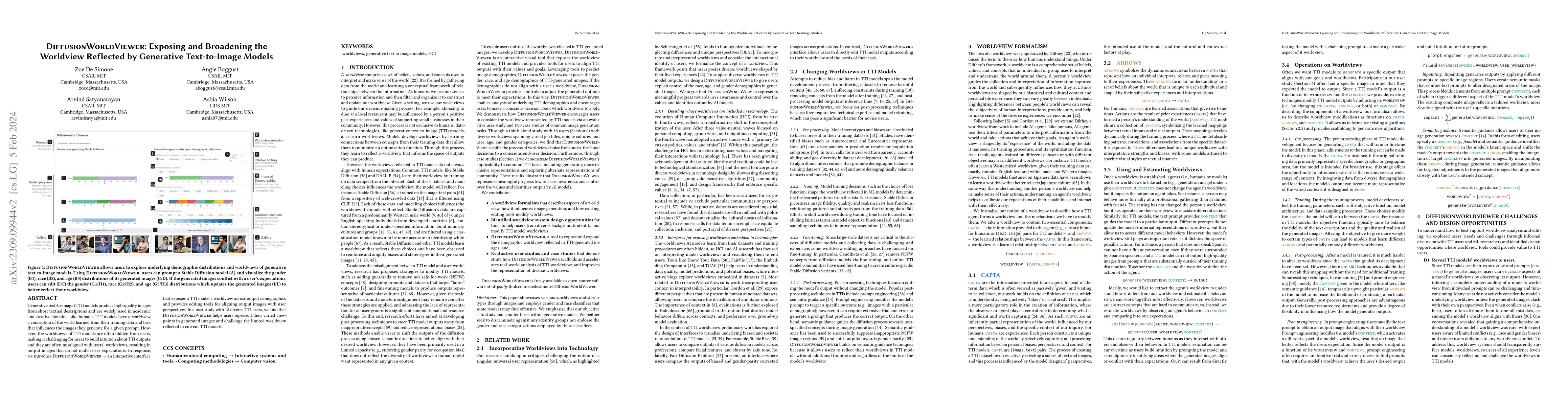
Generative text-to-image (TTI) models produce high-quality images from short textual descriptions and are widely used in academic and creative domains. Like humans, TTI models have a worldview, a co...
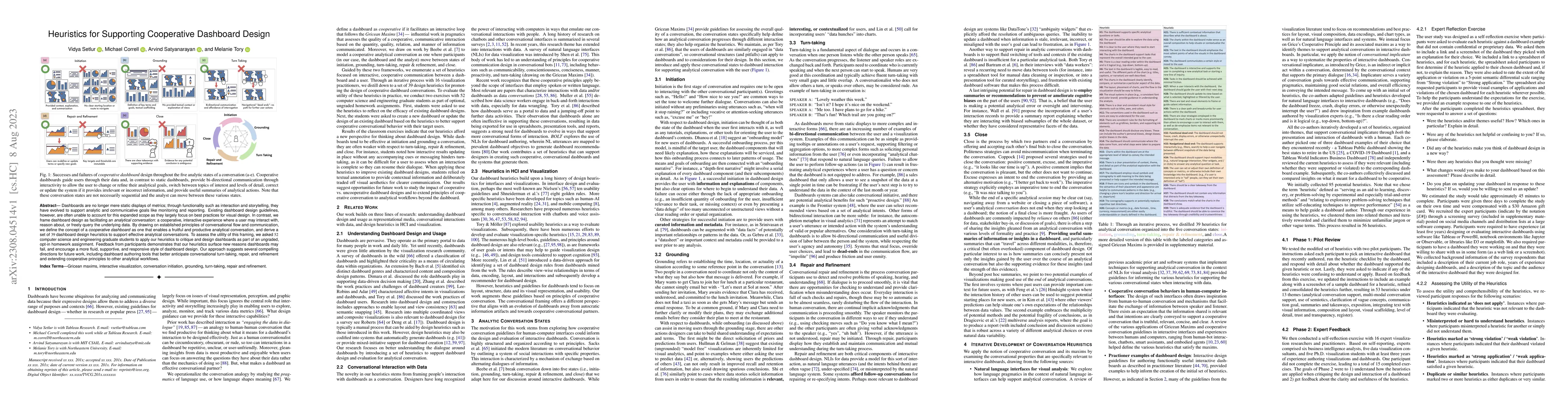
Dashboards are no longer mere static displays of metrics; through functionality such as interaction and storytelling, they have evolved to support analytic and communicative goals like monitoring an...
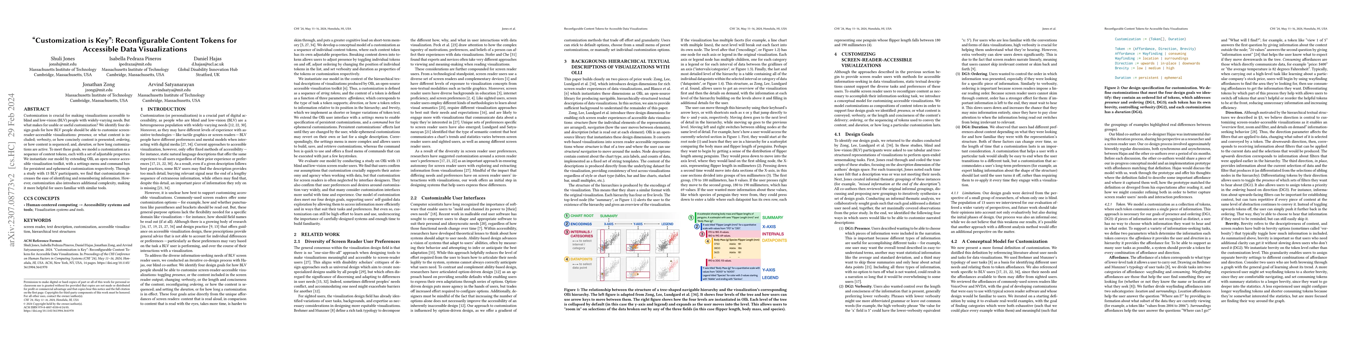
Customization is crucial for making visualizations accessible to blind and low-vision (BLV) people with widely-varying needs. But what makes for usable or useful customization? We identify four desi...
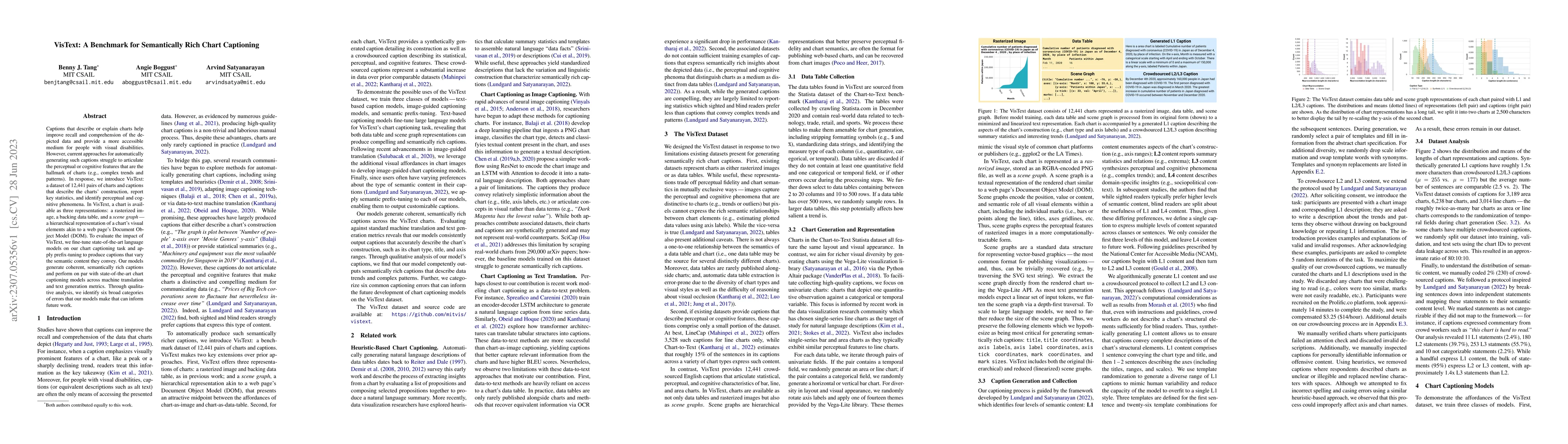
Captions that describe or explain charts help improve recall and comprehension of the depicted data and provide a more accessible medium for people with visual disabilities. However, current approac...
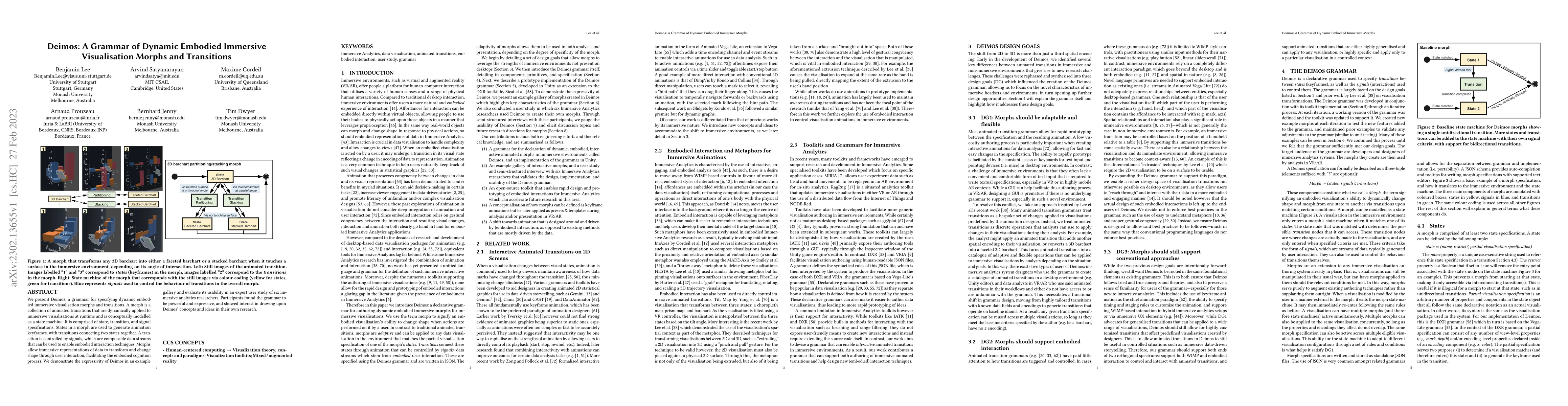
We present Deimos, a grammar for specifying dynamic embodied immersive visualisation morphs and transitions. A morph is a collection of animated transitions that are dynamically applied to immersive...
This position statement is a response to the Office of Science and Technology Policy's Request for Information on "Equitable Data Engagement and Accountability." This response considers data equity ...
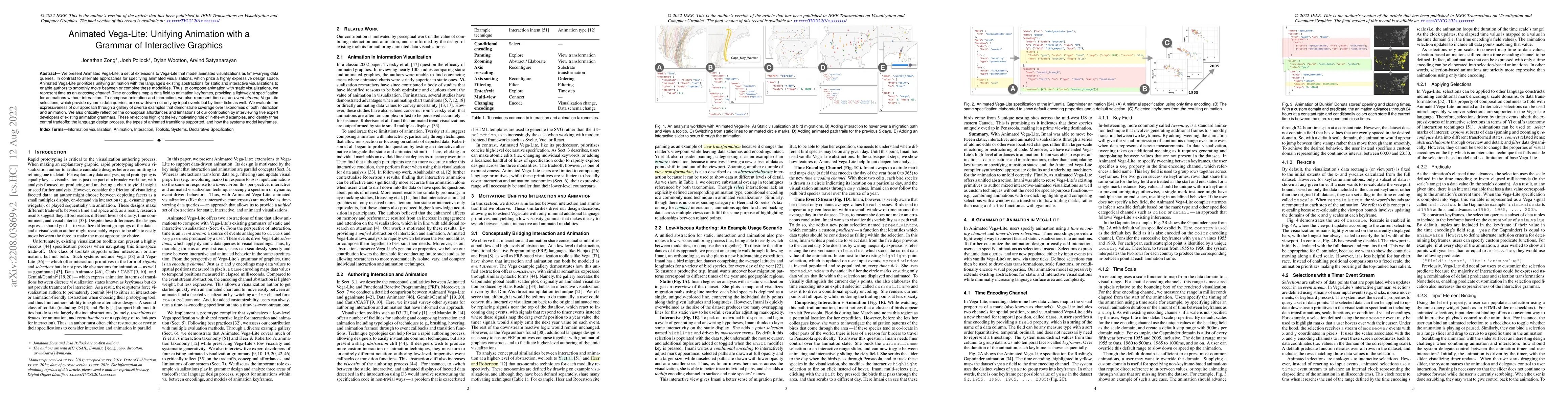
We present Animated Vega-Lite, a set of extensions to Vega-Lite that model animated visualizations as time-varying data queries. In contrast to alternate approaches for specifying animated visualiza...
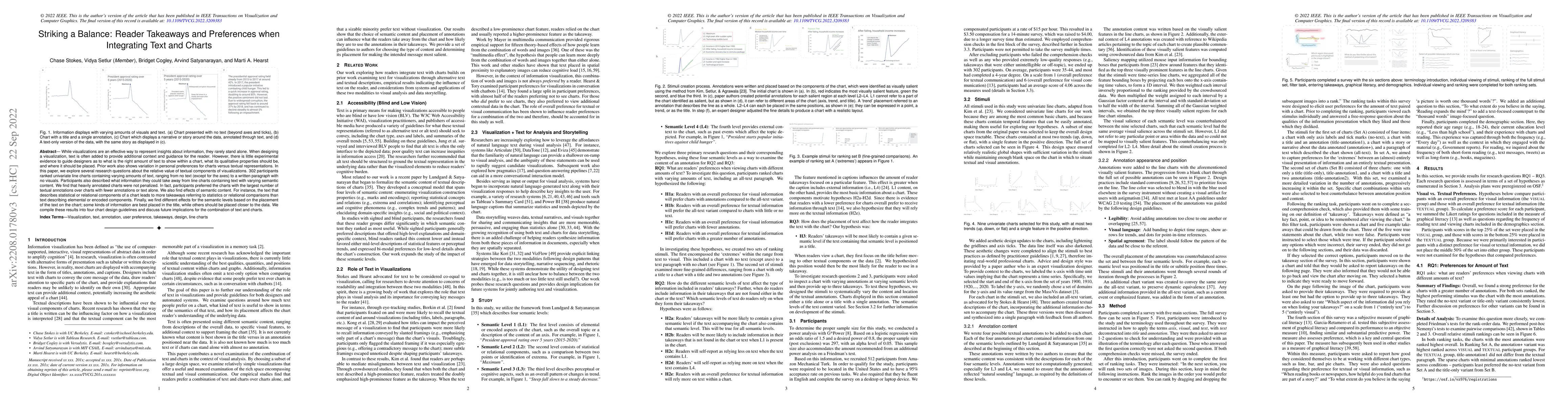
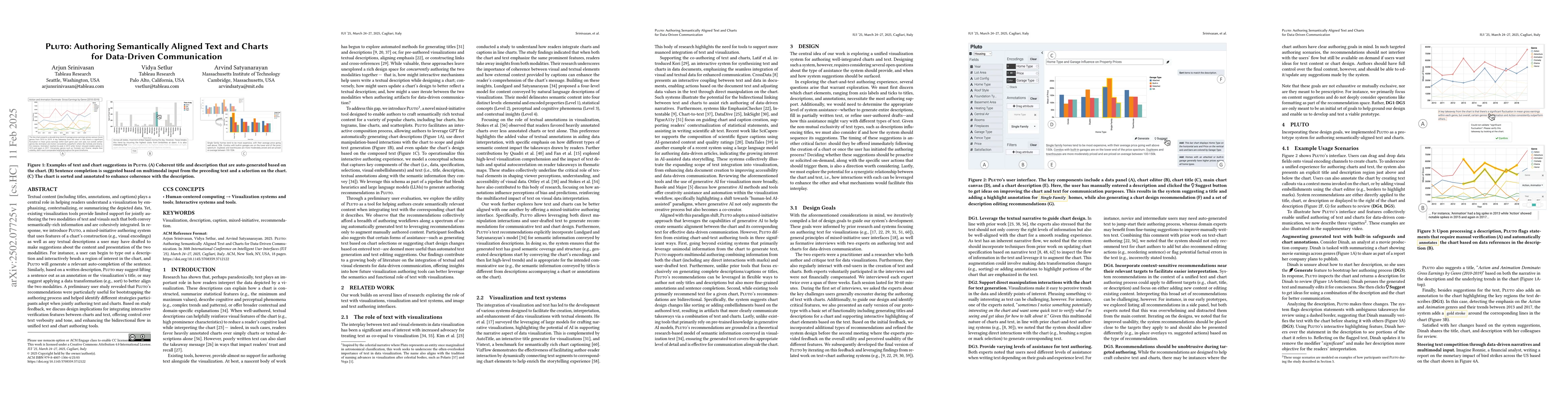
While visualizations are an effective way to represent insights about information, they rarely stand alone. When designing a visualization, text is often added to provide additional context and guid...
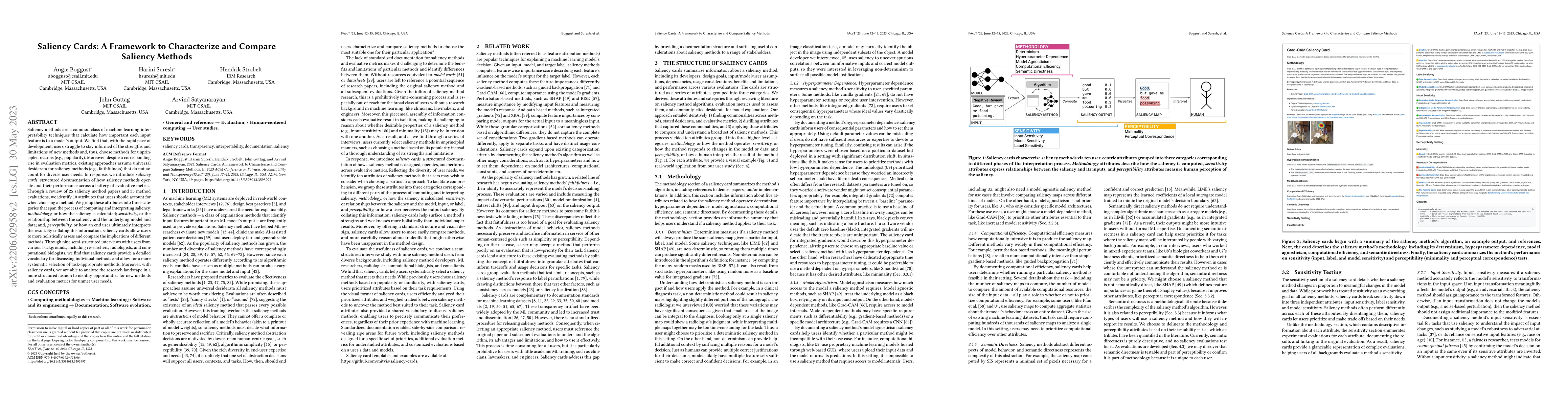
Saliency methods are a common class of machine learning interpretability techniques that calculate how important each input feature is to a model's output. We find that, with the rapid pace of devel...
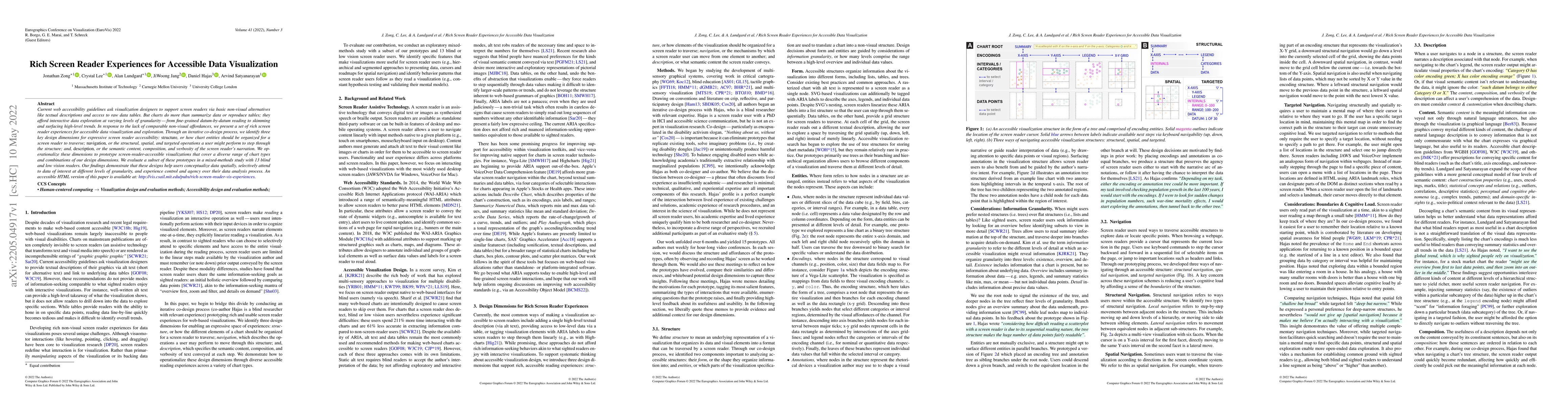
Current web accessibility guidelines ask visualization designers to support screen readers via basic non-visual alternatives like textual descriptions and access to raw data tables. But charts do mo...
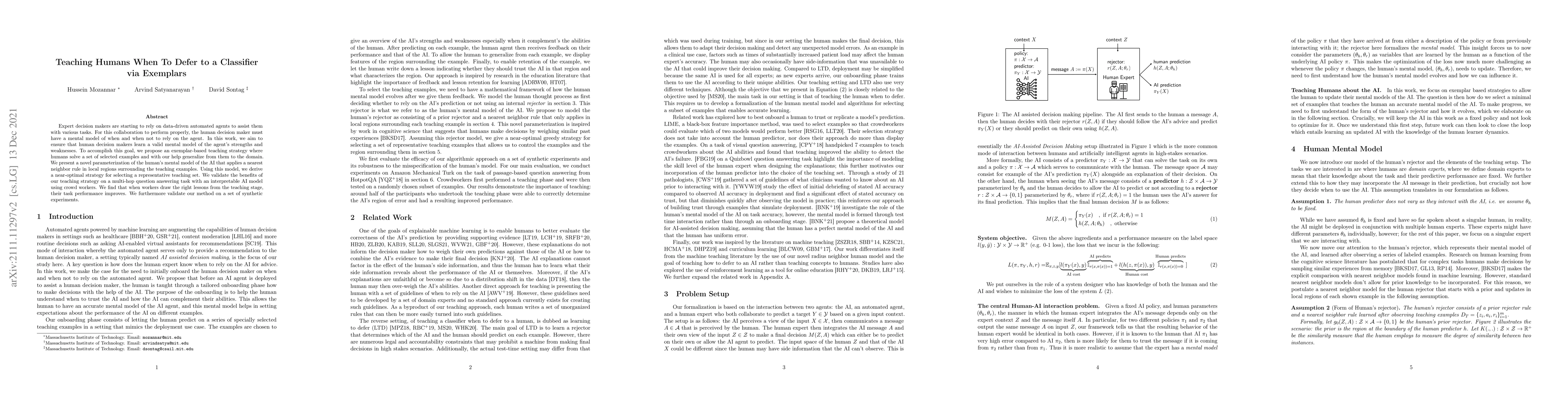
Expert decision makers are starting to rely on data-driven automated agents to assist them with various tasks. For this collaboration to perform properly, the human decision maker must have a mental...
While different language models are ubiquitous in NLP, it is hard to contrast their outputs and identify which contexts one can handle better than the other. To address this question, we introduce L...
Natural language descriptions sometimes accompany visualizations to better communicate and contextualize their insights, and to improve their accessibility for readers with disabilities. However, it...
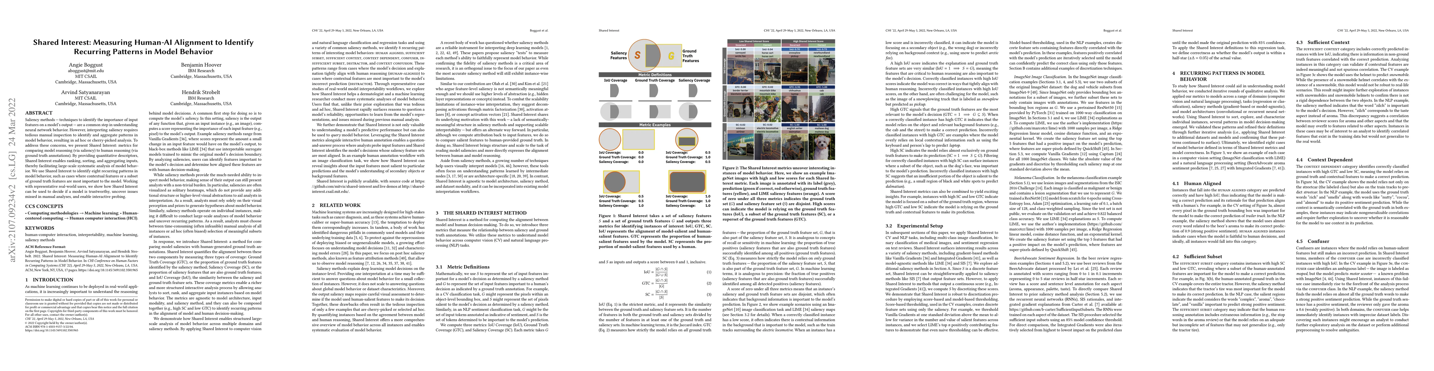
Saliency methods -- techniques to identify the importance of input features on a model's output -- are a common step in understanding neural network behavior. However, interpreting saliency requires...
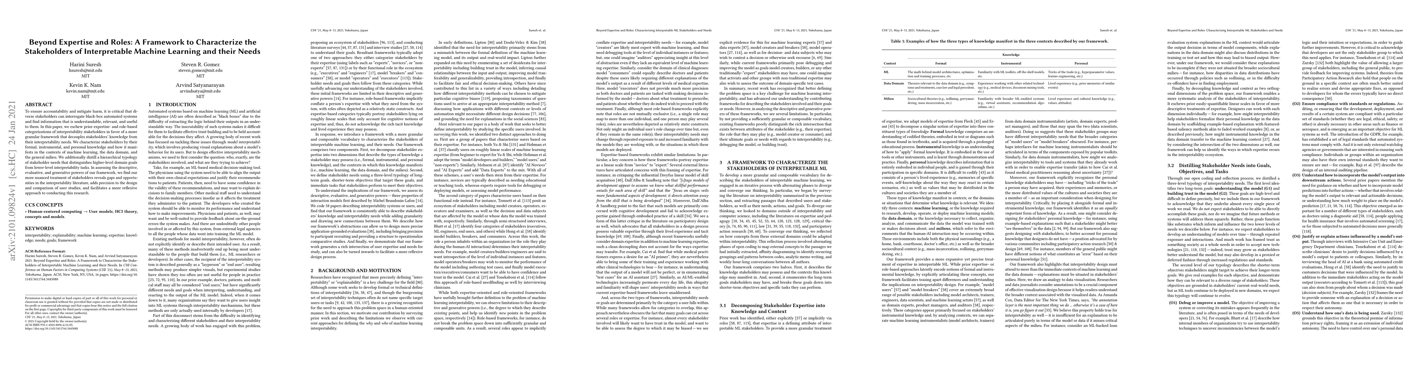
To ensure accountability and mitigate harm, it is critical that diverse stakeholders can interrogate black-box automated systems and find information that is understandable, relevant, and useful to ...
Controversial understandings of the coronavirus pandemic have turned data visualizations into a battleground. Defying public health officials, coronavirus skeptics on US social media spent much of 2...
Establishing common ground and maintaining shared awareness amongst participants is a key challenge in collaborative visualization. For real-time collaboration, existing work has primarily focused o...
Recent graphical interfaces offer direct manipulation mechanisms for authoring visualizations, but are largely restricted to static output. To author interactive visualizations, users must instead t...
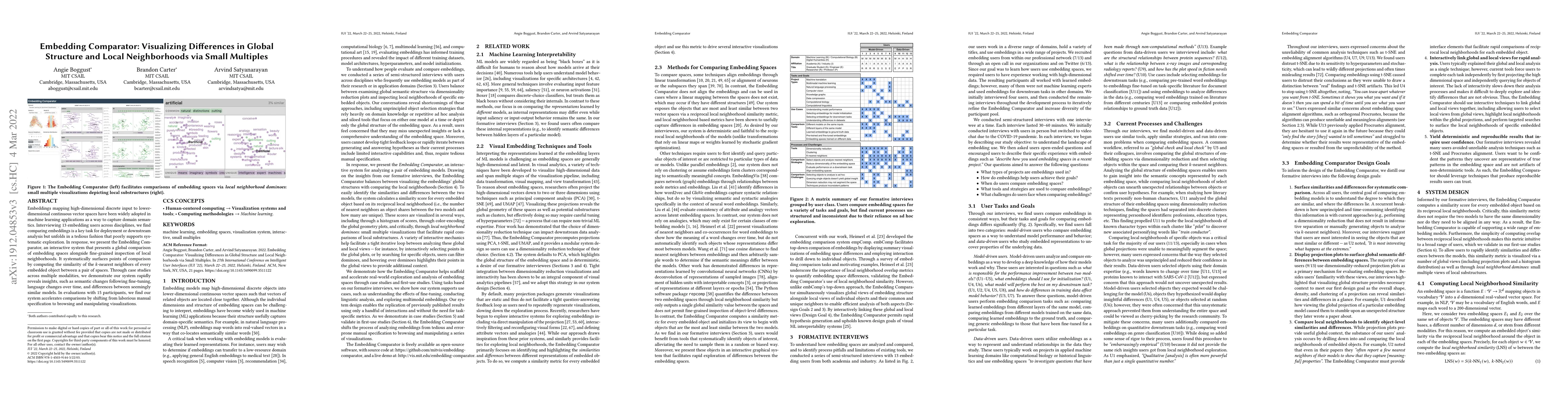
Embeddings mapping high-dimensional discrete input to lower-dimensional continuous vector spaces have been widely adopted in machine learning applications as a way to capture domain semantics. Inter...
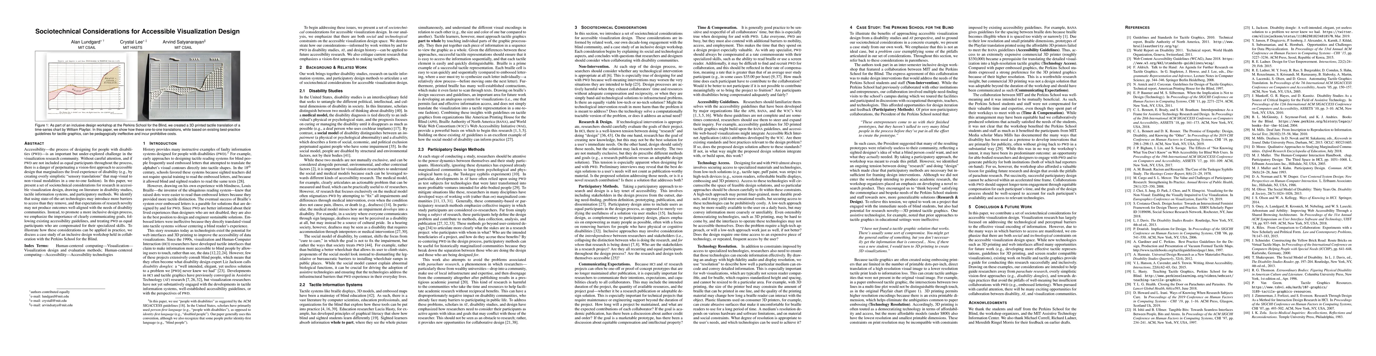
Accessibility--the process of designing for people with disabilities (PWD)--is an important but under-explored challenge in the visualization research community. Without careful attention, and if PW...
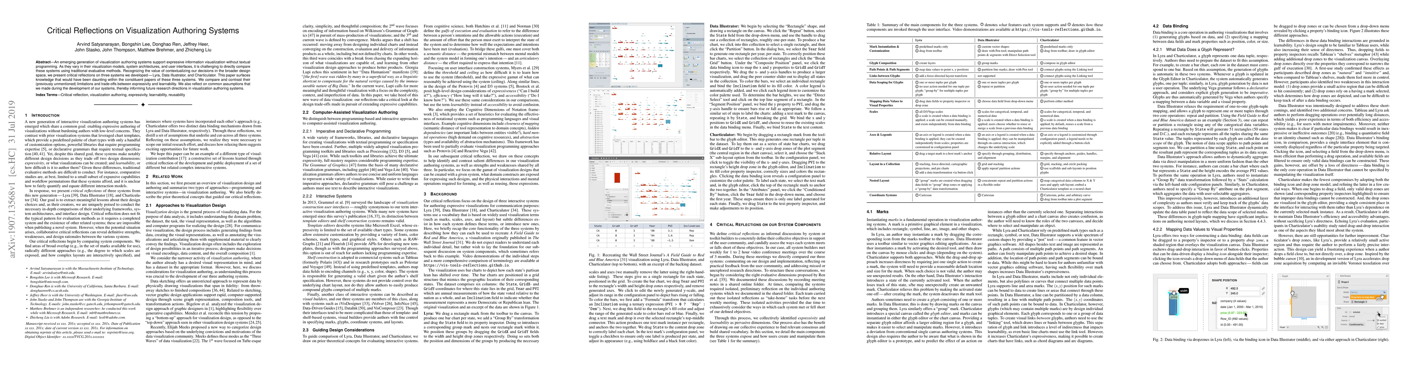
An emerging generation of visualization authoring systems support expressive information visualization without textual programming. As they vary in their visualization models, system architectures, ...
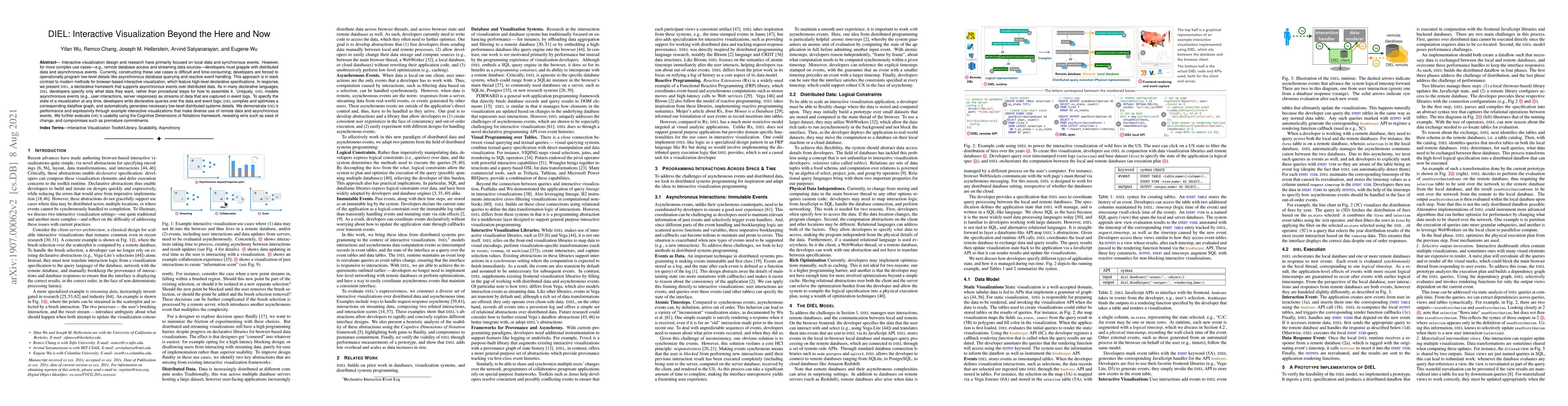
Interactive visualization design and research have primarily focused on local data and synchronous events. However, for more complex use cases---e.g., remote database access and streaming data sourc...
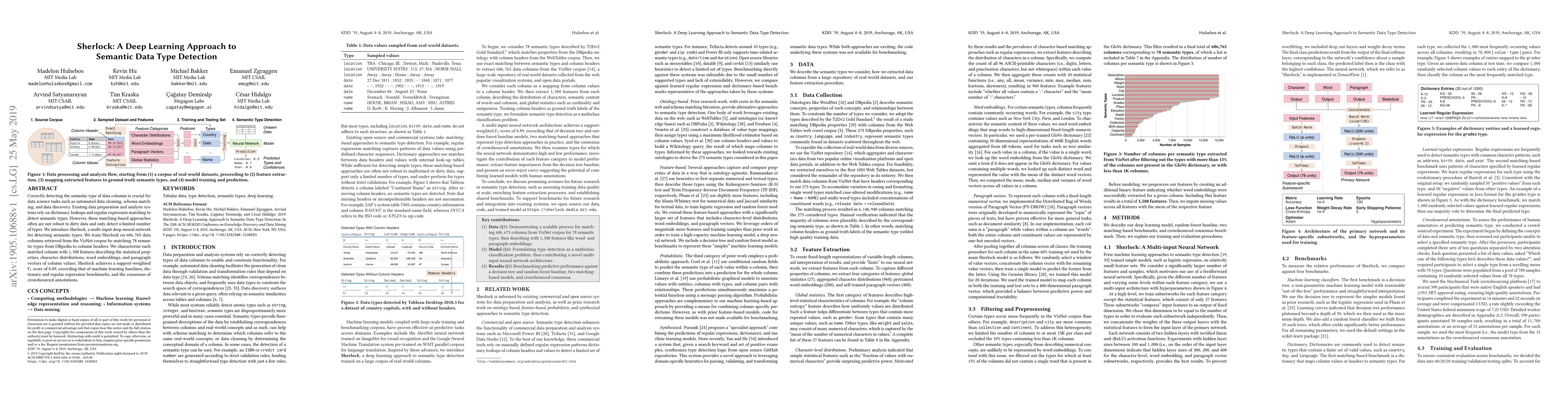
Correctly detecting the semantic type of data columns is crucial for data science tasks such as automated data cleaning, schema matching, and data discovery. Existing data preparation and analysis s...
This article proposes a new integration of linguistic anthropology and machine learning (ML) around convergent interests in both the underpinnings of language and making language technologies more soc...
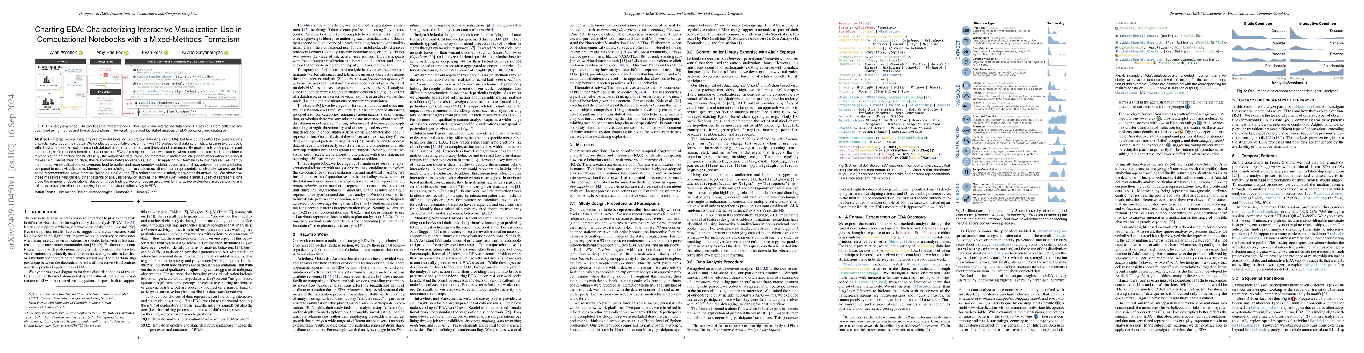
Interactive visualizations are powerful tools for Exploratory Data Analysis (EDA), but how do they affect the observations analysts make about their data? We conducted a qualitative experiment with 13...
Textual content (including titles, annotations, and captions) plays a central role in helping readers understand a visualization by emphasizing, contextualizing, or summarizing the depicted data. Yet,...
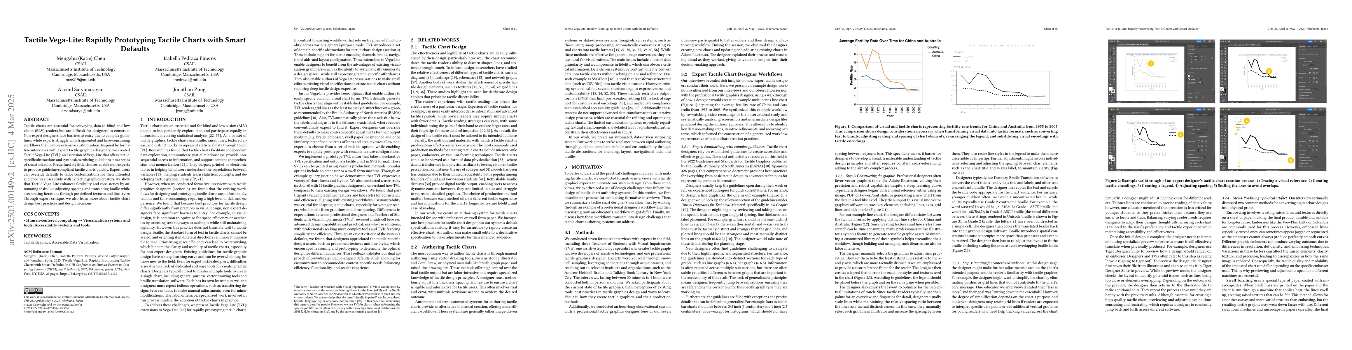
Tactile charts are essential for conveying data to blind and low vision (BLV) readers but are difficult for designers to construct. Non-expert designers face barriers to entry due to complex guideline...
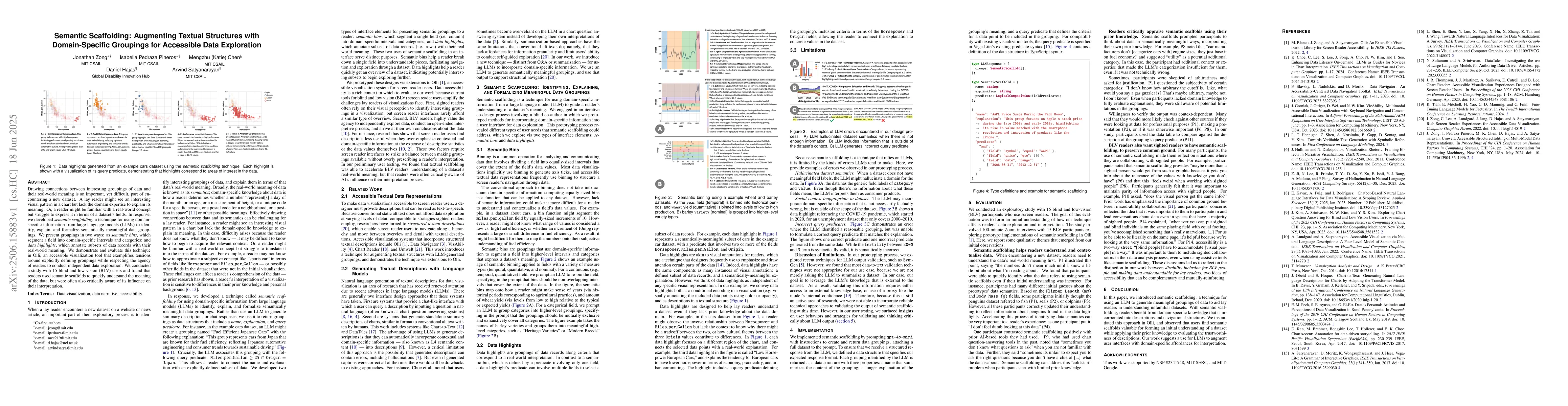
Drawing connections between interesting groupings of data and their real-world meaning is an important, yet difficult, part of encountering a new dataset. A lay reader might see an interesting visual ...
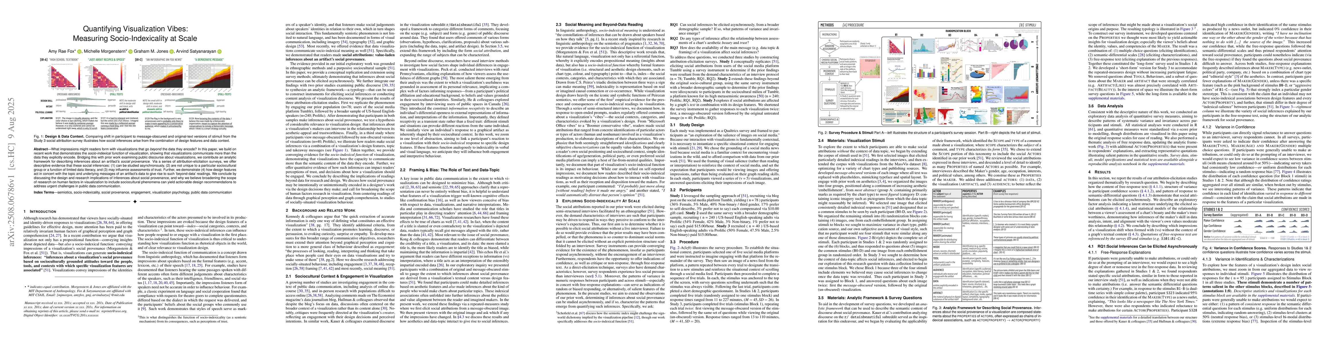
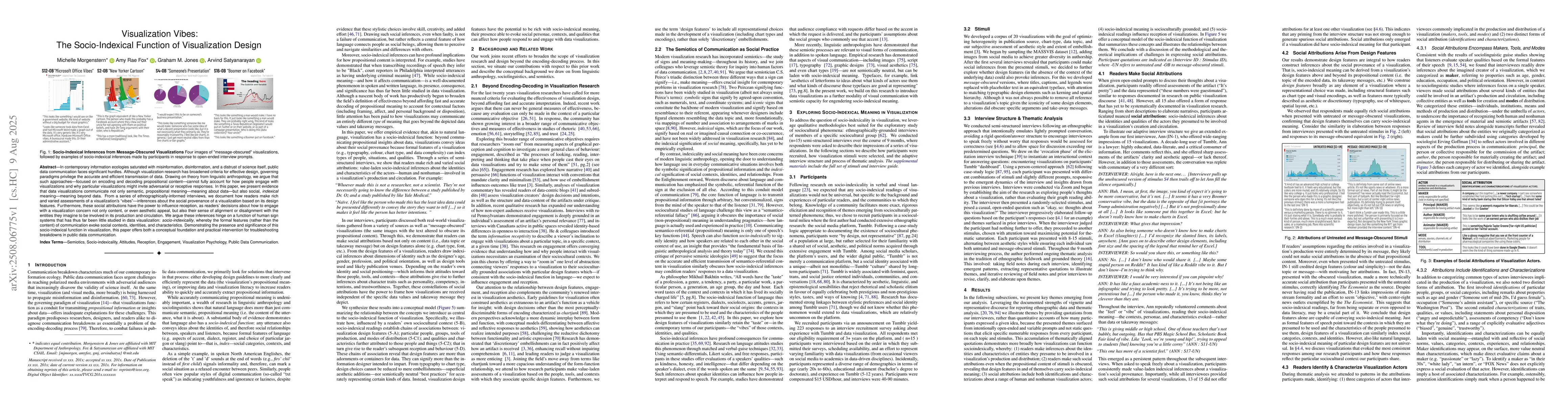
What impressions might readers form with visualizations that go beyond the data they encode? In this paper, we build on recent work that demonstrates the socio-indexical function of visualization, sho...
In contemporary information ecologies saturated with misinformation, disinformation, and a distrust of science itself, public data communication faces significant hurdles. Although visualization resea...
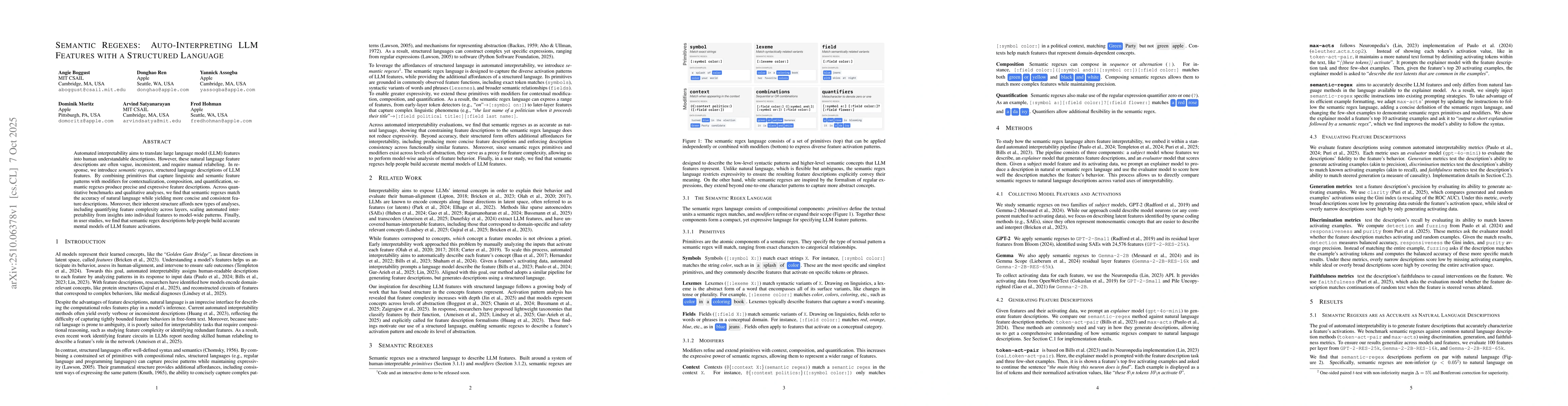
Automated interpretability aims to translate large language model (LLM) features into human understandable descriptions. However, these natural language feature descriptions are often vague, inconsist...
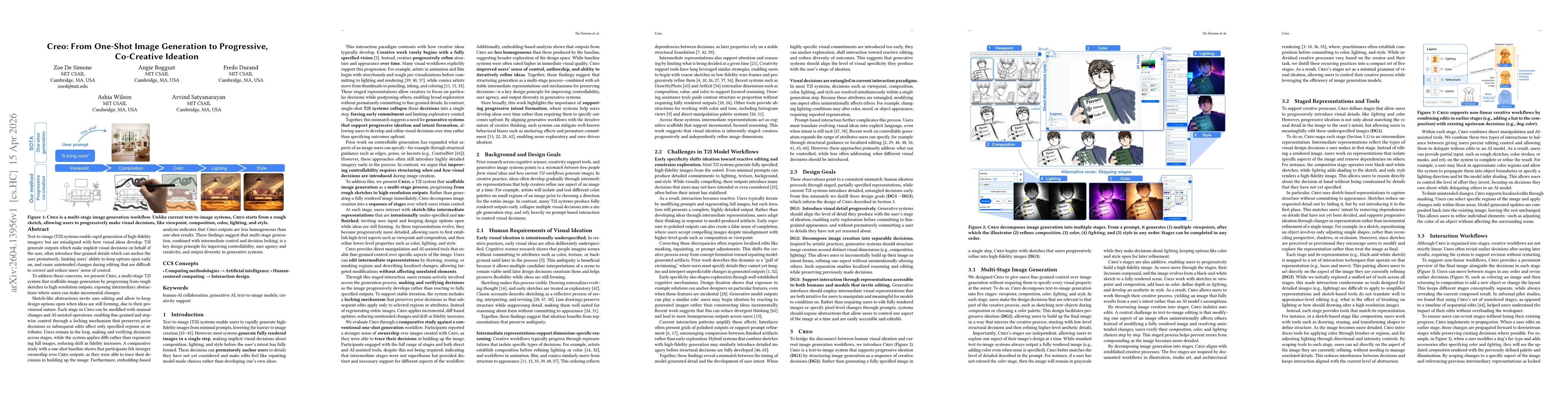
Text-to-image (T2I) systems enable rapid generation of high-fidelity imagery but are misaligned with how visual ideas develop. T2I systems generate outputs that make implicit visual decisions on behal...