Publication

Published: Apr 09, 2026
Categories: cs.GR

Metrics

Source: ArXiv

Quick Actions

View PDF

Quick Answers

What methodology did the authors use?

Mixed-methods online study with 215 participants using a click-to-select interface to evaluate four univariate distribution charts (boxplot, violinplot, jittered stripplot, histogram) across low-level tasks; quantitative accuracy metrics and qualitative coding of free-text feedback were combined with semi-structured interviews of five domain experts. More in Methodology →

What are the key results?

Boxplots excel at median comparison but suffer from range misinterpretation; violinplots best capture distribution shape and clusters; jittered stripplots outperform others on mean/median comparison and range identification. — Chart preference does not align with task performance; histograms are most preferred by general users yet perform poorly on summary-statistic comparisons. More in Key Results →

Why is this work significant?

Provides empirical evidence that chart choice should be task- and audience-aware, challenging conventional reliance on familiarity; informs design of hybrid or defensive visualizations to mitigate misinterpretation. More in Significance →

What are the main limitations?

Only ggplot default implementations of the four chart types were tested, limiting generalizability to other design variants. — Tasks were limited to low-level analytic operations, not reflecting complex real-world analytical workflows. More in Limitations →

Paper Preview

Abstract

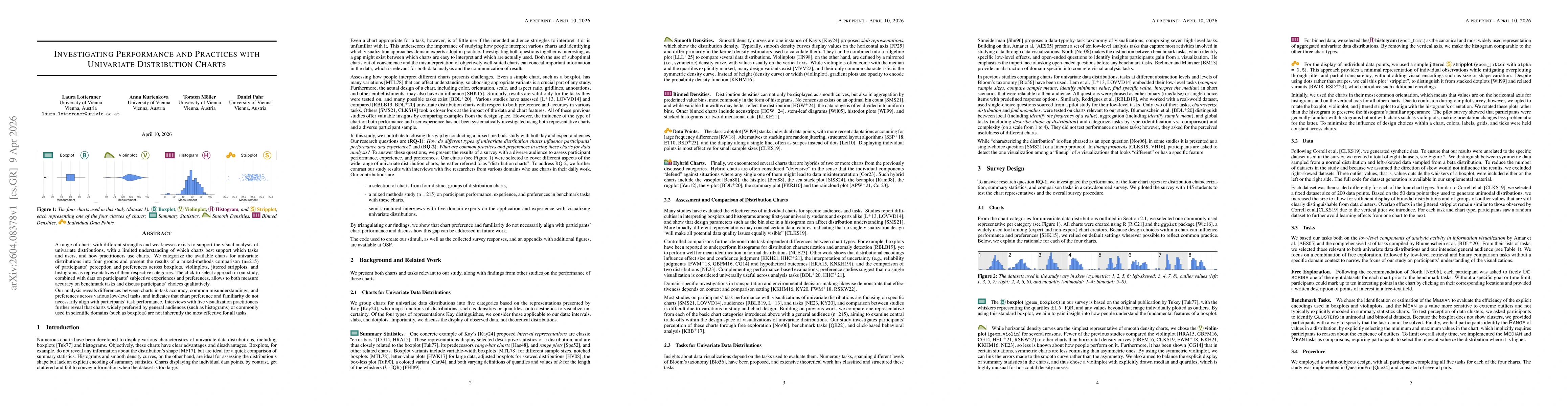
A range of charts with different strengths and weaknesses exists to support the visual analysis of univariate distributions, with a limited understanding of which charts best support which tasks and users, and how practitioners use charts. We categorize the available charts for univariate distributions into four groups and present the results of a mixed-methods comparison (n=215) of participants' perception and preferences across boxplots, violinplots, jittered stripplots, and histograms as representatives of their respective categories. The click-to-select approach in our study, combined with data on participants' subjective experiences and preferences, allows to both measure accuracy on benchmark tasks and discuss participants' choices qualitatively. Our analysis reveals differences between charts in task accuracy, common misunderstandings, and preferences across various low-level tasks, and indicates that chart preference and familiarity do not necessarily align with participants' task performance. Interviews with five visualization practitioners further reveal that charts widely preferred by general audiences (such as histograms) or commonly used in scientific domains (such as boxplots) are not inherently the most effective for all tasks.

AI Key Findings

Generated Apr 10, 2026

Methodology — What approach did the authors take?

Mixed-methods online study with 215 participants using a click-to-select interface to evaluate four univariate distribution charts (boxplot, violinplot, jittered stripplot, histogram) across low-level tasks; quantitative accuracy metrics and qualitative coding of free-text feedback were combined with semi-structured interviews of five domain experts.

Key Results — What are the main findings?

  • Boxplots excel at median comparison but suffer from range misinterpretation; violinplots best capture distribution shape and clusters; jittered stripplots outperform others on mean/median comparison and range identification.
  • Chart preference does not align with task performance; histograms are most preferred by general users yet perform poorly on summary-statistic comparisons.
  • Domain experts heavily rely on boxplots despite common misunderstandings, while experts show openness to violinplots and jittered stripplots for specific tasks.

Significance — Why does this research matter?

Provides empirical evidence that chart choice should be task- and audience-aware, challenging conventional reliance on familiarity; informs design of hybrid or defensive visualizations to mitigate misinterpretation.

Technical Contribution — What is the technical contribution?

Systematic performance and preference benchmark for four common univariate distribution charts using a novel click-to-select paradigm, integrating quantitative accuracy with qualitative insight.

Novelty — What is new about this work?

First study to combine click-to-select accuracy measurement with mixed-methods analysis across multiple chart types, revealing a systematic mismatch between user preference and task performance and offering a baseline for default chart design.

Limitations — What are the limitations of this study?

  • Only ggplot default implementations of the four chart types were tested, limiting generalizability to other design variants.
  • Tasks were limited to low-level analytic operations, not reflecting complex real-world analytical workflows.

Future Work — What did the authors propose for future work?

  • Extend the click-to-select methodology to additional chart variants and real-world analytical scenarios.
  • Conduct domain-specific studies to explore how disciplinary conventions influence chart choice and performance.

Paper Details

Paper ID: 2604.08378
Categories:
cs.GR

How to Cite This Paper

BibTeX
@article{kurtenkova2026investigating,
  title         = {Investigating Performance and Practices with Univariate Distribution Charts},
  author        = {Kurtenkova, Anna and Pahr, Daniel and Lotteraner, Laura and others},
  year          = {2026},
  eprint        = {2604.08378},
  archivePrefix = {arXiv},
  primaryClass  = {cs.GR},
  doi           = {10.1111/cgf.70482},
}
APA 7
Kurtenkova, A., Pahr, D., Lotteraner, L., & Möller, T. (2026). Investigating Performance and Practices with Univariate Distribution Charts. arXiv. https://doi.org/10.1111/cgf.70482
MLA 9
Kurtenkova, Anna, et al. "Investigating Performance and Practices with Univariate Distribution Charts." arXiv, 2026, doi.org/10.1111/cgf.70482.

Comments (0)

This website uses cookies to ensure you get the best experience. Learn more