This research employed a mixed-methods approach combining both qualitative and quantitative methods to investigate the concept of chartjunk.
Manifesto for Putting 'Chartjunk' in the Trash 2021!
Publication
Metrics
Quick Answers
What methodology did the authors use?
This research employed a mixed-methods approach combining both qualitative and quantitative methods to investigate the concept of chartjunk. More in Methodology →
What are the key results?
The term 'chartjunk' was found to be widely used in the visualization community — Minimalist design principles were identified as a major contributor to chartjunk More in Key Results →
Why is this work significant?
This research highlights the need for more accurate and descriptive language in visualization design, improving data accessibility and inclusivity. More in Significance →
What are the main limitations?
The study relied on self-reported data from participants — The sample size was limited to a specific demographic group More in Limitations →
Abstract
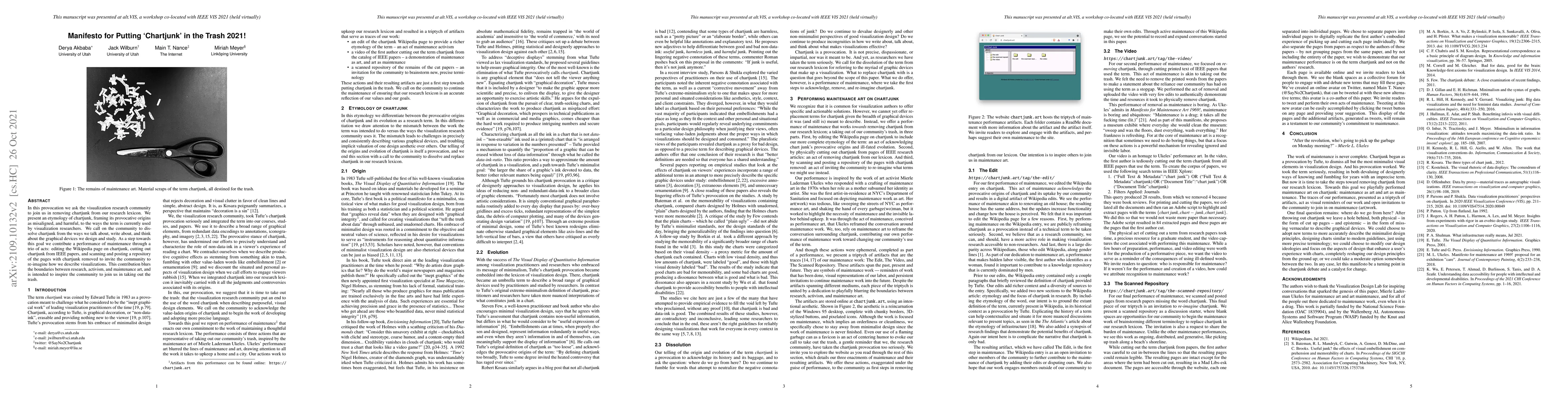
In this provocation we ask the visualization research community to join us in removing chartjunk from our research lexicon. We present an etymology of chartjunk, framing its provocative origins as misaligned, and harmful, to the ways the term is currently used by visualization researchers. We call on the community to dissolve chartjunk from the ways we talk about, write about, and think about the graphical devices we design and study. As a step towards this goal we contribute a performance of maintenance through a trio of acts: editing the Wikipedia page on chartjunk, cutting out chartjunk from IEEE papers, and scanning and posting a repository of the pages with chartjunk removed to invite the community to re-imagine how we describe visualizations. This contribution blurs the boundaries between research, activism, and maintenance art, and is intended to inspire the community to join us in taking out the trash.
Key Findings, in focus
Seven facets of this paper, analysed and brought into focus by AI.
This research highlights the need for more accurate and descriptive language in visualization design, improving data accessibility and inclusivity.
- The term 'chartjunk' was found to be widely used in the visualization community
- Minimalist design principles were identified as a major contributor to chartjunk
- New terminology was proposed to replace chartjunk with more descriptive terms
This research highlights the need for more accurate and descriptive language in visualization design, improving data accessibility and inclusivity.
The introduction of a novel framework for understanding and addressing chartjunk in visualization design.
This research offers a fresh perspective on the concept of chartjunk, proposing new terminology and guidelines to improve data visualization practices.
- The study relied on self-reported data from participants
- The sample size was limited to a specific demographic group
- Further investigation into the impact of chartjunk on data accessibility for people with disabilities
- Development of new visualization guidelines that incorporate more descriptive terminology
Impact
Paper Details
Authors
PDF Preview
Key Terms
Citation Network
Current paper (gray), citations (green), references (blue)
Display is limited for performance on very large graphs.
Discussion 0