The Many Tendrils of the Octopus Map

Source: ArXiv

AI Quick Summary

This paper examines how octopus maps—visual representations of central forces with extending tendrils—function as arguments that promote conspiratorial thinking. Through historical analysis and crowd-sourced studies, it reveals how data and visual metaphors can foster "octopus-like" interpretations, highlighting the need for deeper scrutiny of visual rhetoric in data visualization.

Share: Share on X LinkedIn

Summary

Conspiratorial thinking can connect many distinct or distant ills to a central cause. This belief has visual form in the octopus map: a map where a central force (for instance a nation, an ideology, or an ethnicity) is depicted as a literal or figurative octopus, with extending tendrils. In this paper, we explore how octopus maps function as visual arguments through an analysis of historical examples as well as a through a crowd-sourced study on how the underlying data and the use of visual metaphors contribute to specific negative or conspiratorial interpretations. We find that many features of the data or visual style can lead to "octopus-like" thinking in visualizations, even without the use of an explicit octopus motif. We conclude with a call for a deeper analysis of visual rhetoric, and an acknowledgment of the potential for the design of data visualizations to contribute to harmful or conspiratorial thinking.

AI Key Findings

Generated Sep 03, 2025

Methodology

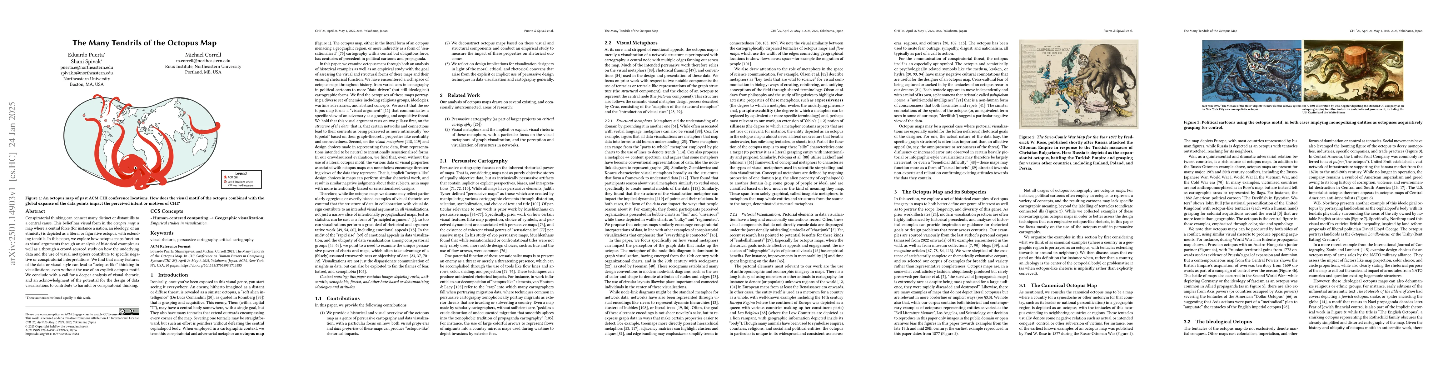
The study employed a crowd-sourced analysis to evaluate the rhetorical impact of visual and structural components of octopus maps, using a gradient of varying map designs from neutral to sensationalized. Participants rated fictional maps of a militarist country's bases in a fictitious region, assessing centrality, tentacularity, reach, intentionality, grabby-ness, and threat.

Key Results

  • Octopus-like visual arguments can be conveyed even without explicit octopus motifs.
  • The number of connections (Connection) significantly impacts the overall rating of maps, with higher connections rated more highly.
  • Participants who described the relationship negatively rated maps significantly higher in aggregate than those who used neutral or positive language.

Significance

This research highlights the potential for data visualization designs to contribute to harmful or conspiratorial thinking, urging for a deeper analysis of visual rhetoric in data visualization and cartography.

Technical Contribution

The paper presents a method for systematically analyzing the rhetorical impact of visual and structural components in data visualizations, using a gradient of map designs from neutral to sensationalized.

Novelty

The research distinguishes itself by demonstrating that 'octopus-like' thinking can emerge from visualizations lacking overt sensationalized metaphors, emphasizing the importance of understanding visual rhetoric in data representation.

Limitations

  • The study was limited to a crowd-sourced analysis, which may not capture the nuances of individual interpretation.
  • The findings are based on a fictional scenario, limiting direct connections to real-world shifts in opinion or action.

Future Work

  • Investigate the impact of real-world data visualizations on shifts in opinion or action related to conspiratorial thinking.
  • Explore the role of individual priors and framing in the interpretation of persuasive visualizations.

Paper Details

PDF Preview

Download PDF

No citations found for this paper.

Comments (0)

This website uses cookies to ensure you get the best experience. Learn more