Academic Profile
Statistics
Similar Authors
Papers on arXiv
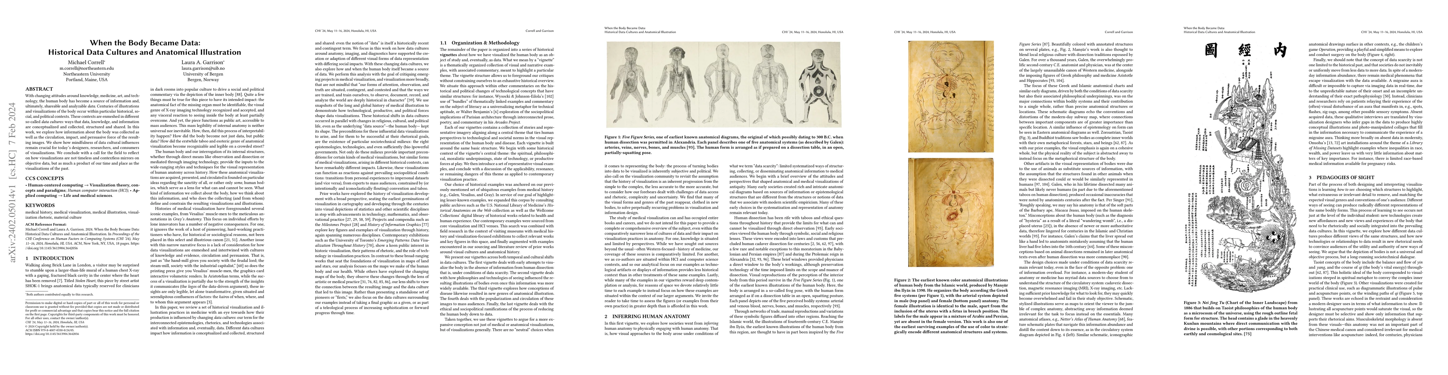
With changing attitudes around knowledge, medicine, art, and technology, the human body has become a source of information and, ultimately, shareable and analyzable data. Centuries of illustrations ...
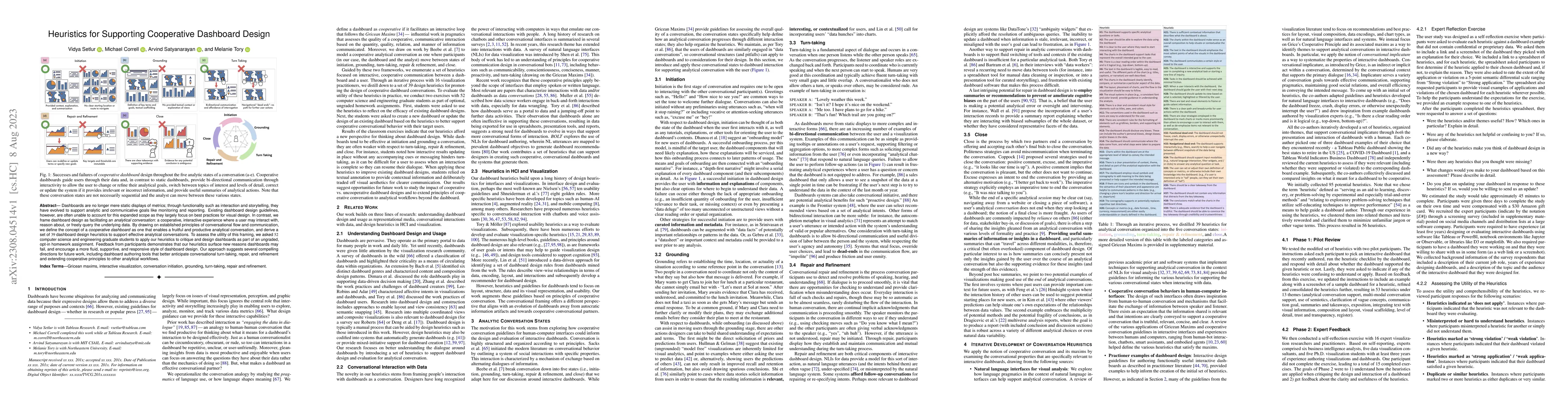
Dashboards are no longer mere static displays of metrics; through functionality such as interaction and storytelling, they have evolved to support analytic and communicative goals like monitoring an...
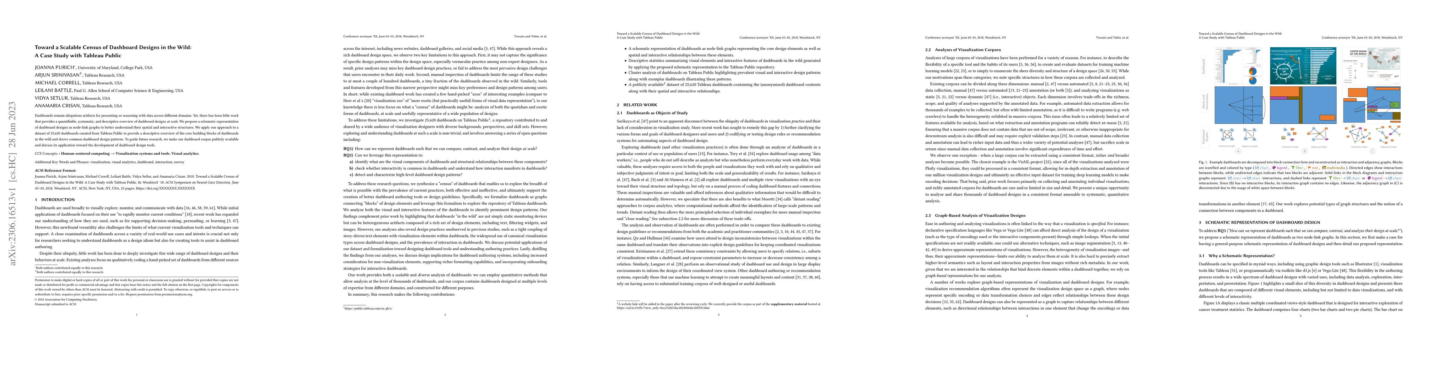
Dashboards remain ubiquitous artifacts for presenting or reasoning with data across different domains. Yet, there has been little work that provides a quantifiable, systematic, and descriptive overv...
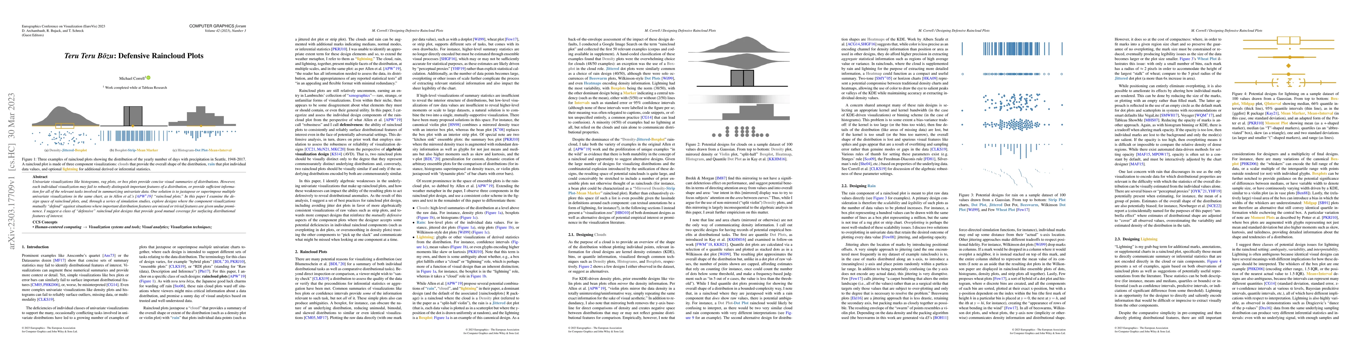
Univariate visualizations like histograms, rug plots, or box plots provide concise visual summaries of distributions. However, each individual visualization may fail to robustly distinguish importan...
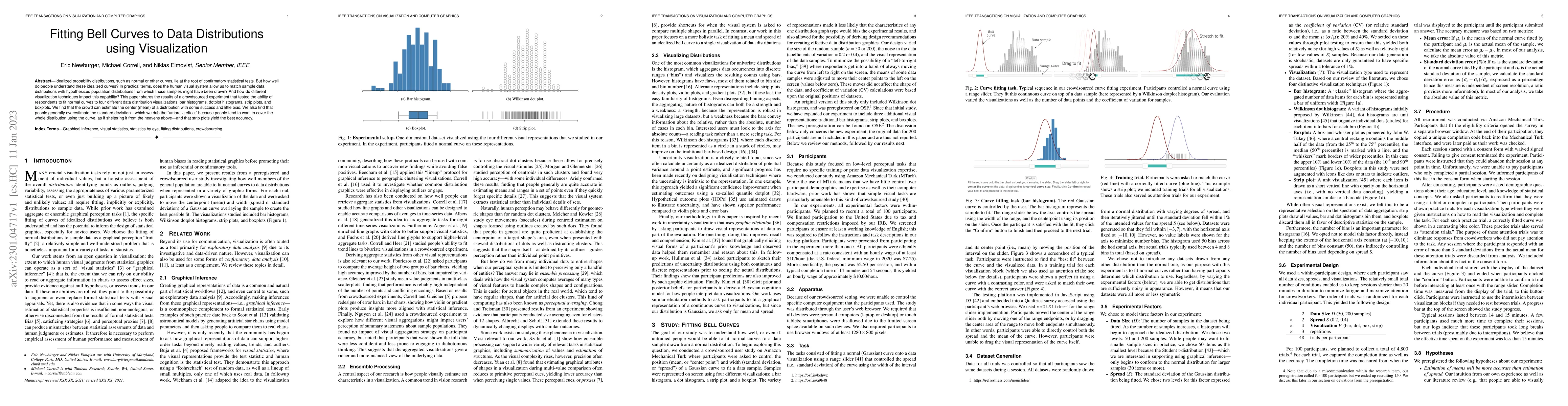
Idealized probability distributions, such as normal or other curves, lie at the root of confirmatory statistical tests. But how well do people understand these idealized curves? In practical terms, ...
In this work, I use a survey of senior visualization researchers and thinkers to ideate about the notion of progress in visualization research: how are we growing as a field, what are we building to...
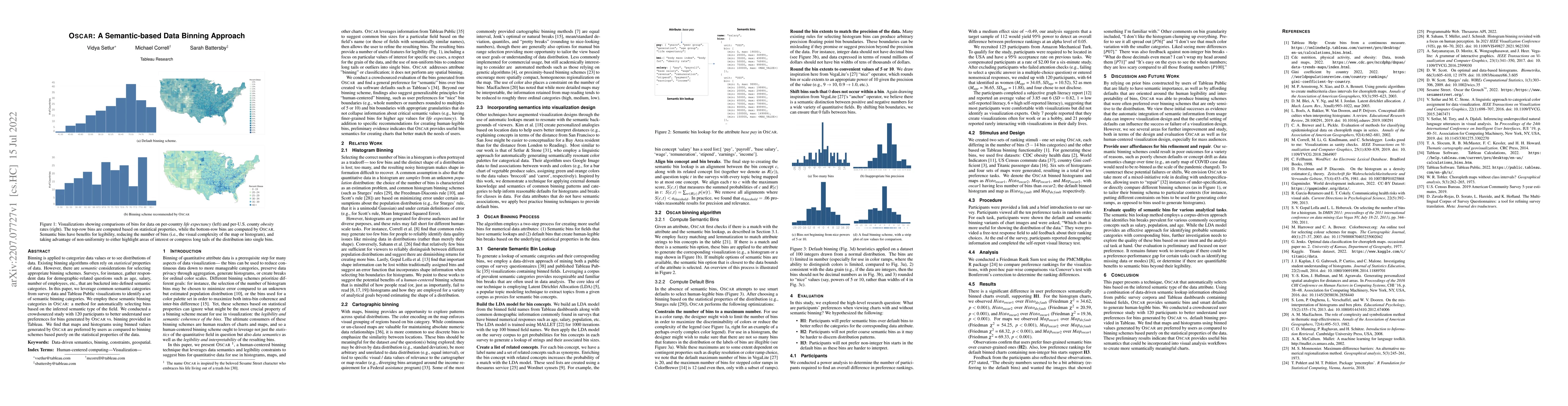
Binning is applied to categorize data values or to see distributions of data. Existing binning algorithms often rely on statistical properties of data. However, there are semantic considerations for...
The promise of visualization recommendation systems is that analysts will be automatically provided with relevant and high-quality visualizations that will reduce the work of manual exploration or c...
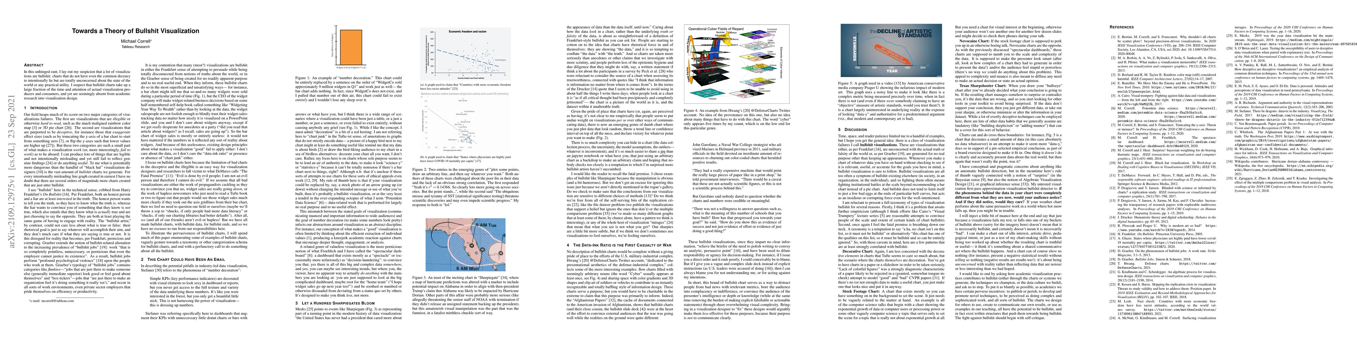
In this unhinged rant, I lay out my suspicion that a lot of visualizations are bullshit: charts that do not have even the common decency to intentionally lie but are totally unconcerned about the st...
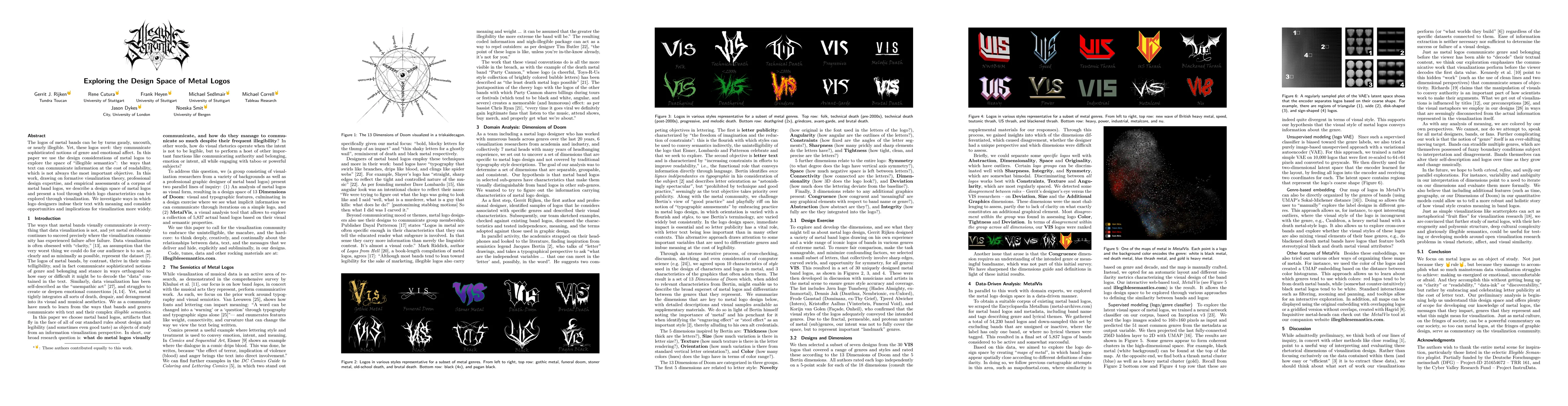
The logos of metal bands can be by turns gaudy, uncouth, or nearly illegible. Yet, these logos work: they communicate sophisticated notions of genre and emotional affect. In this paper we use the de...
Working with data in table form is usually considered a preparatory and tedious step in the sensemaking pipeline; a way of getting the data ready for more sophisticated visualization and analytical ...
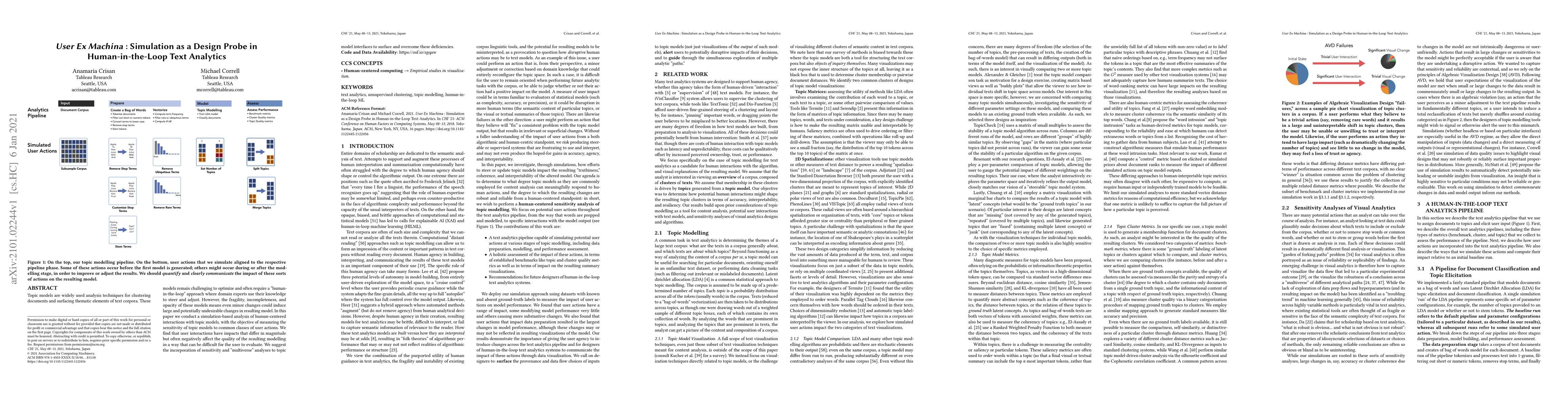
Topic models are widely used analysis techniques for clustering documents and surfacing thematic elements of text corpora. These models remain challenging to optimize and often require a "human-in-t...
We often point to the relative increase in the amount and sophistication of evaluations of visualization systems versus the earliest days of the field as evidence that we are maturing as a field. I ...
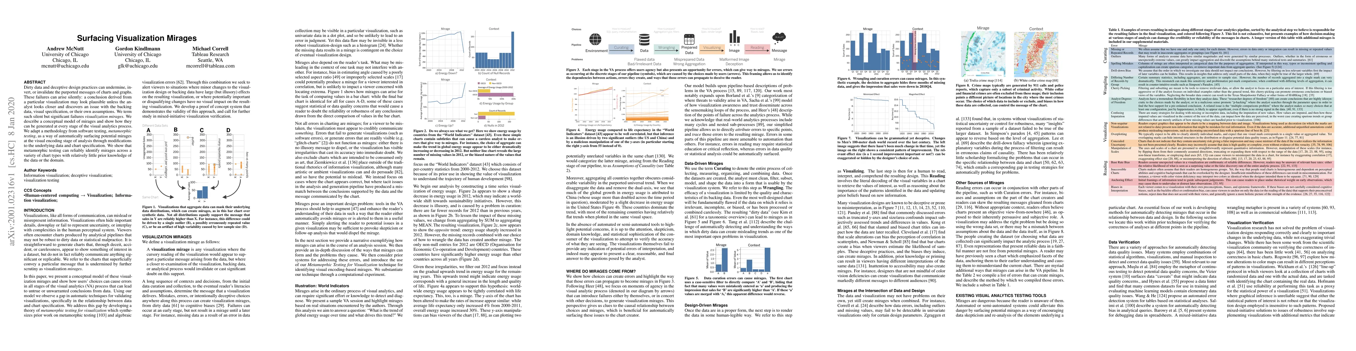
Dirty data and deceptive design practices can undermine, invert, or invalidate the purported messages of charts and graphs. These failures can arise silently: a conclusion derived from a particular ...
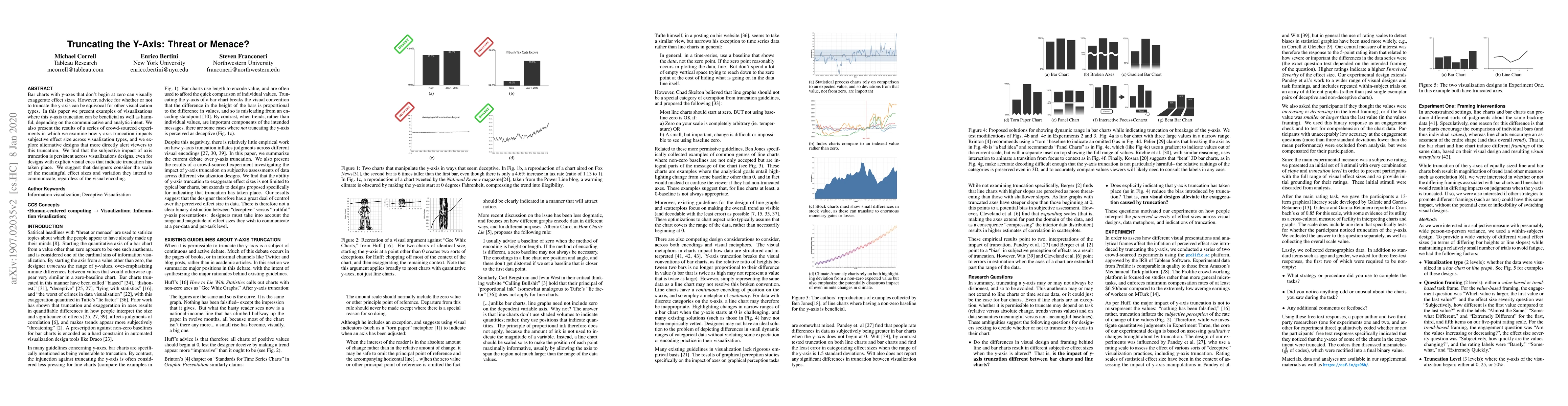
Bar charts with y-axes that don't begin at zero can visually exaggerate effect sizes. However, advice for whether or not to truncate the y-axis can be equivocal for other visualization types. In thi...
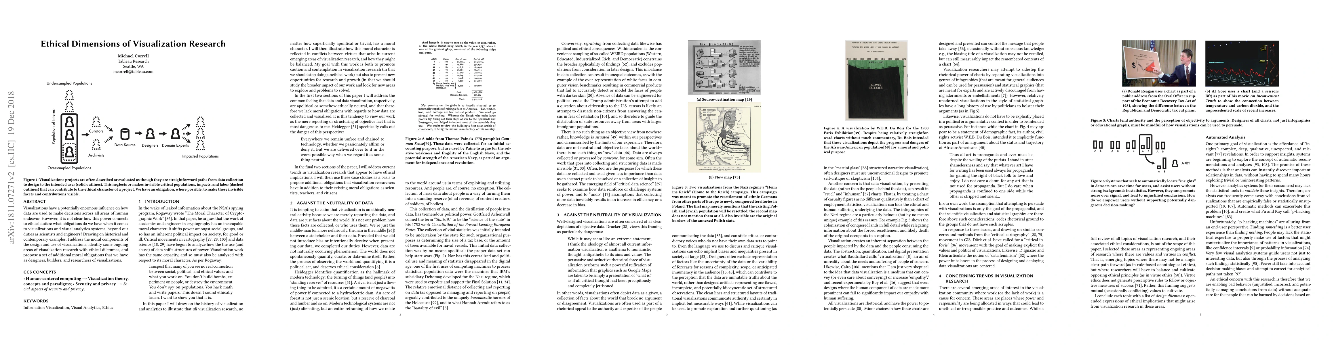
Visualizations have a potentially enormous influence on how data are used to make decisions across all areas of human endeavor. However, it is not clear how this power connects to ethical duties: wh...
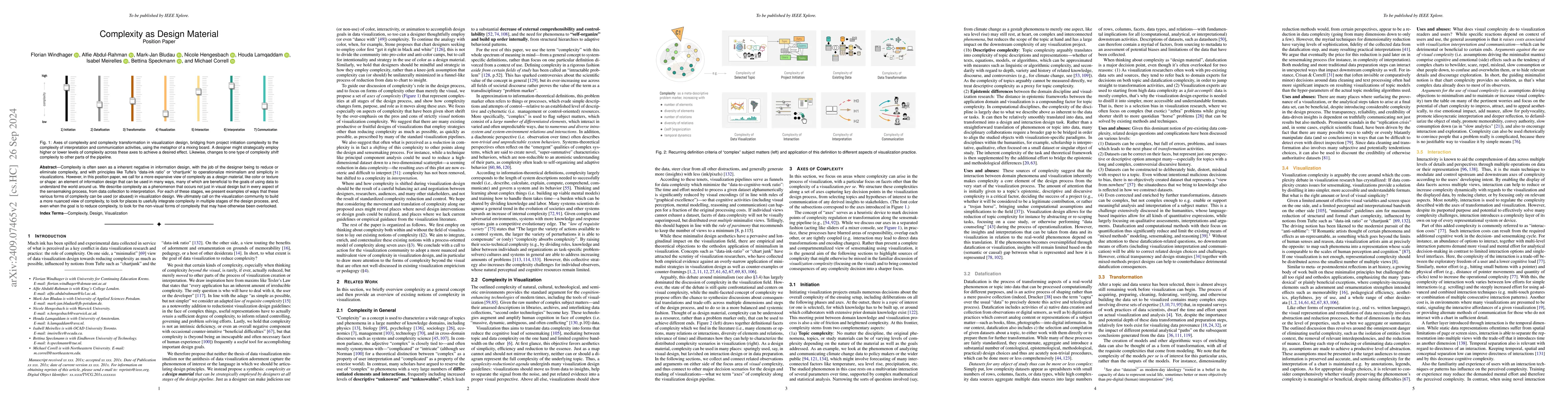
Complexity is often seen as a inherent negative in information design, with the job of the designer being to reduce or eliminate complexity, and with principles like Tufte's "data-ink ratio" or "chart...
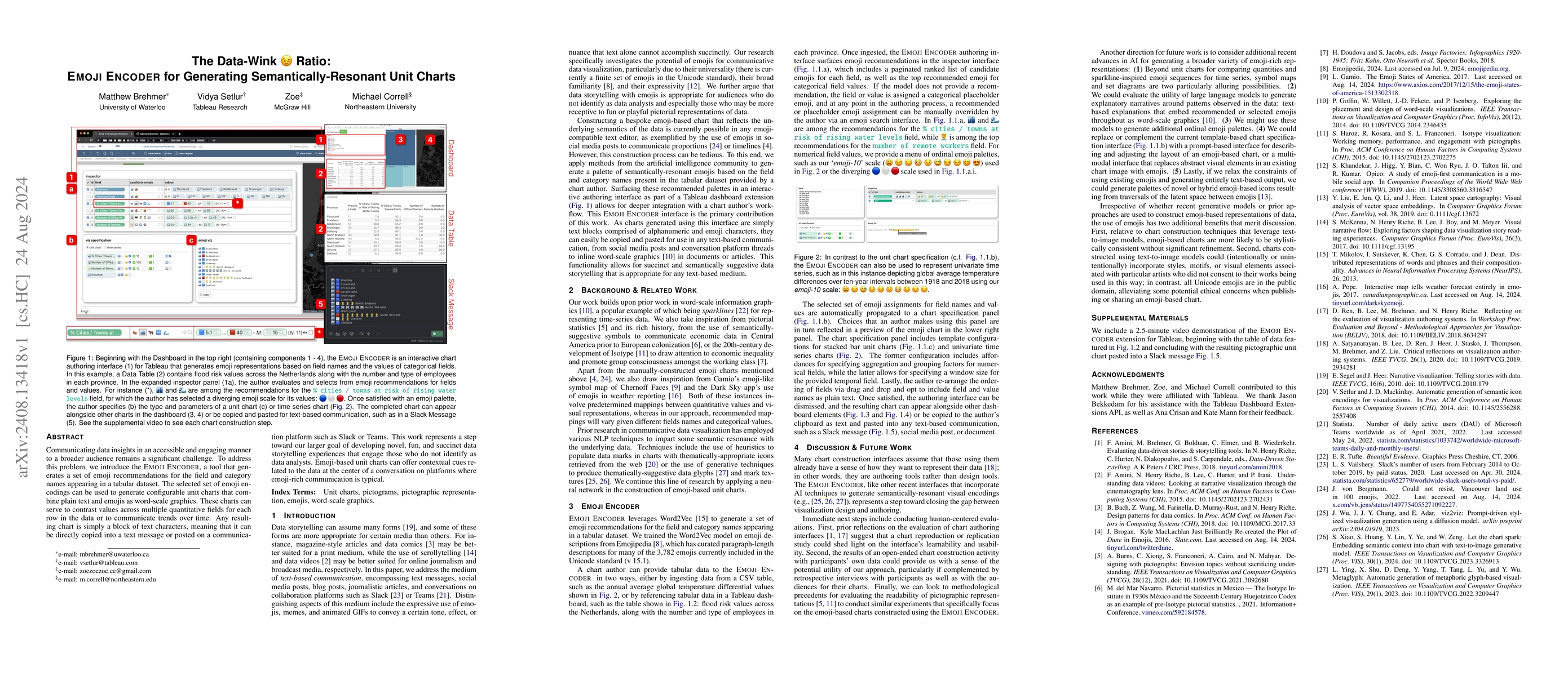
Communicating data insights in an accessible and engaging manner to a broader audience remains a significant challenge. To address this problem, we introduce the Emoji Encoder, a tool that generates a...
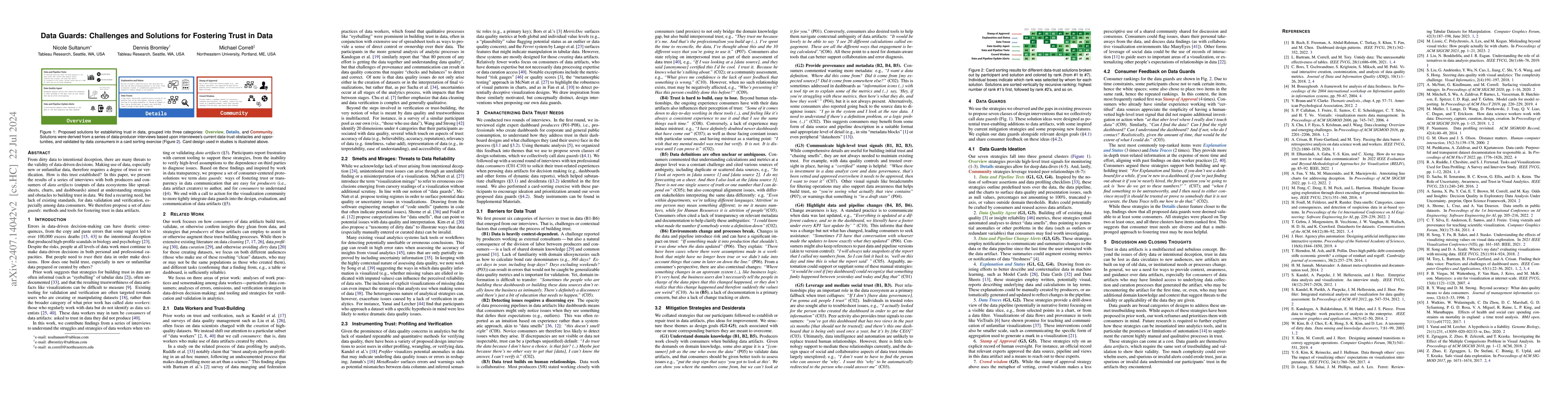
From dirty data to intentional deception, there are many threats to the validity of data-driven decisions. Making use of data, especially new or unfamiliar data, therefore requires a degree of trust o...
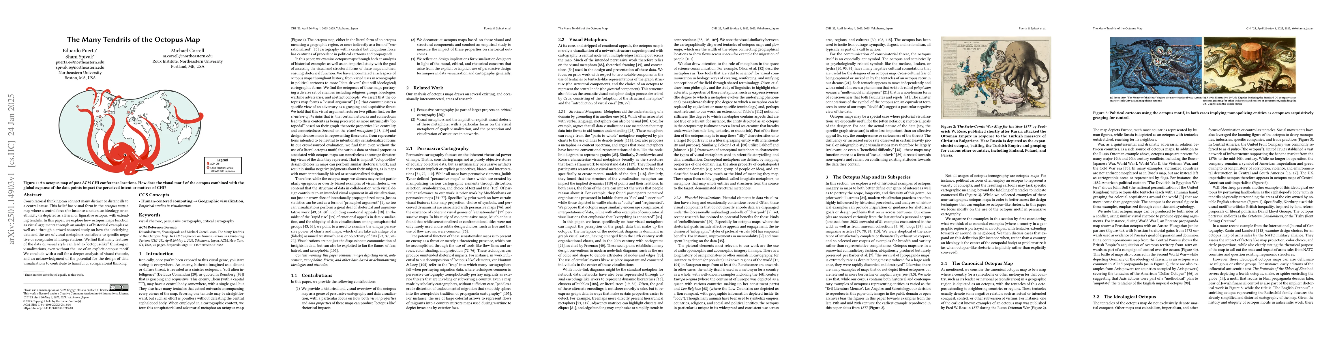
Conspiratorial thinking can connect many distinct or distant ills to a central cause. This belief has visual form in the octopus map: a map where a central force (for instance a nation, an ideology, o...
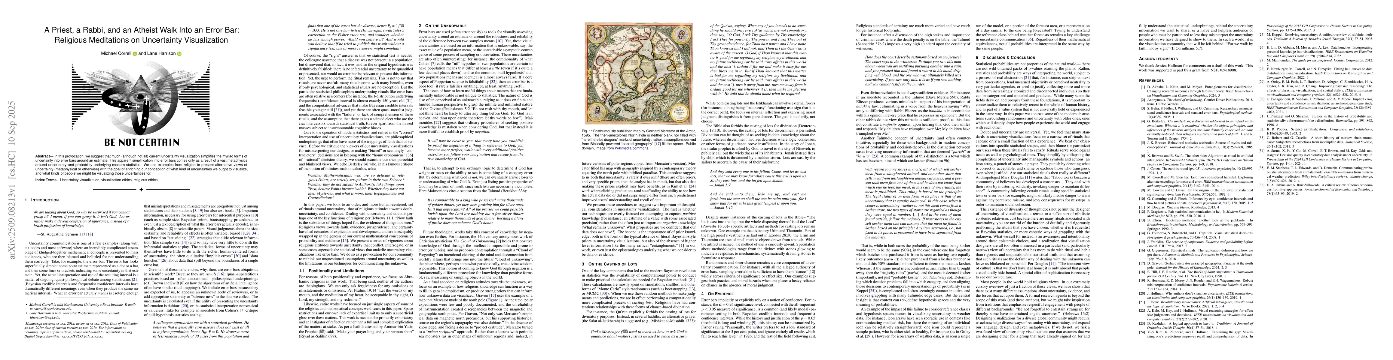
In this provocation, we suggest that much (although not all) current uncertainty visualization simplifies the myriad forms of uncertainty into error bars around an estimate. This apparent simplificati...
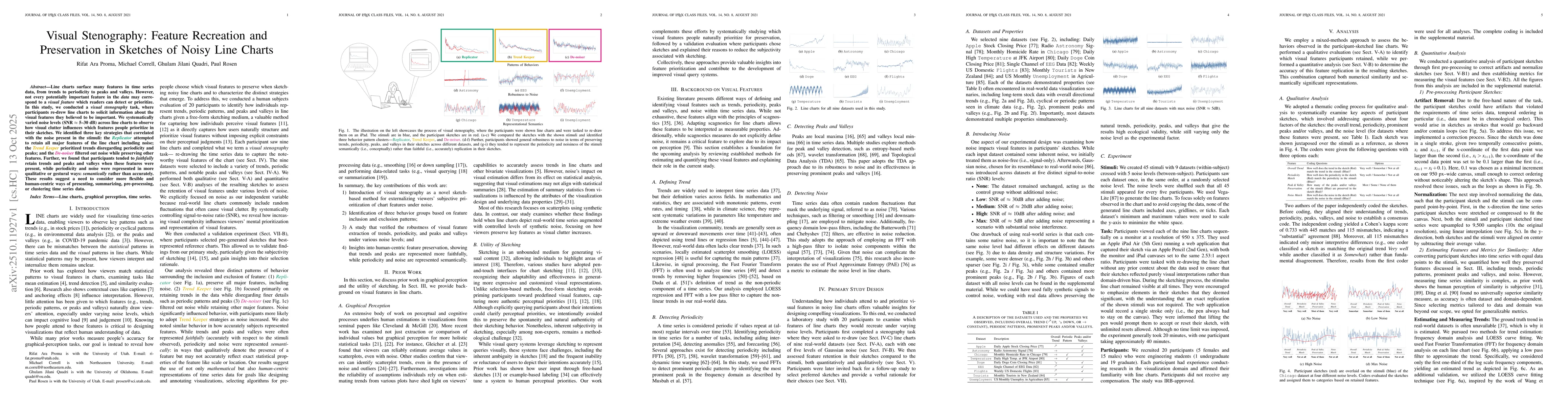
Line charts surface many features in time series data, from trends to periodicity to peaks and valleys. However, not every potentially important feature in the data may correspond to a visual feature ...
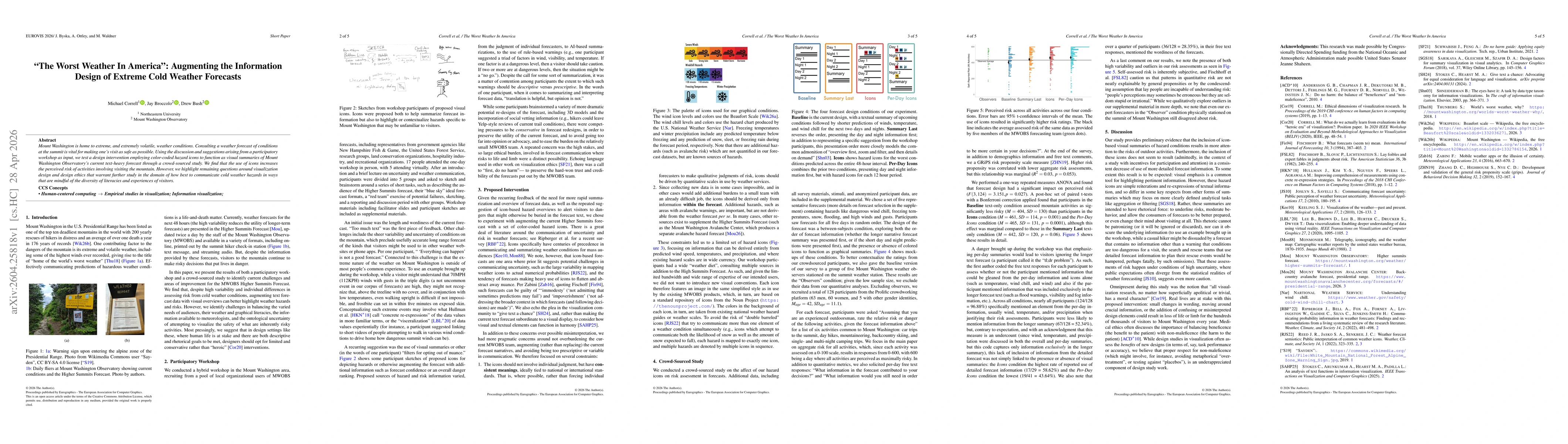
Mount Washington is home to extreme, and extremely volatile, weather conditions. Consulting a weather forecast of conditions at the summit is vital for making one's visit as safe as possible. Using th...
A perennial research question in visualization involves identifying which visual encodings for a particular dataset are most effective for users in performing a specific task. The relative effectivene...