Authors
Summary
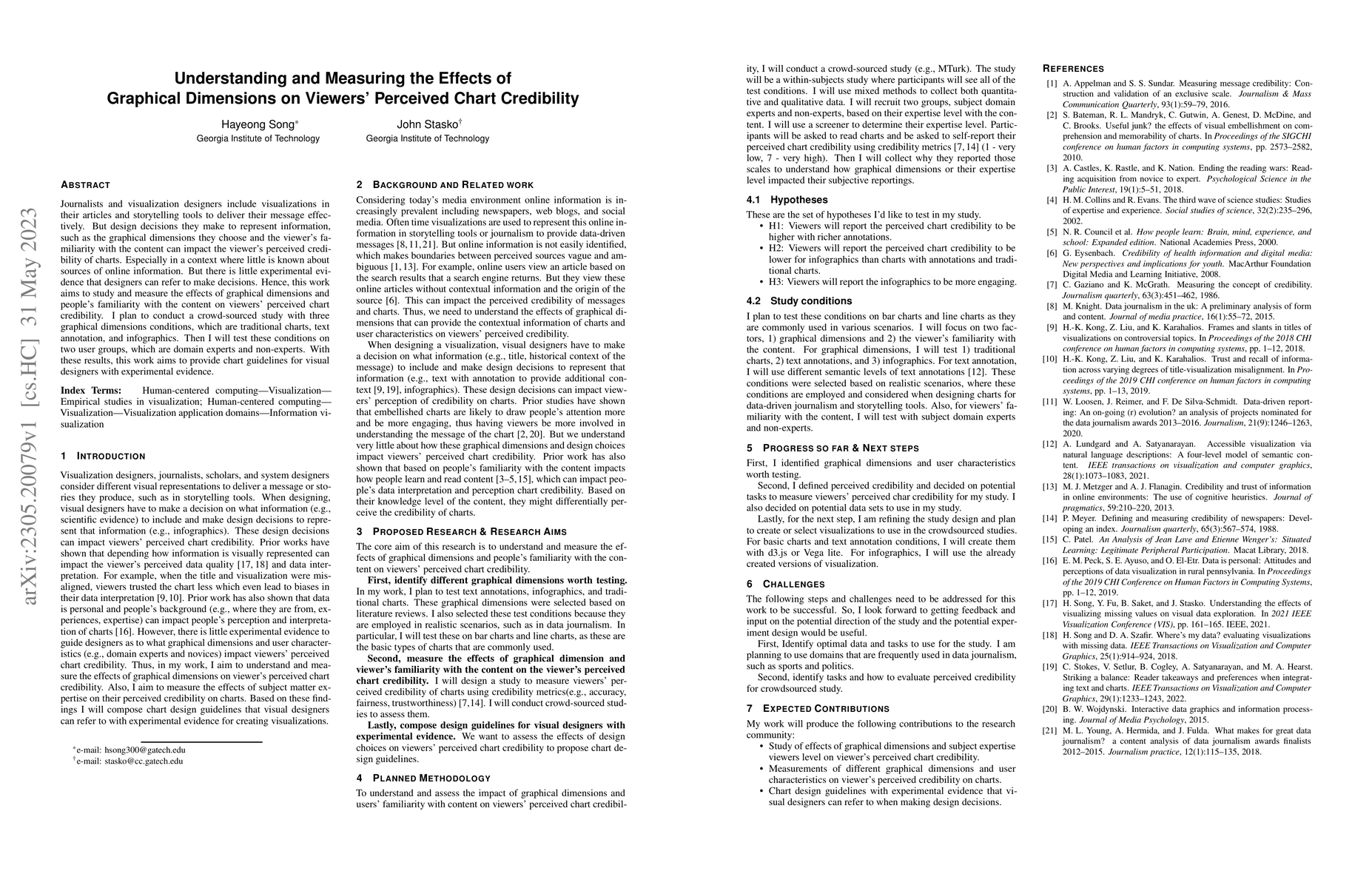
Journalists and visualization designers include visualizations in their articles and storytelling tools to deliver their message effectively. But design decisions they make to represent information, such as the graphical dimensions they choose and the viewer's familiarity with the content can impact the viewer's perceived credibility of charts. Especially in a context where little is known about sources of online information. But there is little experimental evidence that designers can refer to make decisions. Hence, this work aims to study and measure the effects of graphical dimensions and people's familiarity with the content on viewers' perceived chart credibility. I plan to conduct a crowd-sourced study with three graphical dimensions conditions, which are traditional charts, text annotation, and infographics. Then I will test these conditions on two user groups, which are domain experts and non-experts. With these results, this work aims to provide chart guidelines for visual designers with experimental evidence.
AI Key Findings
Get AI-generated insights about this paper's methodology, results, and significance.
Paper Details
PDF Preview
Key Terms
Citation Network
Current paper (gray), citations (green), references (blue)
Display is limited for performance on very large graphs.
Similar Papers
Found 4 papersOn the Same Page: Dimensions of Perceived Shared Understanding in Human-AI Interaction
Qingyu Liang, Jaime Banks
Socratic Chart: Cooperating Multiple Agents for Robust SVG Chart Understanding
Haohan Wang, Yuyang Ji
ChartCards: A Chart-Metadata Generation Framework for Multi-Task Chart Understanding
Yifan Wu, Leixian Shen, Yuyu Luo et al.
Beyond Credibility: Understanding the Mediators Between Electronic Word-of-Mouth and Purchase Intention
Nicoleta Dospinescu, Octavian Dospinescu, Anastasiei Bogdan
No citations found for this paper.

Comments (0)