The ability to effectively visualize data is crucial in the contemporary
world where information is often voluminous and complex. Visualizations, such
as charts, graphs, and maps, provide an intuitive and easily understandable
means to interpret, analyze, and communicate patterns, trends, and insights
hidden within large datasets. These graphical representations can help
researchers, policymakers, and the public to better comprehend and respond to a
multitude of issues. In this study, we explore a visualization tool to
interpret and understand various data of COVID-19 pandemic. While others have
shown COVID-19 visualization methods/tools, our tool provides a mean to analyze
COVID-19 data in a more comprehensive way. We have used the public data from NY
Times and CDC, and various COVID-19 data (e.g., core places, patterns, foot
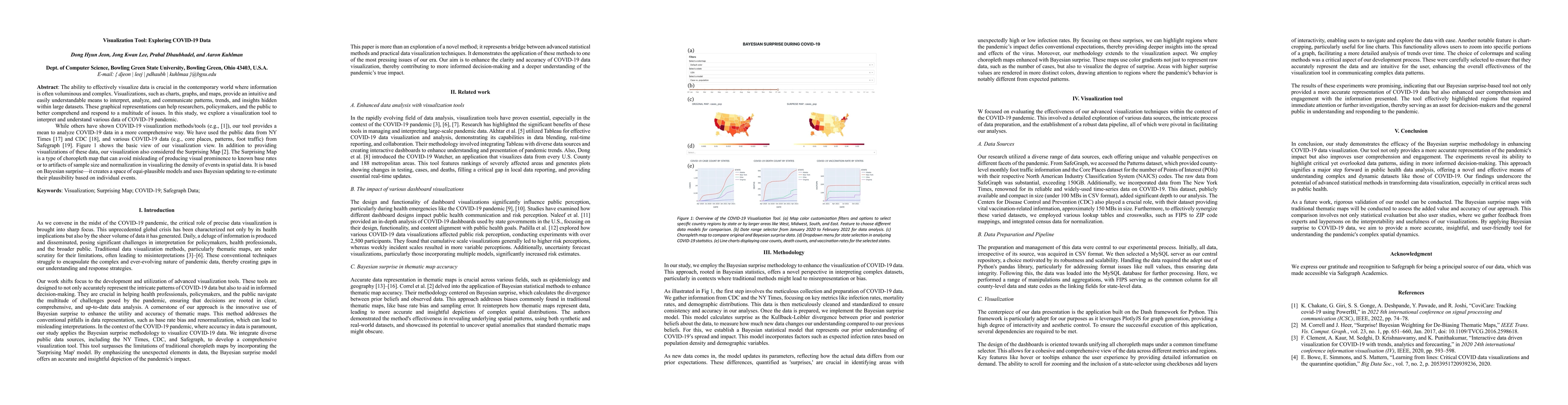
traffic) from Safegraph. Figure 1 shows the basic view of our visualization
view. In addition to providing visualizations of these data, our visualization
also considered the Surprising Map. The Surprising Map is a type of choropleth
map that can avoid misleading of producing visual prominence to known base
rates or to artifacts of sample size and normalization in visualizing the
density of events in spatial data. It is based on Bayesian surprise-it creates
a space of equi-plausible models and uses Bayesian updating to re-estimate
their plausibility based on individual events.
Discussion 0