An Evaluation of Visualization Methods for Population Statistics Based on Choropleth Maps
Publication
Metrics
AI Quick Summary
This study evaluates visualization methods for population statistics, including 3D choropleth maps and popcharts, to improve understanding of multivariate data.
Paper Preview
Abstract
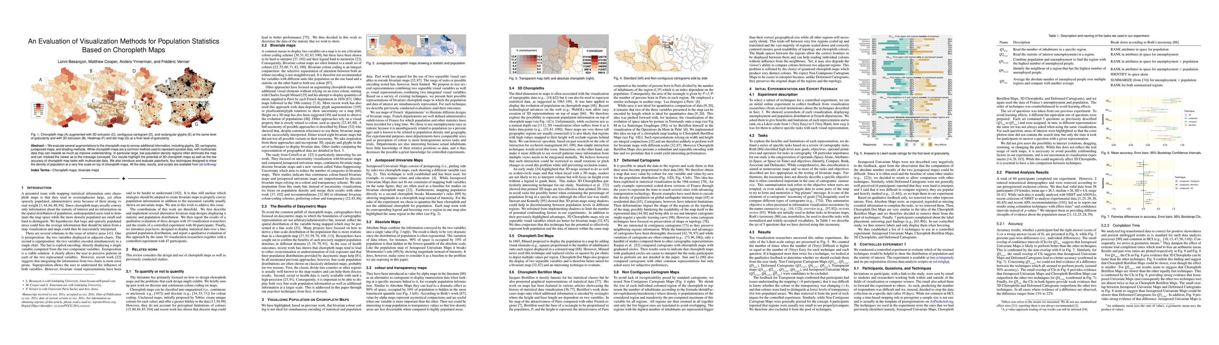
We evaluate several augmentations to the choropleth map to convey additional information, including glyphs, 3D, cartograms, juxtaposed maps, and shading methods. While choropleth maps are a common method used to represent societal data, with multivariate data they can impede as much as improve understanding. In particular large, low population density regions often dominate the map and can mislead the viewer as to the message conveyed. Our results highlight the potential of 3D choropleth maps as well as the low accuracy of choropleth map tasks with multivariate data. We also introduce and evaluate popcharts, four techniques designed to show the density of population at a very fine scale on top of choropleth maps. All the data, results, and scripts are available from https://osf.io/8rxwg/.
AI Key Findings
Get AI-generated insights about this paper's methodology, results, significance, and more — seven facets brought into focus.
Impact
Paper Details
Authors
PDF Preview
Key Terms
Citation Network
Current paper (gray), citations (green), references (blue)
Display is limited for performance on very large graphs.
Discussion 0