Visualization According to Statisticians: An Interview Study on the Role of Visualization for Inferential Statistics
Publication
Metrics
AI Quick Summary
This study explores statisticians' use of visualization in inferential statistics through interviews with 18 professionals, revealing extensive use of visual tools throughout their analytic process and a preference for visually-based mental models. The findings suggest that multi-faceted visual displays that highlight effect sizes could better balance statistical rigor with uncertainty awareness.
Paper Preview
Abstract
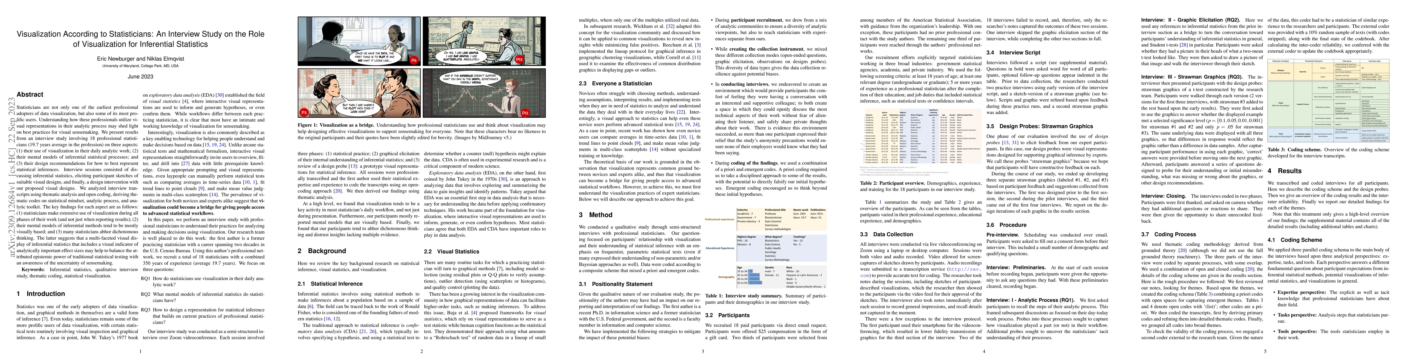
Statisticians are not only one of the earliest professional adopters of data visualization, but also some of its most prolific users. Understanding how these professionals utilize visual representations in their analytic process may shed light on best practices for visual sensemaking. We present results from an interview study involving 18 professional statisticians (19.7 years average in the profession) on three aspects: (1) their use of visualization in their daily analytic work; (2) their mental models of inferential statistical processes; and (3) their design recommendations for how to best represent statistical inferences. Interview sessions consisted of discussing inferential statistics, eliciting participant sketches of suitable visual designs, and finally, a design intervention with our proposed visual designs. We analyzed interview transcripts using thematic analysis and open coding, deriving thematic codes on statistical mindset, analytic process, and analytic toolkit. The key findings for each aspect are as follows: (1) statisticians make extensive use of visualization during all phases of their work (and not just when reporting results); (2) their mental models of inferential methods tend to be mostly visually based; and (3) many statisticians abhor dichotomous thinking. The latter suggests that a multi-faceted visual display of inferential statistics that includes a visual indicator of analytically important effect sizes may help to balance the attributed epistemic power of traditional statistical testing with an awareness of the uncertainty of sensemaking.
AI Key Findings
Get AI-generated insights about this paper's methodology, results, significance, and more — seven facets brought into focus.
Impact
Paper Details
Authors
PDF Preview
Key Terms
Citation Network
Current paper (gray), citations (green), references (blue)
Display is limited for performance on very large graphs.
Discussion 0