Comparing Overlapping Data Distributions Using Visualization
Publication
Metrics
AI Quick Summary
This study investigates how different data visualizations affect people's ability to determine if two samples come from the same population. Surprisingly, idealized normal curves, akin to the Student's t-test, yielded higher accuracy compared to more complex visualizations like histograms and boxplots.
Paper Preview
Abstract
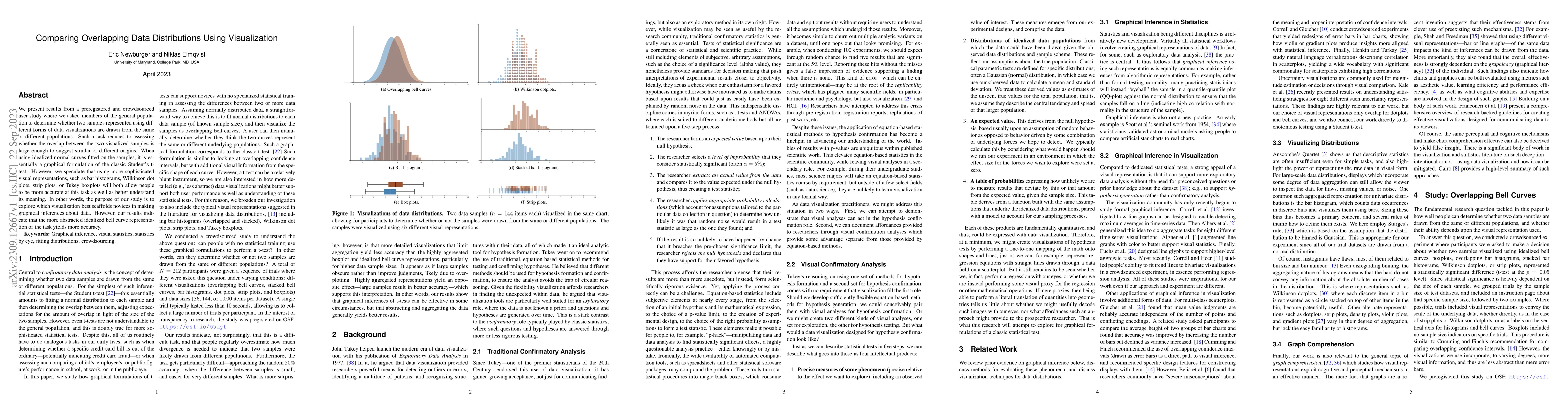
We present results from a preregistered and crowdsourced user study where we asked members of the general population to determine whether two samples represented using different forms of data visualizations are drawn from the same or different populations. Such a task reduces to assessing whether the overlap between the two visualized samples is large enough to suggest similar or different origins. When using idealized normal curves fitted on the samples, it is essentially a graphical formulation of the classic Student's t-test. However, we speculate that using more sophisticated visual representations, such as bar histograms, Wilkinson dot plots, strip plots, or Tukey boxplots will both allow people to be more accurate at this task as well as better understand its meaning. In other words, the purpose of our study is to explore which visualization best scaffolds novices in making graphical inferences about data. However, our results indicate that the more abstracted idealized bell curve representation of the task yields more accuracy.
AI Key Findings
Get AI-generated insights about this paper's methodology, results, significance, and more — seven facets brought into focus.
Impact
Paper Details
Authors
PDF Preview
Key Terms
Citation Network
Current paper (gray), citations (green), references (blue)
Display is limited for performance on very large graphs.
Discussion 0