Revisited Experimental Comparison of Node-Link and Matrix Representations
Publication
Metrics
AI Quick Summary
A study comparing node-link diagrams and adjacency matrices for visualizing network data found statistically significant differences between the two visualizations. The research used a large dataset and crowdsourcing to evaluate multiple tasks, adding new insights into visualization techniques.
Paper Preview
Abstract
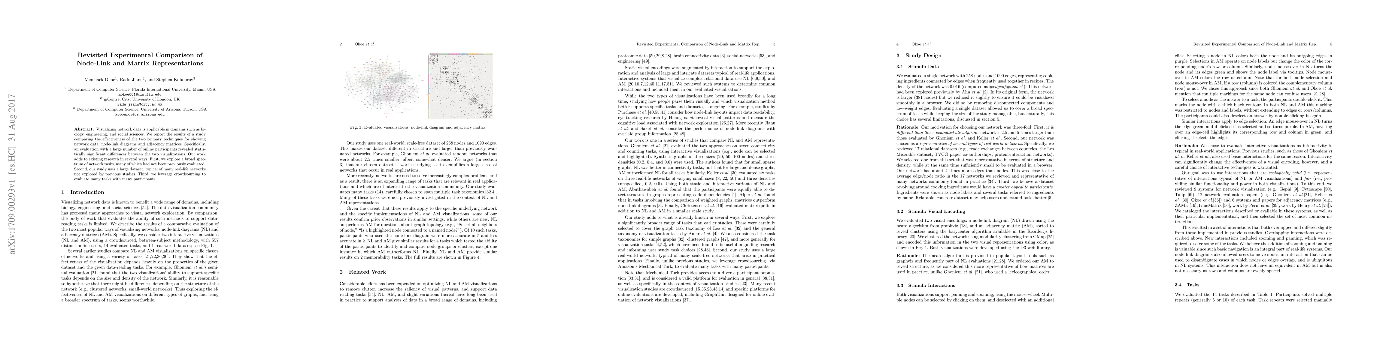
Visualizing network data is applicable in domains such as biology, engineering, and social sciences. We report the results of a study comparing the effectiveness of the two primary techniques for showing network data: node-link diagrams and adjacency matrices. Specifically, an evaluation with a large number of online participants revealed statistically significant differences between the two visualizations. Our work adds to existing research in several ways. First, we explore a broad spectrum of network tasks, many of which had not been previously evaluated. Second, our study uses a large dataset, typical of many real-life networks not explored by previous studies. Third, we leverage crowdsourcing to evaluate many tasks with many participants.
AI Key Findings
Get AI-generated insights about this paper's methodology, results, significance, and more — seven facets brought into focus.
Impact
Paper Details
PDF Preview
Key Terms
Citation Network
Current paper (gray), citations (green), references (blue)
Display is limited for performance on very large graphs.
Discussion 0