Academic Profile
Statistics
Similar Authors
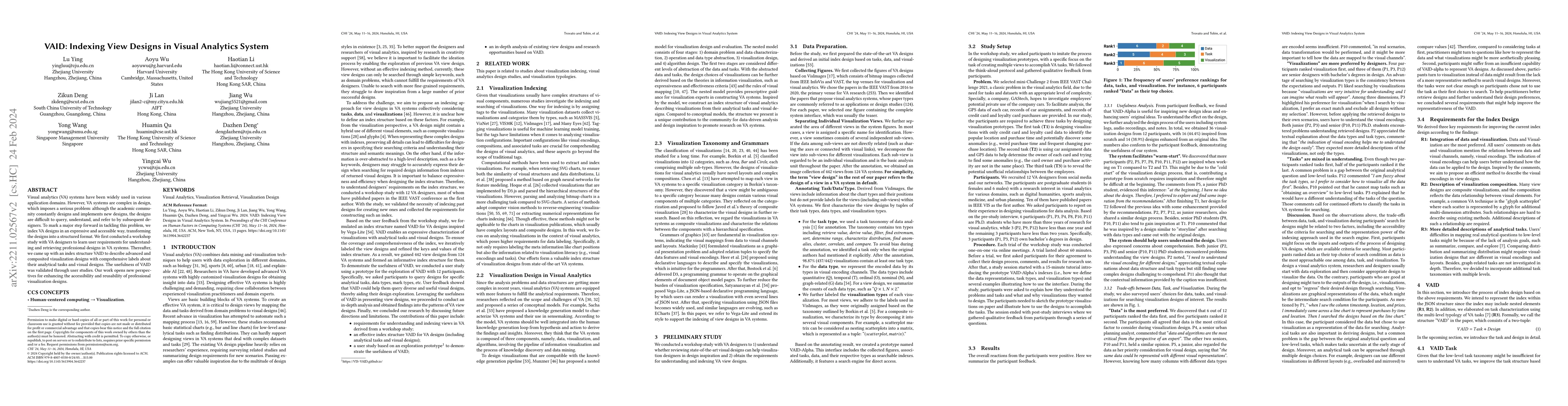
Papers on arXiv
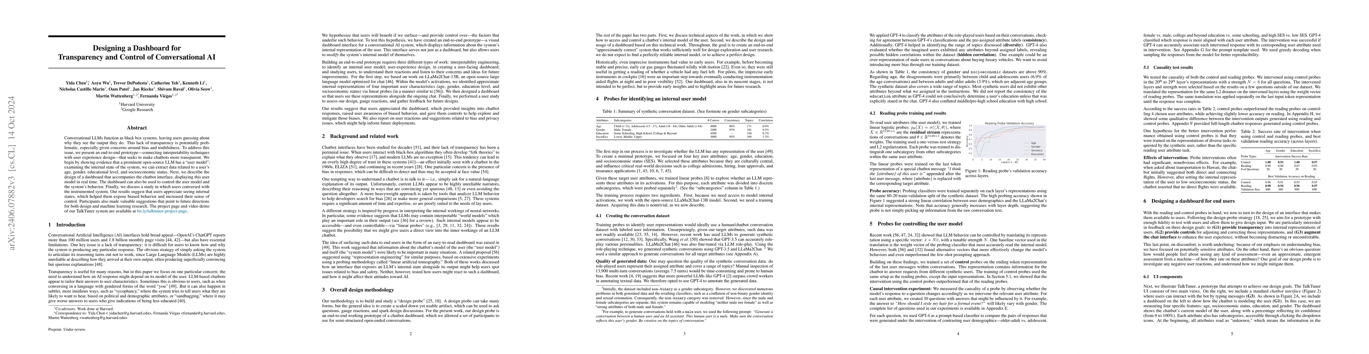
Conversational LLMs function as black box systems, leaving users guessing about why they see the output they do. This lack of transparency is potentially problematic, especially given concerns aroun...
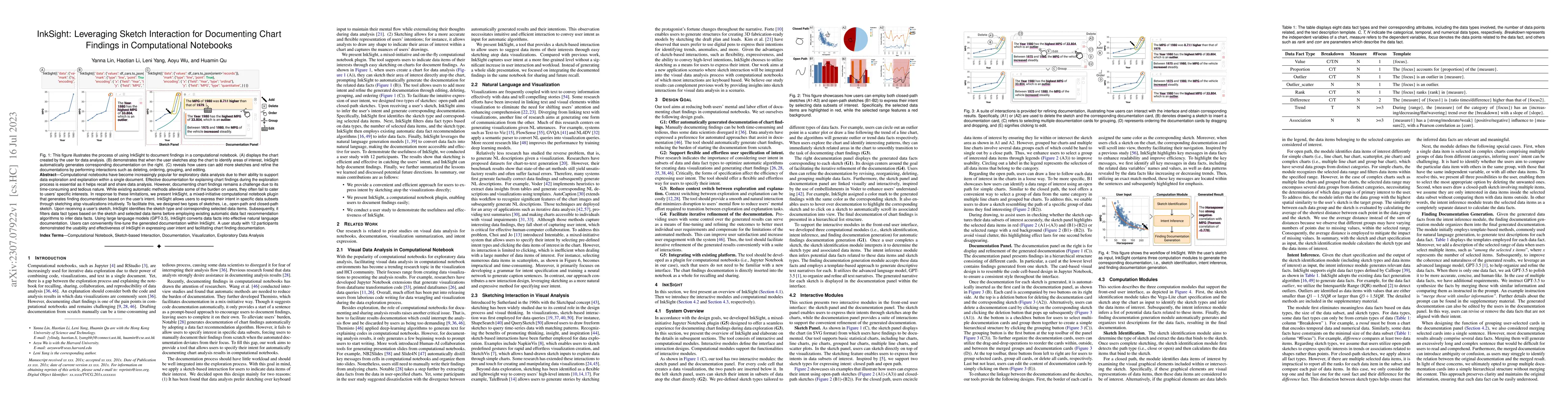
Computational notebooks have become increasingly popular for exploratory data analysis due to their ability to support data exploration and explanation within a single document. Effective documentat...
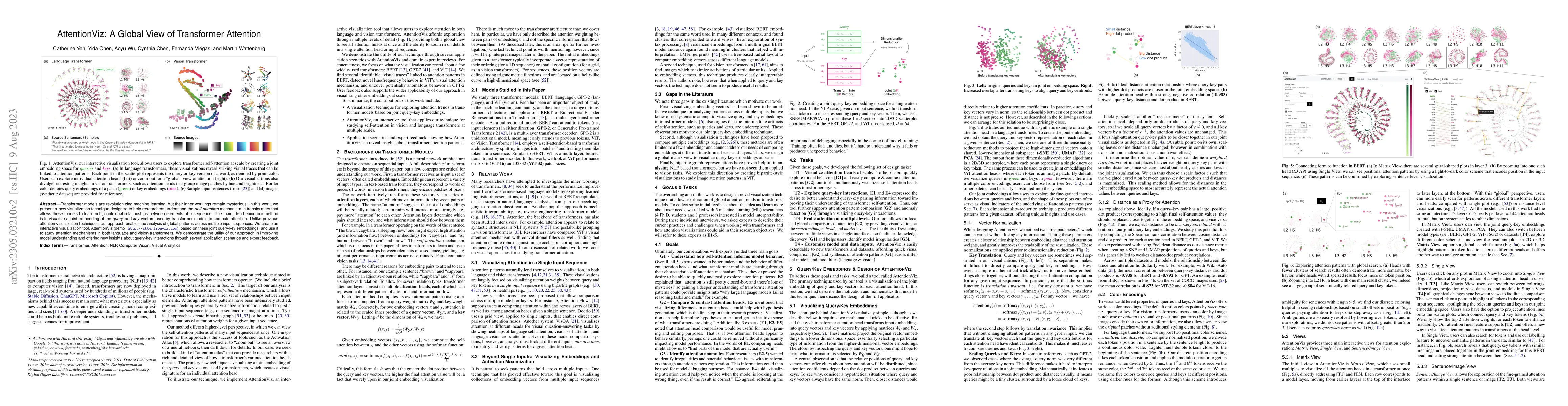
Transformer models are revolutionizing machine learning, but their inner workings remain mysterious. In this work, we present a new visualization technique designed to help researchers understand th...
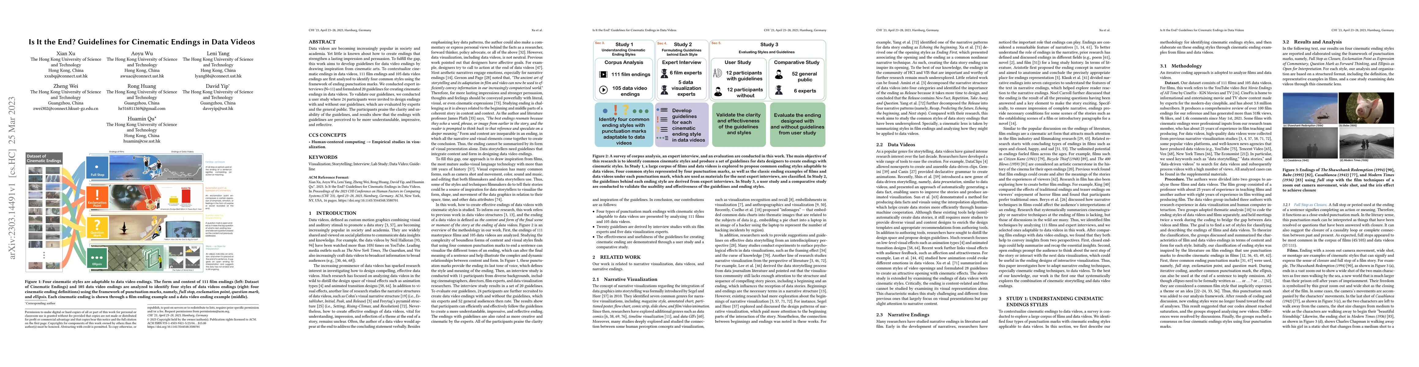
Data videos are becoming increasingly popular in society and academia. Yet little is known about how to create endings that strengthen a lasting impression and persuasion. To fulfill the gap, this w...
Visual analytics (VA) systems have been widely used in various application domains. However, VA systems are complex in design, which imposes a serious problem: although the academic community consta...
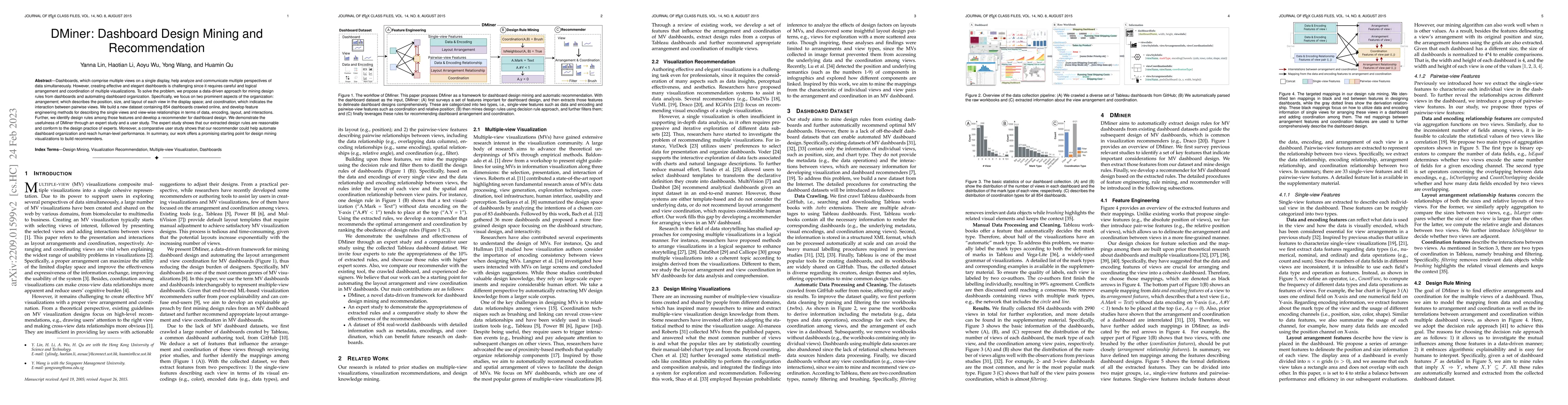
Dashboards, which comprise multiple views on a single display, help analyze and communicate multiple perspectives of data simultaneously. However, creating effective and elegant dashboards is challe...
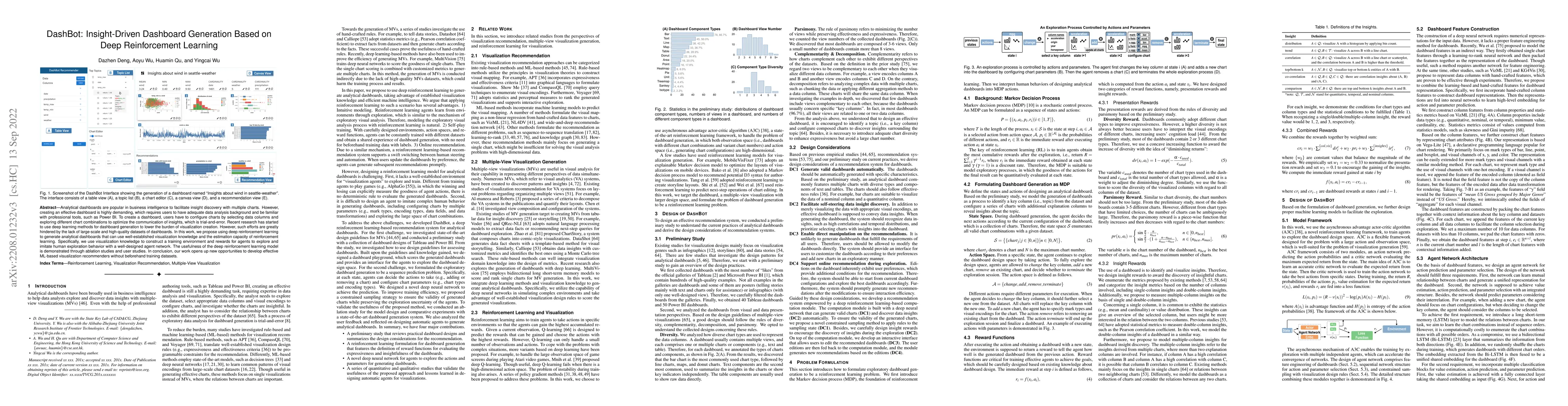
Analytical dashboards are popular in business intelligence to facilitate insight discovery with multiple charts. However, creating an effective dashboard is highly demanding, which requires users to...
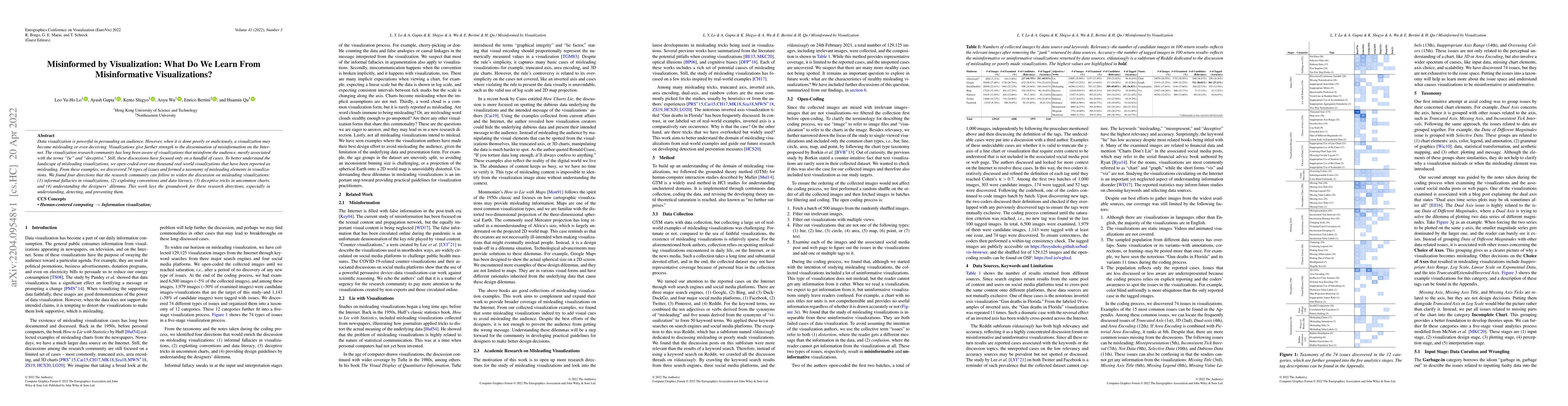
Data visualization is powerful in persuading an audience. However, when it is done poorly or maliciously, a visualization may become misleading or even deceiving. Visualizations give further strengt...
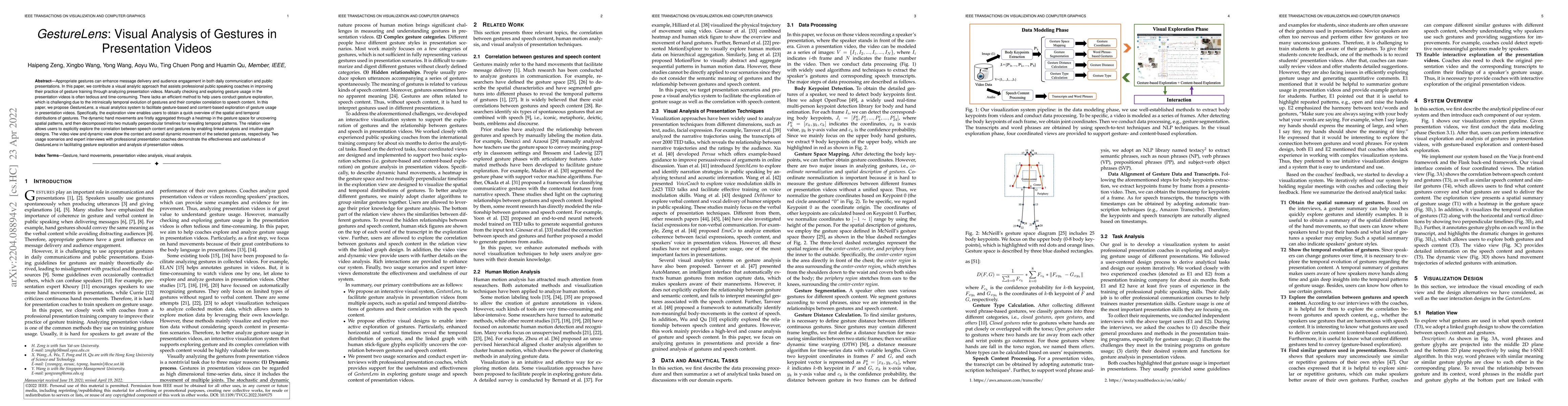
Appropriate gestures can enhance message delivery and audience engagement in both daily communication and public presentations. In this paper, we contribute a visual analytic approach that assists p...
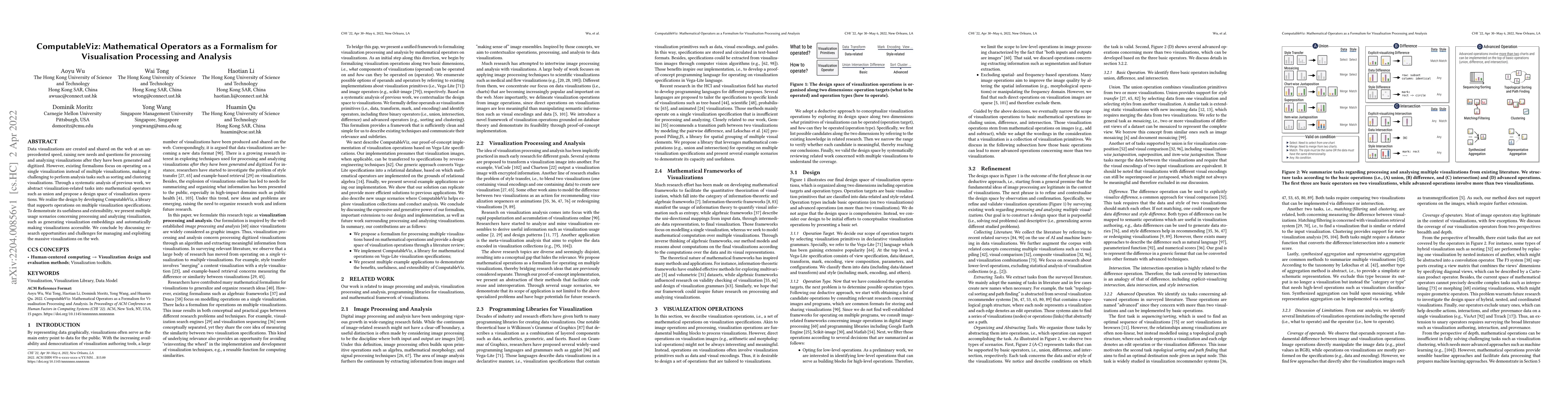
Data visualizations are created and shared on the web at an unprecedented speed, raising new needs and questions for processing and analyzing visualizations after they have been generated and digiti...
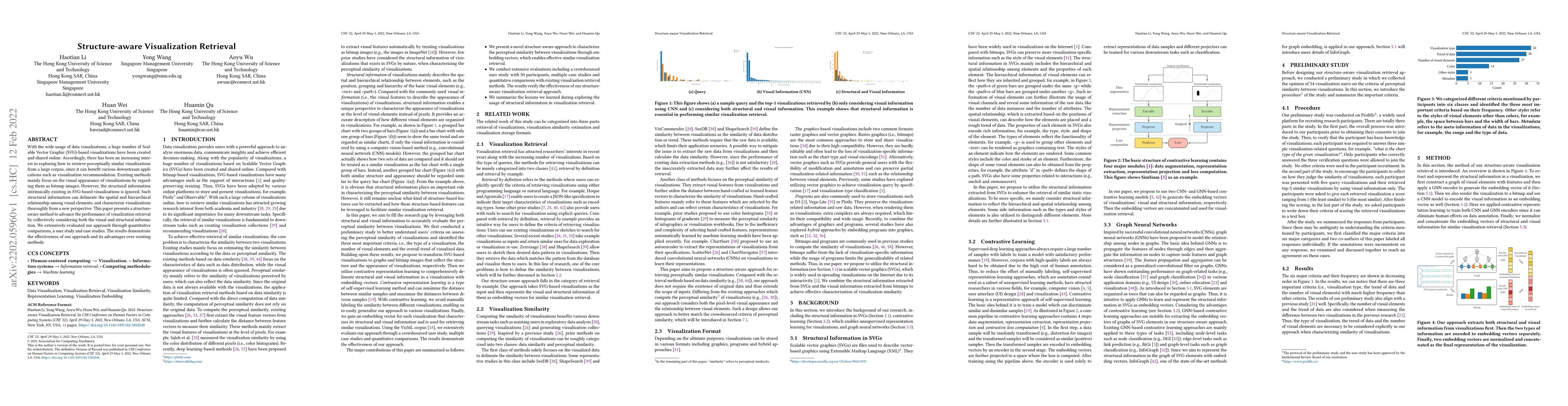
With the wide usage of data visualizations, a huge number of Scalable Vector Graphic (SVG)-based visualizations have been created and shared online. Accordingly, there has been an increasing interes...
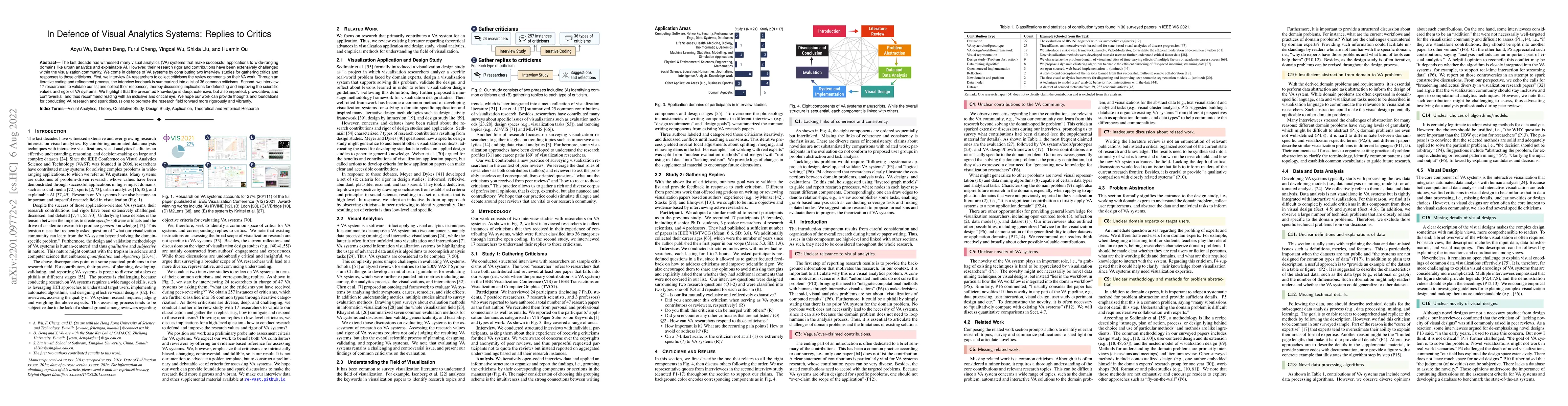
The last decade has witnessed many visual analytics (VA) systems that make successful applications to wide-ranging domains like urban analytics and explainable AI. However, their research rigor and ...
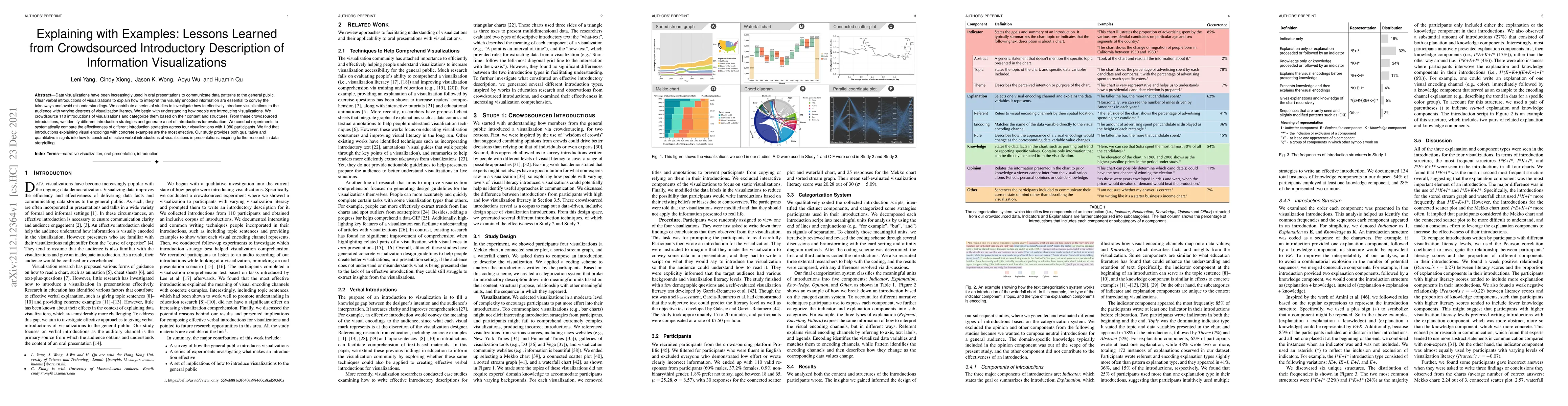
Data visualizations have been increasingly used in oral presentations to communicate data patterns to the general public. Clear verbal introductions of visualizations to explain how to interpret the...
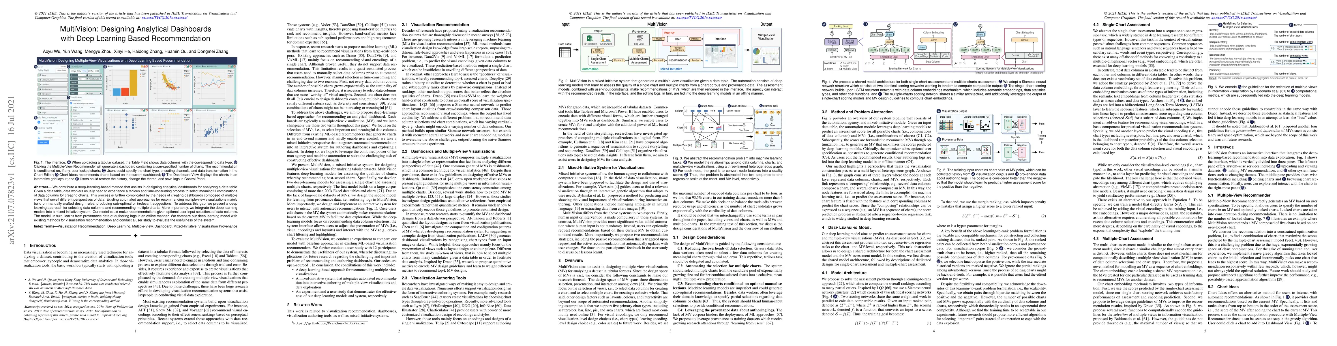
We contribute a deep-learning-based method that assists in designing analytical dashboards for analyzing a data table. Given a data table, data workers usually need to experience a tedious and time-...
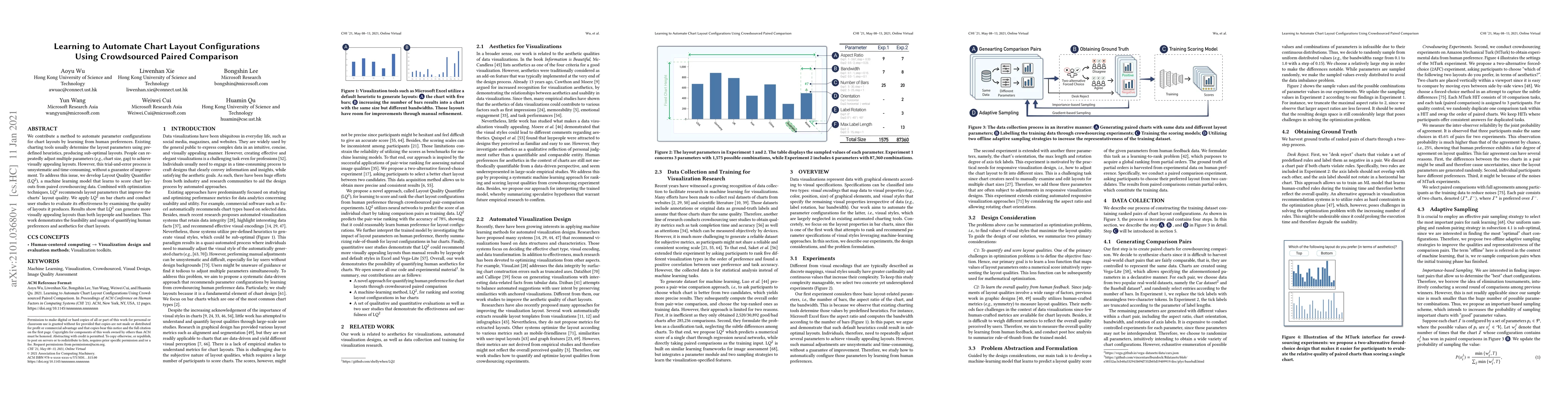
We contribute a method to automate parameter configurations for chart layouts by learning from human preferences. Existing charting tools usually determine the layout parameters using predefined heu...
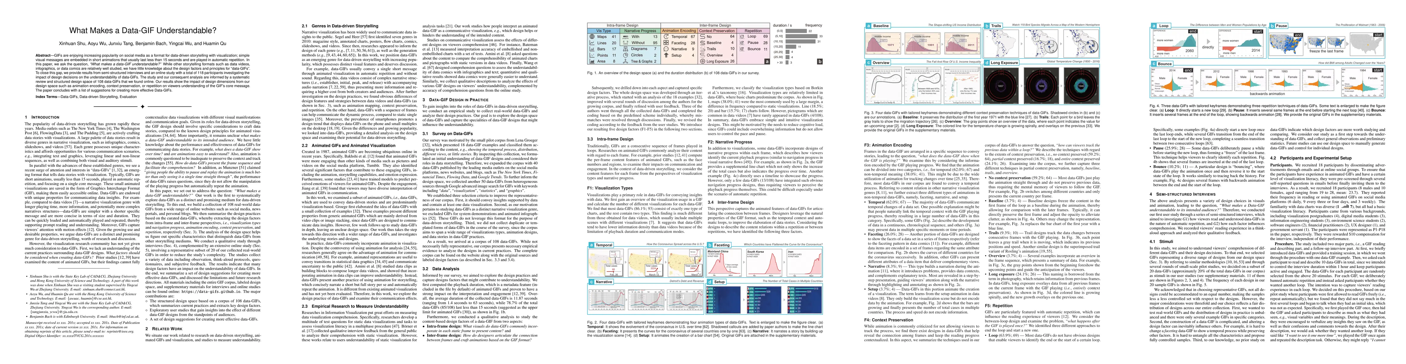
GIFs are enjoying increasing popularity on social media as a format for data-driven storytelling with visualization; simple visual messages are embedded in short animations that usually last less th...
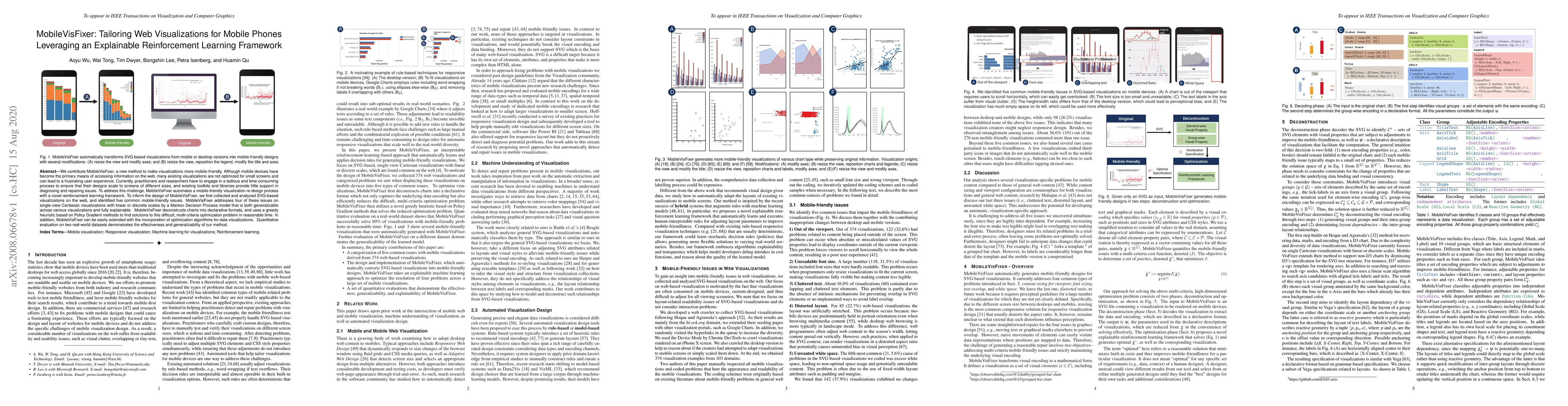
We contribute MobileVisFixer, a new method to make visualizations more mobile-friendly. Although mobile devices have become the primary means of accessing information on the web, many existing visua...
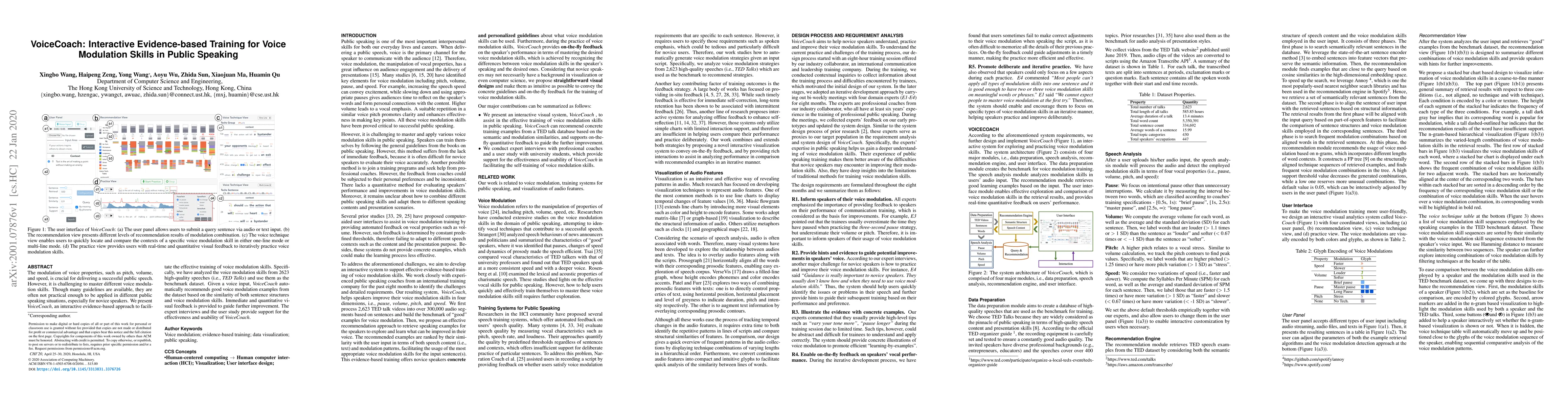
The modulation of voice properties, such as pitch, volume, and speed, is crucial for delivering a successful public speech. However, it is challenging to master different voice modulation skills. Th...
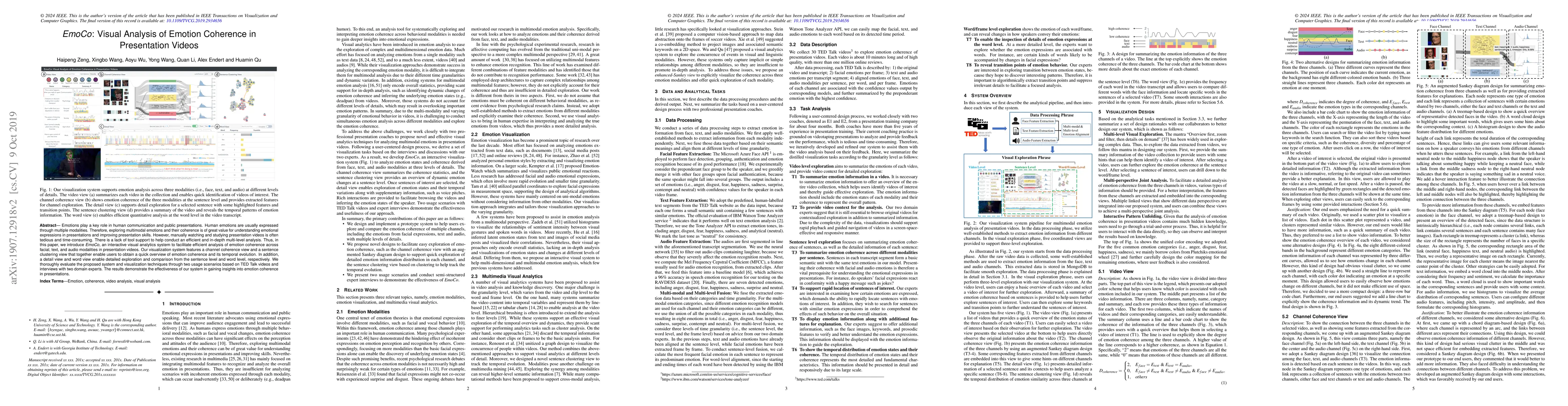
Emotions play a key role in human communication and public presentations. Human emotions are usually expressed through multiple modalities. Therefore, exploring multimodal emotions and their coheren...