Academic Profile
Statistics
Similar Authors
Papers on arXiv
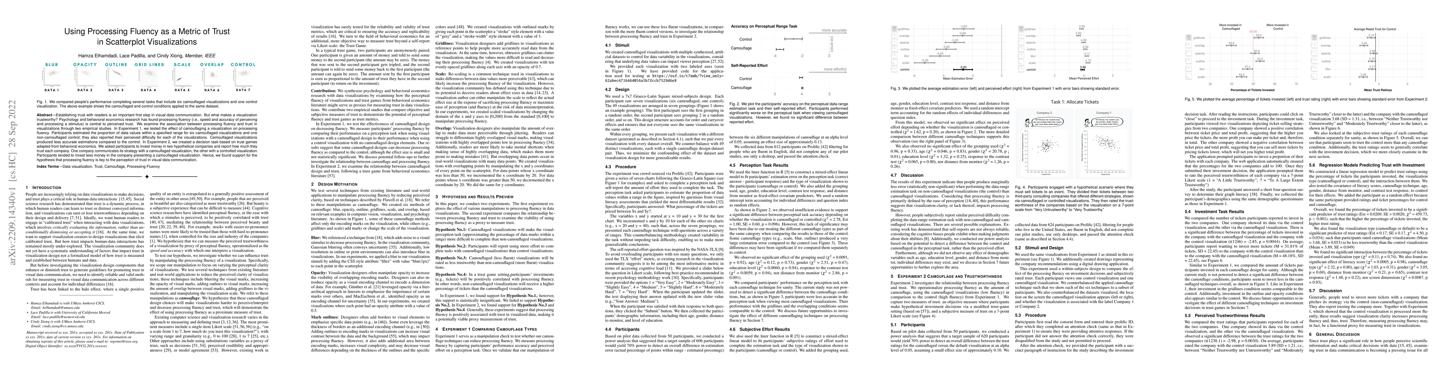
Establishing trust with readers is an important first step in visual data communication. But what makes a visualization trustworthy? Psychology and behavioral economics research has found processing...
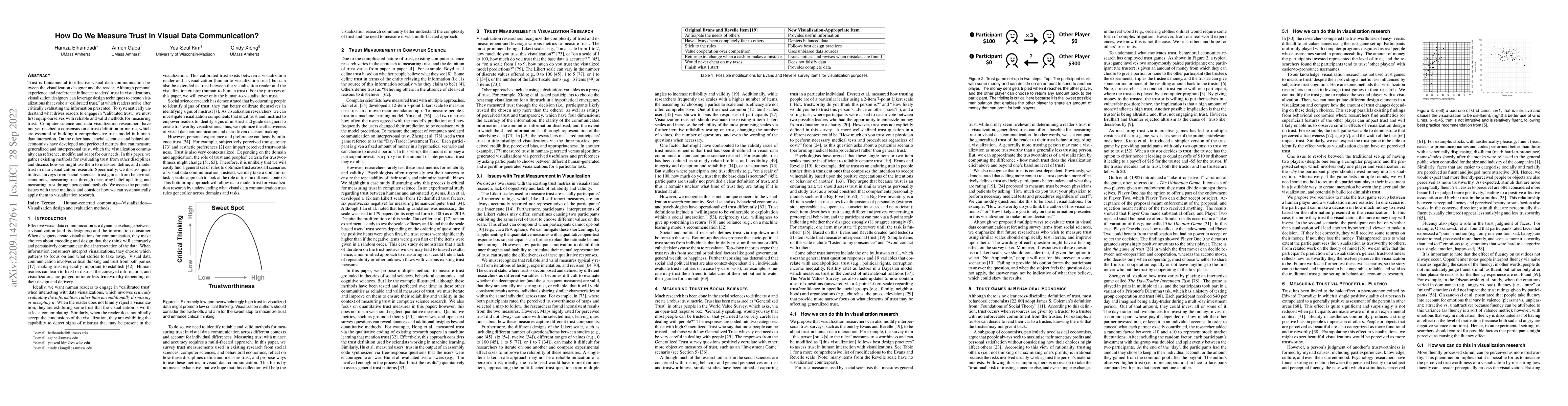
Trust is fundamental to effective visual data communication between the visualization designer and the reader. Although personal experience and preference influence readers' trust in visualizations,...
Visualization research often focuses on perceptual accuracy or helping readers interpret key messages. However, we know very little about how chart designs might influence readers' perceptions of th...
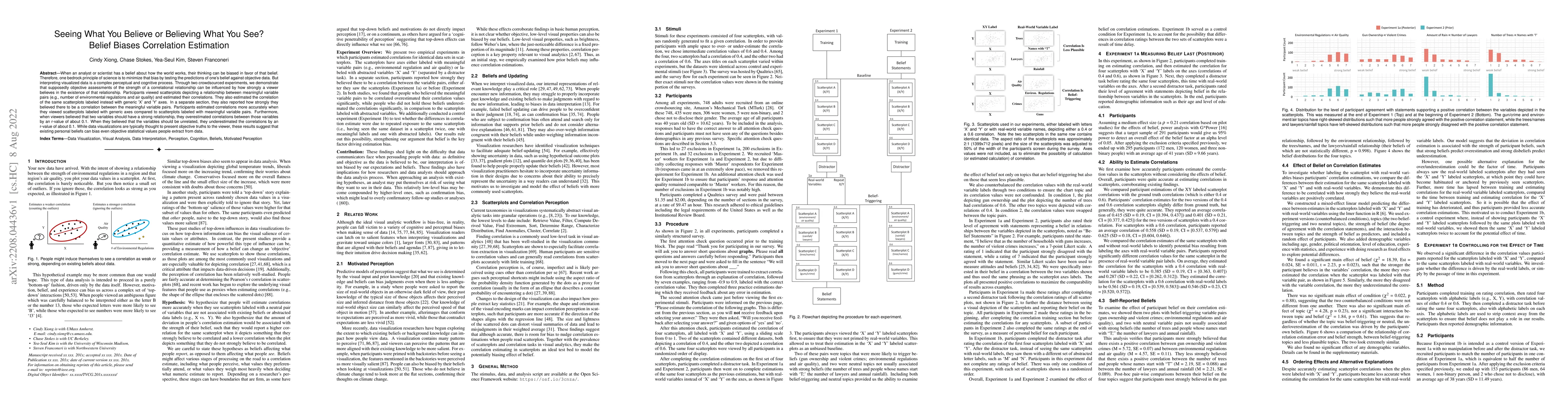
When an analyst or scientist has a belief about how the world works, their thinking can be biased in favor of that belief. Therefore, one bedrock principle of science is to minimize that bias by tes...
Scientific knowledge develops through cumulative discoveries that build on, contradict, contextualize, or correct prior findings. Scientists and journalists often communicate these incremental findi...
The language for expressing comparisons is often complex and nuanced, making supporting natural language-based visual comparison a non-trivial task. To better understand how people reason about comp...
Data visualizations have been increasingly used in oral presentations to communicate data patterns to the general public. Clear verbal introductions of visualizations to explain how to interpret the...
Accompanying a data visualization with metadata may benefit readers by facilitating content understanding, strengthening trust, and providing accountability. However, providing this kind of informat...
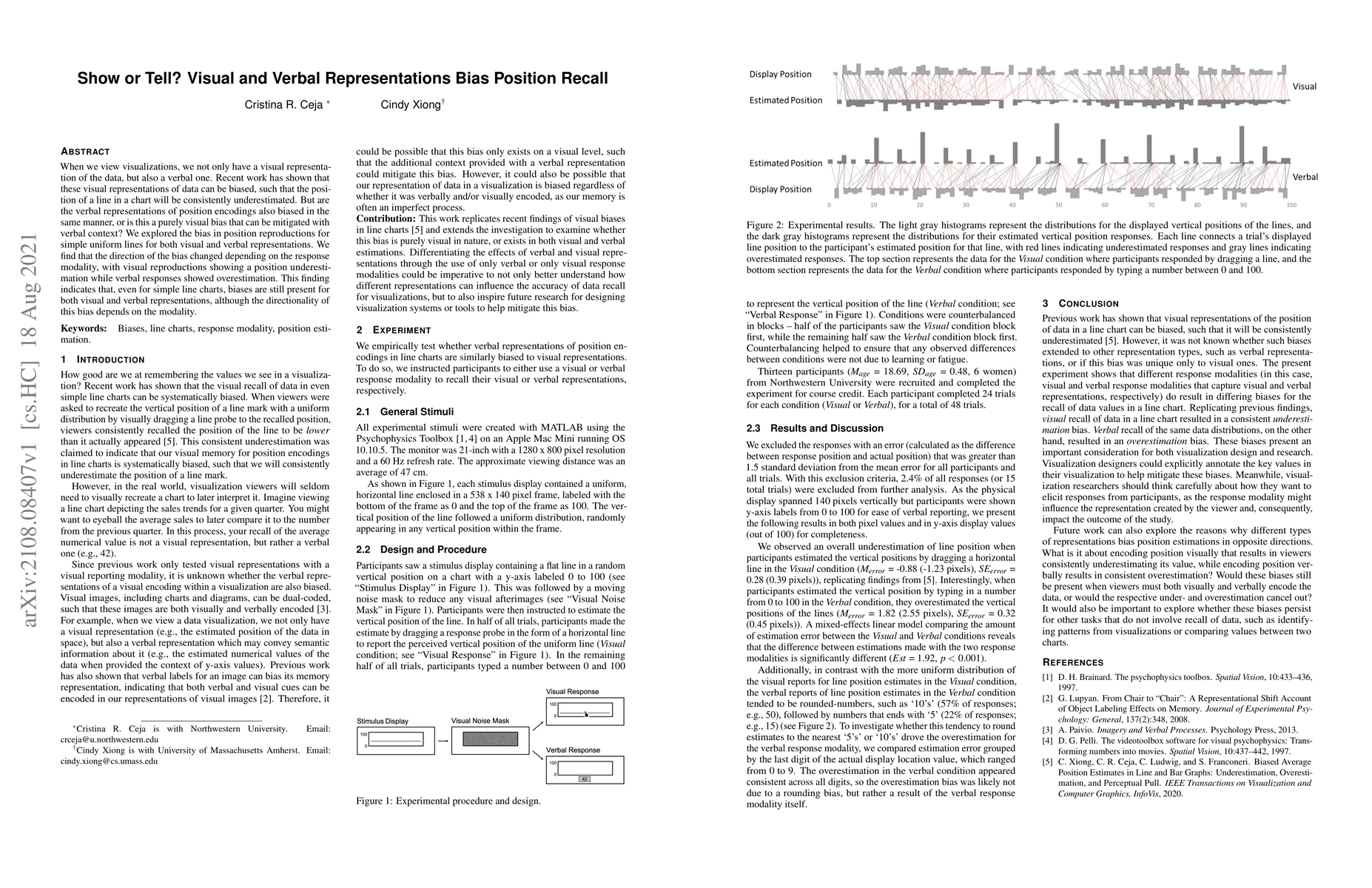
When we view visualizations, we not only have a visual representation of the data, but also a verbal one. Recent work has shown that these visual representations of data can be biased, such that the...
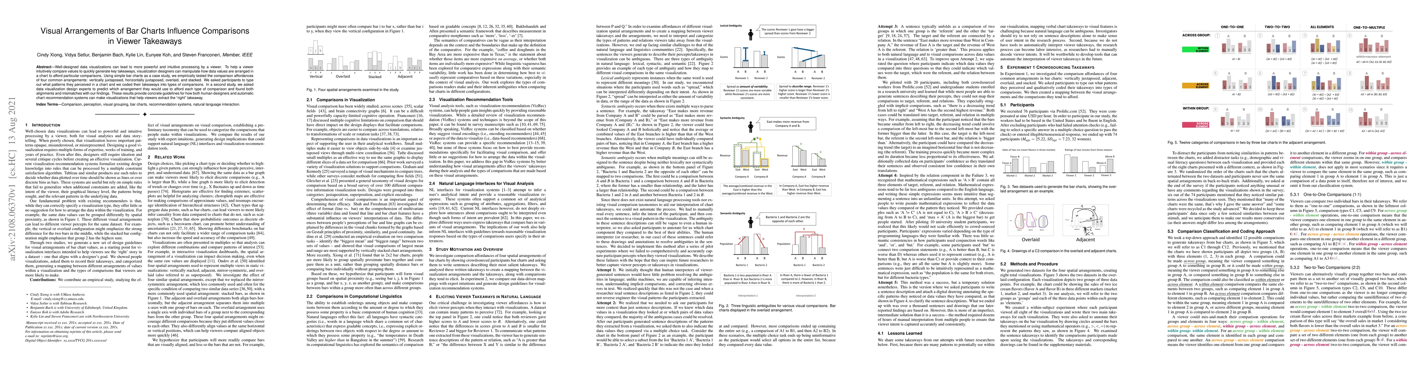
Well-designed data visualizations can lead to more powerful and intuitive processing by a viewer. To help a viewer intuitively compare values to quickly generate key takeaways, visualization designe...
A growing number of efforts aim to understand what people see when using a visualization. These efforts provide scientific grounding to complement design intuitions, leading to more effective visual...
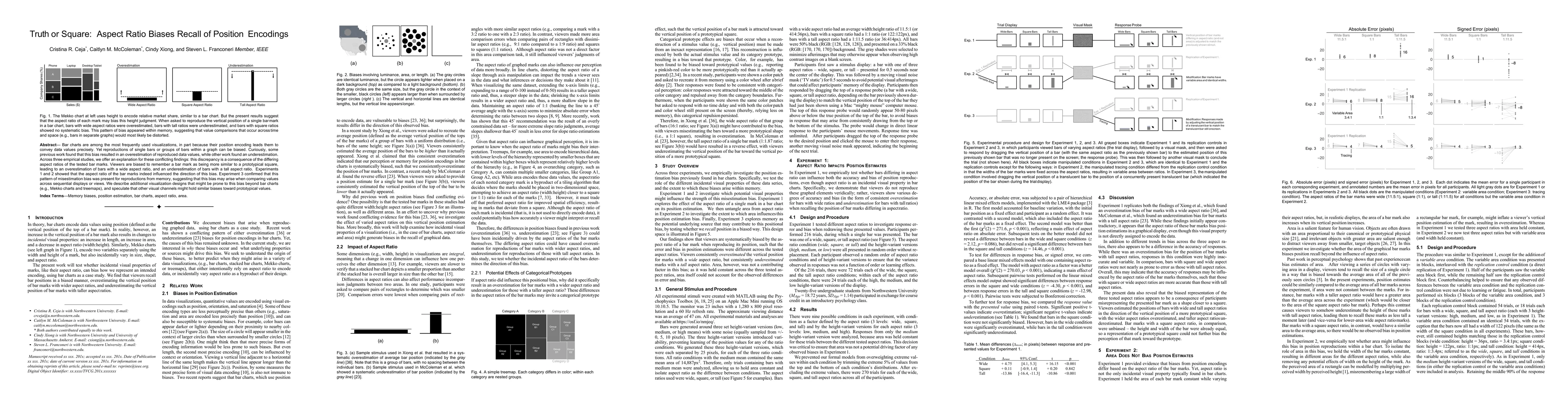
Bar charts are among the most frequently used visualizations, in part because their position encoding leads them to convey data values precisely. Yet reproductions of single bars or groups of bars w...
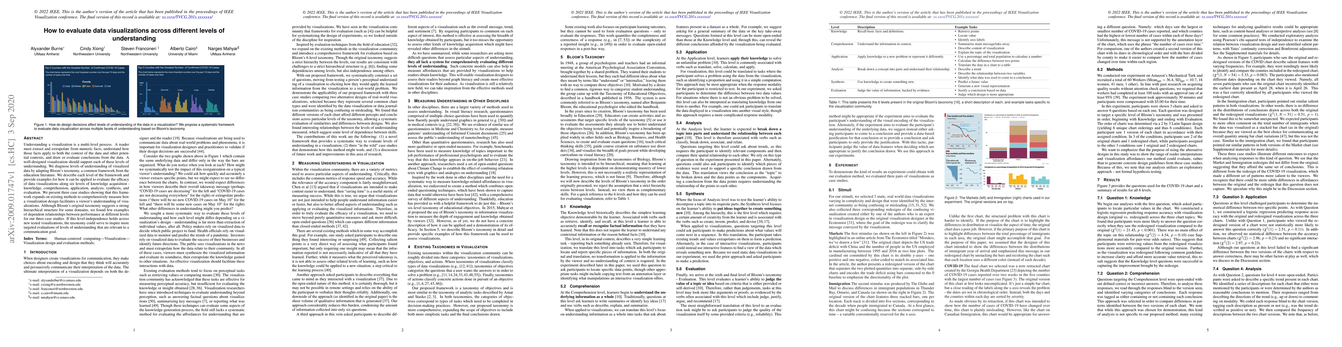
Understanding a visualization is a multi-level process. A reader must extract and extrapolate from numeric facts, understand how those facts apply to both the context of the data and other potential...
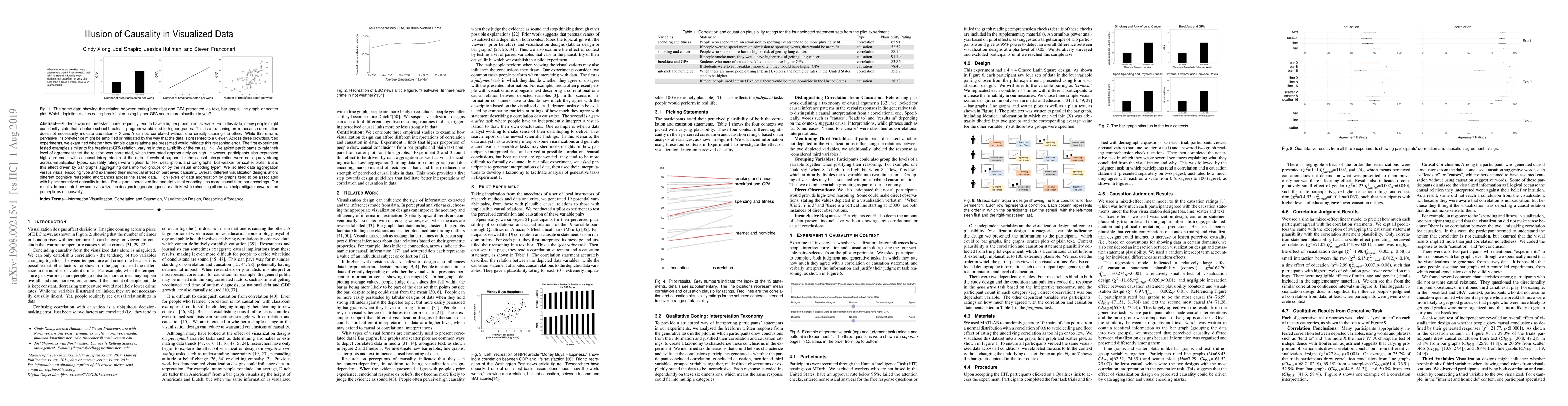
Students who eat breakfast more frequently tend to have a higher grade point average. From this data, many people might confidently state that a before-school breakfast program would lead to higher ...
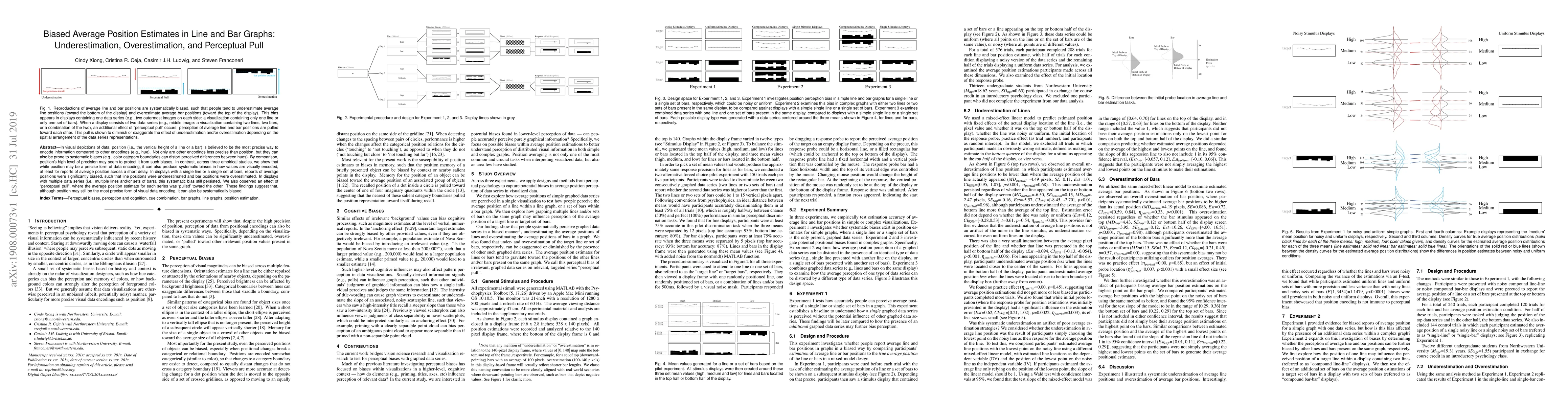
In visual depictions of data, position (i.e., the vertical height of a line or a bar) is believed to be the most precise way to encode information compared to other encodings (e.g., hue). Not only a...

Understanding data visualizations is essential for informed decision-making, yet interpretation is often shaped and even distorted by prior beliefs. We investigate whether an embodied pedagogical appr...