Academic Profile
Statistics
Similar Authors
Papers on arXiv
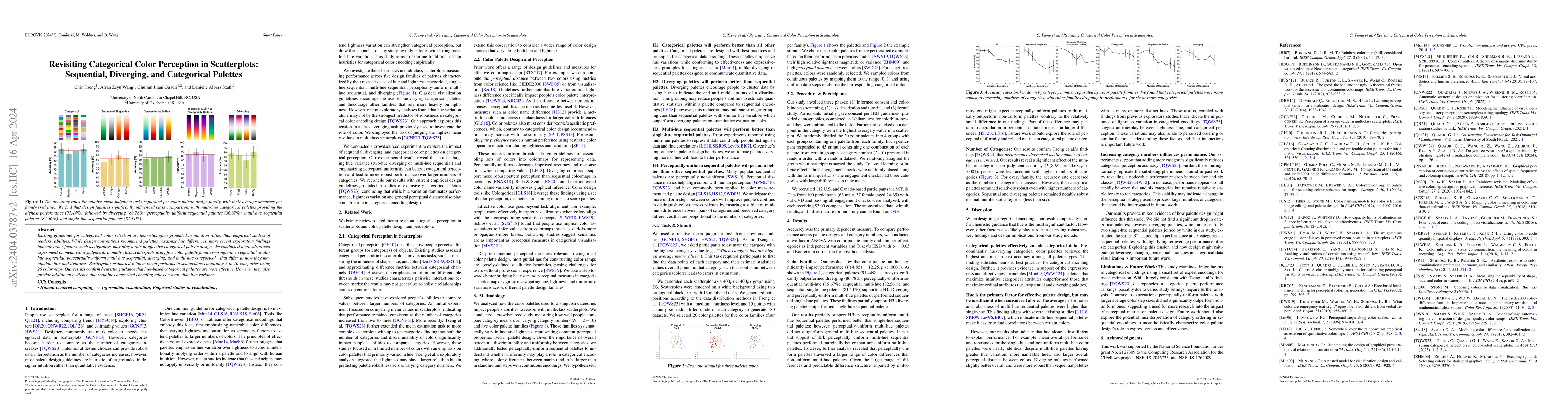
Existing guidelines for categorical color selection are heuristic, often grounded in intuition rather than empirical studies of readers' abilities. While design conventions recommend palettes maximi...
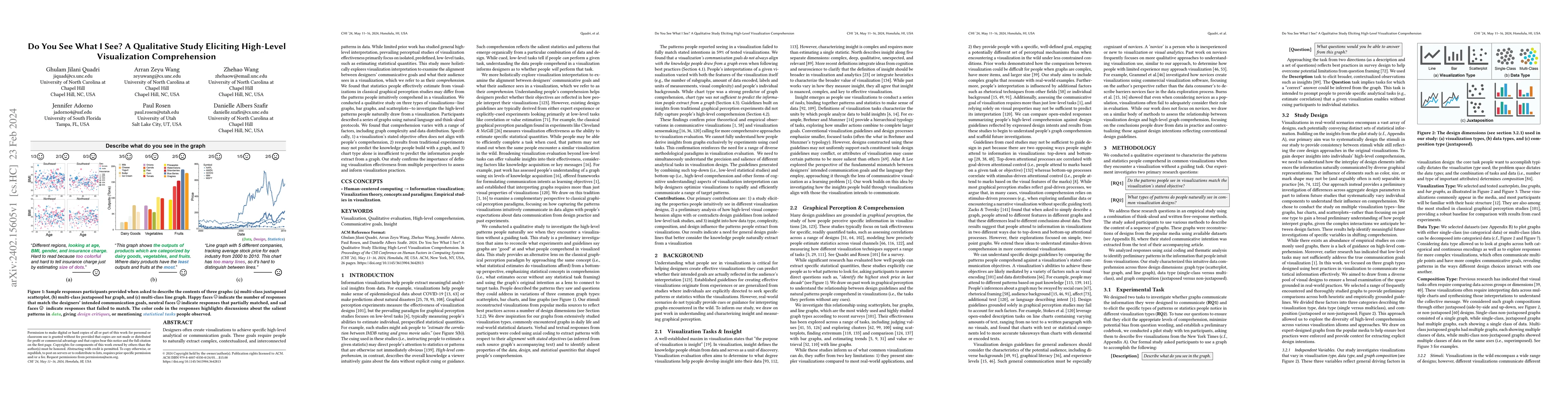
Designers often create visualizations to achieve specific high-level analytical or communication goals. These goals require people to naturally extract complex, contextualized, and interconnected pa...
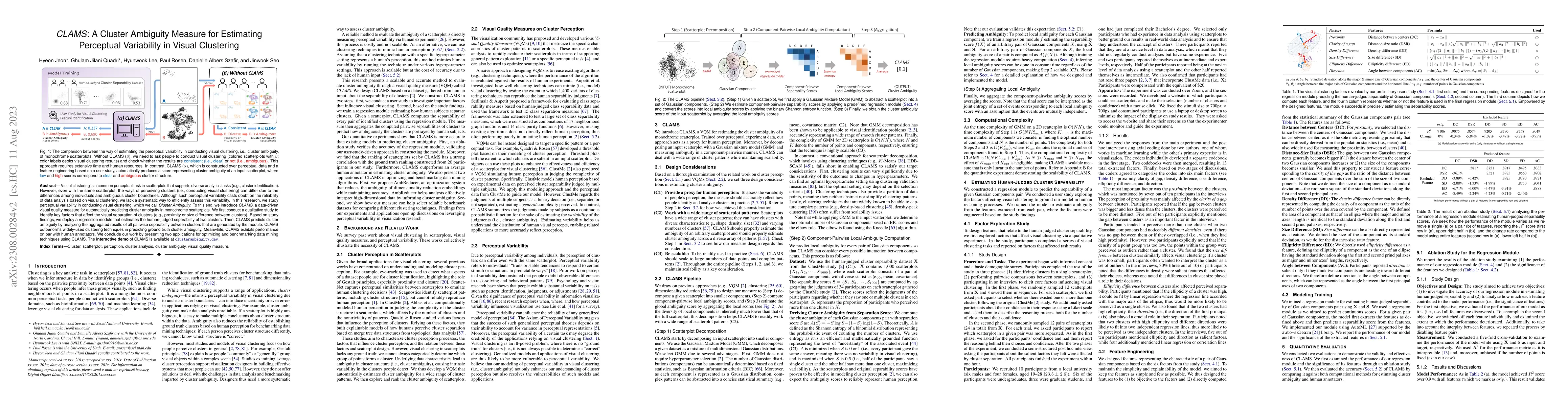
Visual clustering is a common perceptual task in scatterplots that supports diverse analytics tasks (e.g., cluster identification). However, even with the same scatterplot, the ways of perceiving cl...
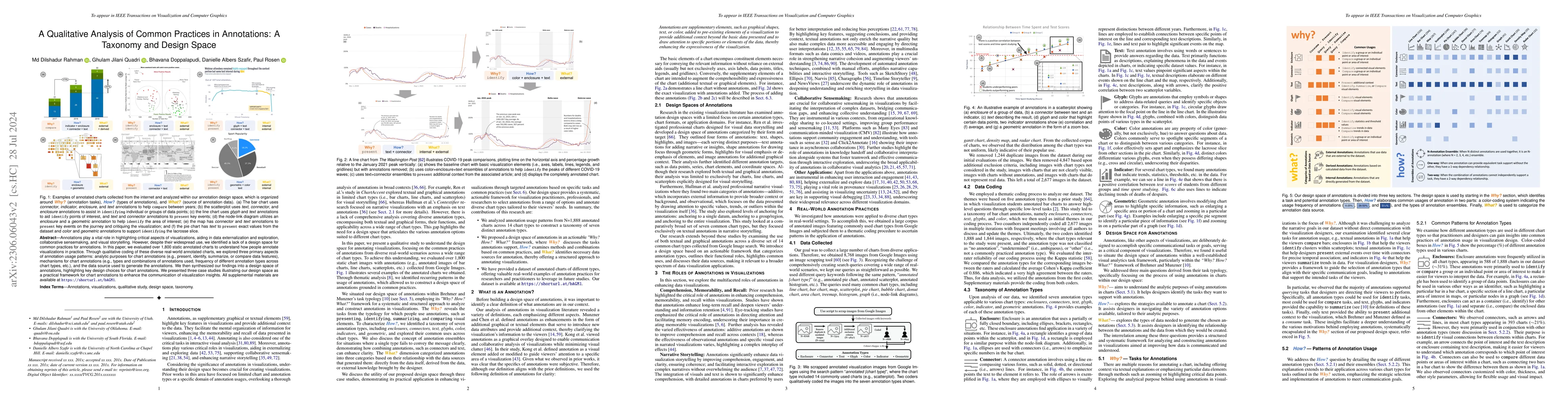
Annotations are a vital component of data externalization and collaborative analysis, directing readers' attention to important visual elements. Therefore, it is crucial to understand their design s...
Scatterplots commonly use color to encode categorical data. However, as datasets increase in size and complexity, the efficacy of these channels may vary. Designers lack insight into how robust diff...
Scatterplots are among the most widely used visualization techniques. Compelling scatterplot visualizations improve understanding of data by leveraging visual perception to boost awareness when perf...
Every year we grow more dependent on wearable devices to gather personalized data, such as our movements, heart rate, respiration, etc. To capture this data, devices contain sensors, such as acceler...
Knowledge of human perception has long been incorporated into visualizations to enhance their quality and effectiveness. The last decade, in particular, has shown an increase in perception-based vis...
Reproducibility has been increasingly encouraged by communities of science in order to validate experimental conclusions, and replication studies represent a significant opportunity to vision scient...
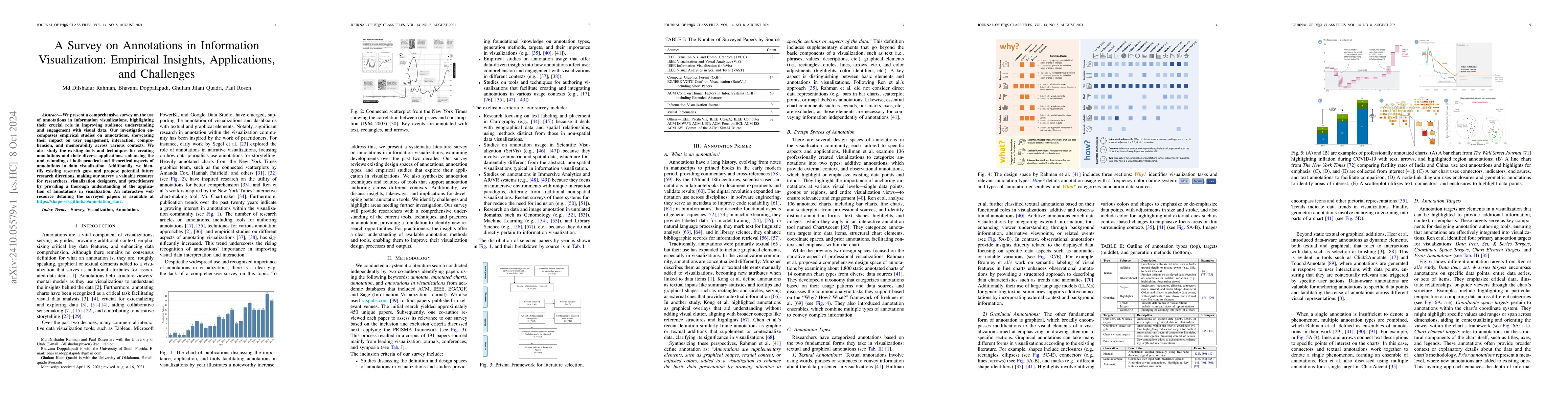
We present a comprehensive survey on the use of annotations in information visualizations, highlighting their crucial role in improving audience understanding and engagement with visual data. Our inve...
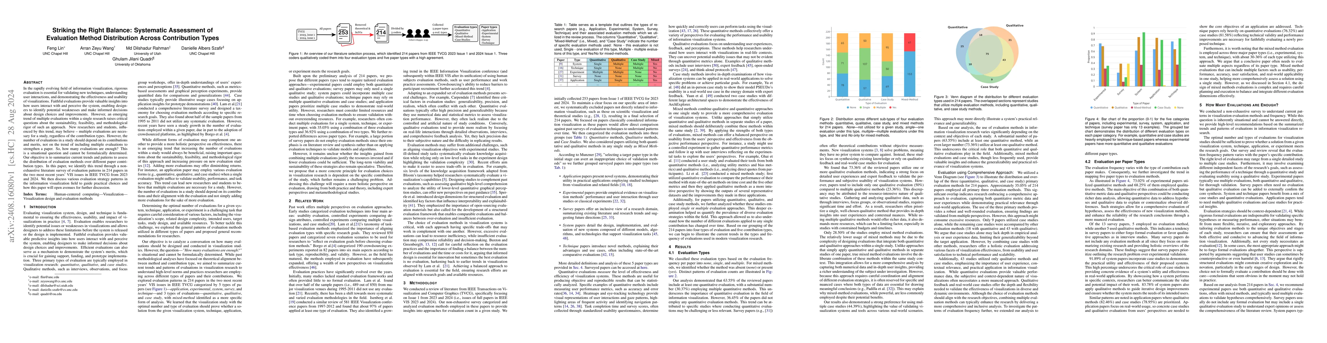
In the rapidly evolving field of information visualization, rigorous evaluation is essential for validating new techniques, understanding user interactions, and demonstrating the effectiveness and usa...
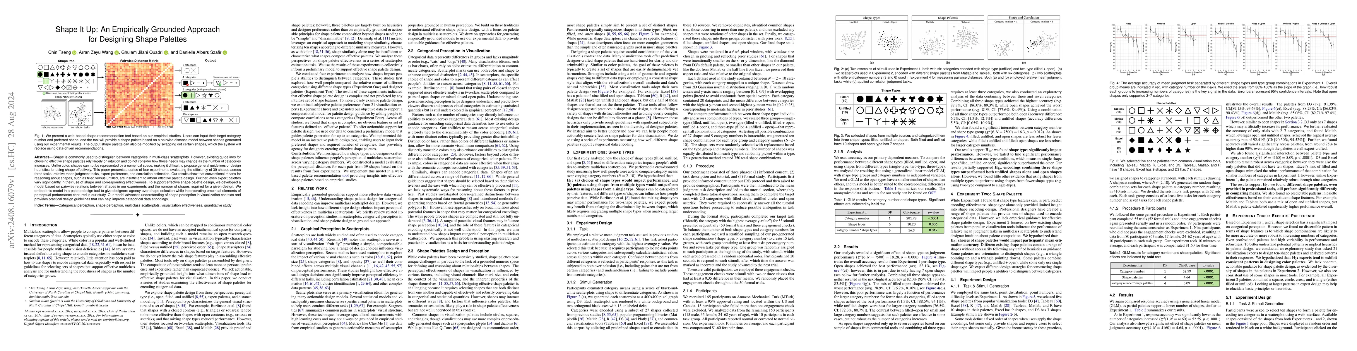
Shape is commonly used to distinguish between categories in multi-class scatterplots. However, existing guidelines for choosing effective shape palettes rely largely on intuition and do not consider h...
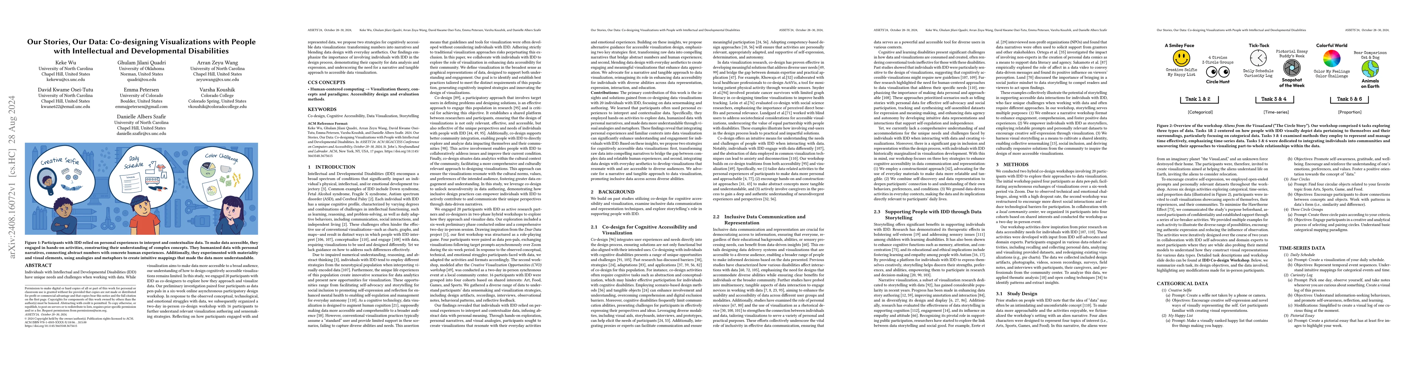
Individuals with Intellectual and Developmental Disabilities (IDD) have unique needs and challenges when working with data. While visualization aims to make data more accessible to a broad audience, o...
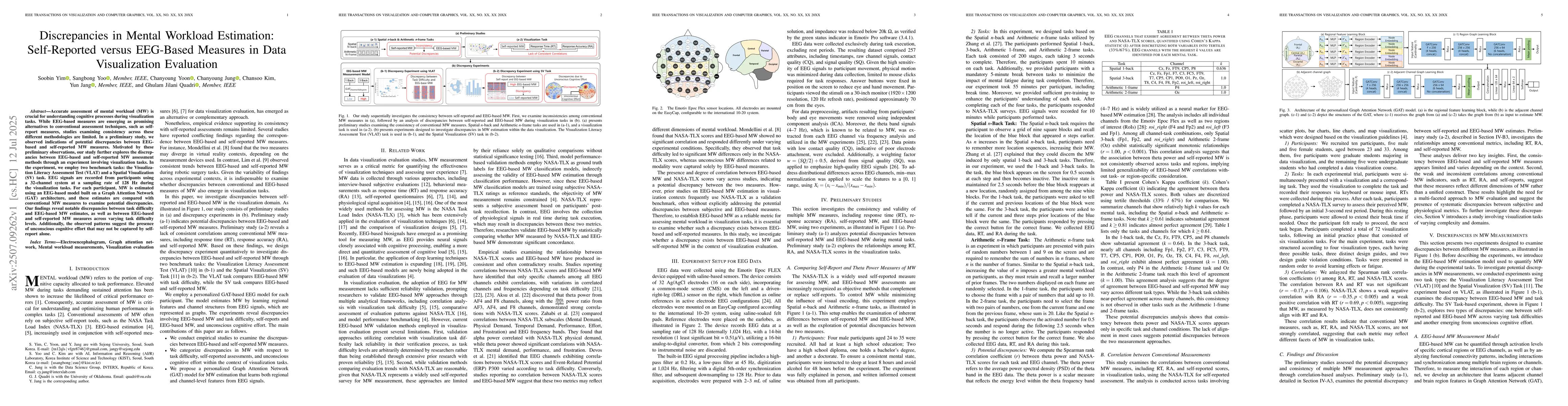
Accurate assessment of mental workload (MW) is crucial for understanding cognitive processes during visualization tasks. While EEG-based measures are emerging as promising alternatives to conventional...
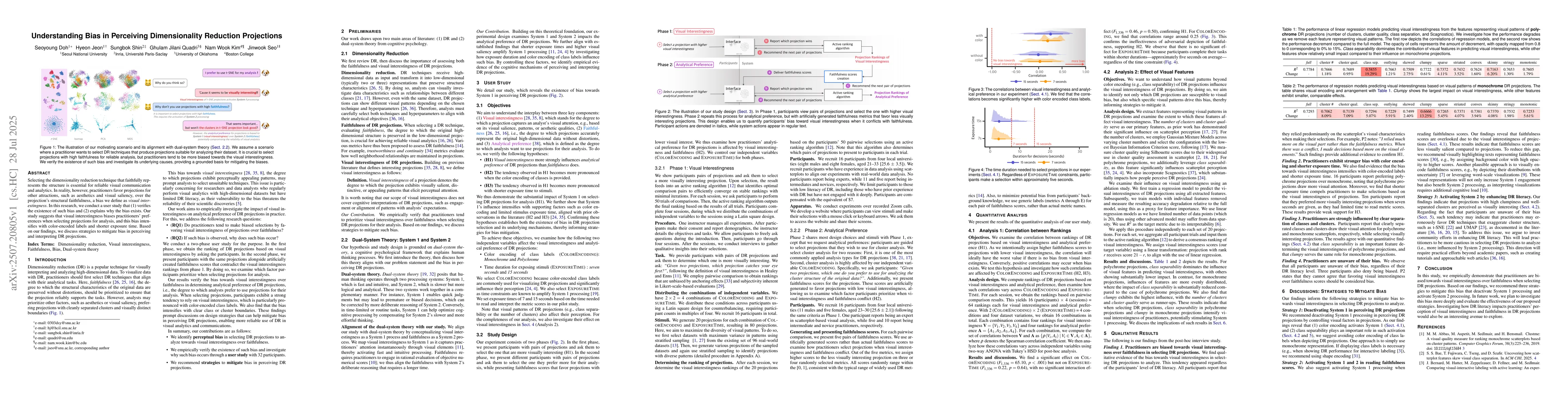
Selecting the dimensionality reduction technique that faithfully represents the structure is essential for reliable visual communication and analytics. In reality, however, practitioners favor project...
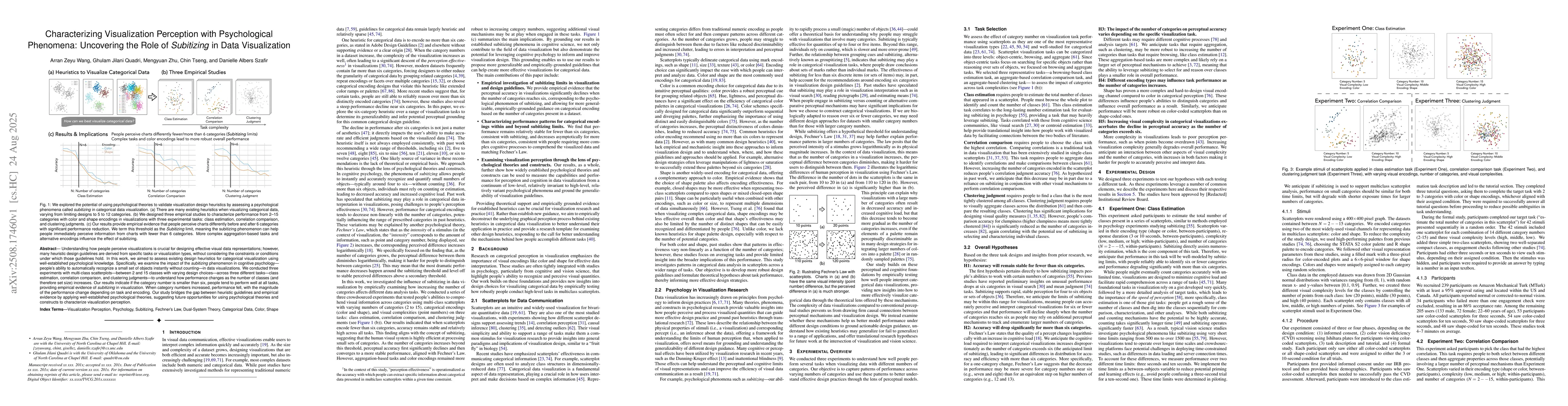
Understanding how people perceive visualizations is crucial for designing effective visual data representations; however, many heuristic design guidelines are derived from specific tasks or visualizat...
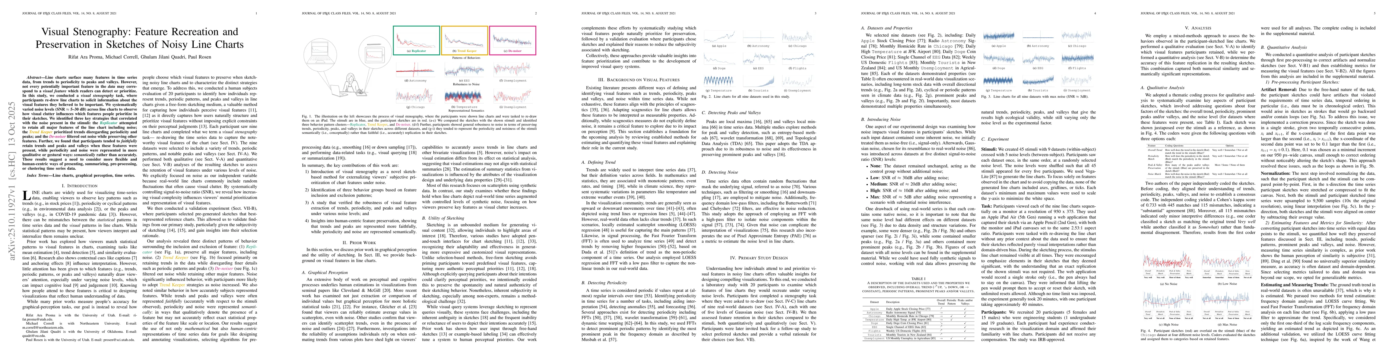
Line charts surface many features in time series data, from trends to periodicity to peaks and valleys. However, not every potentially important feature in the data may correspond to a visual feature ...
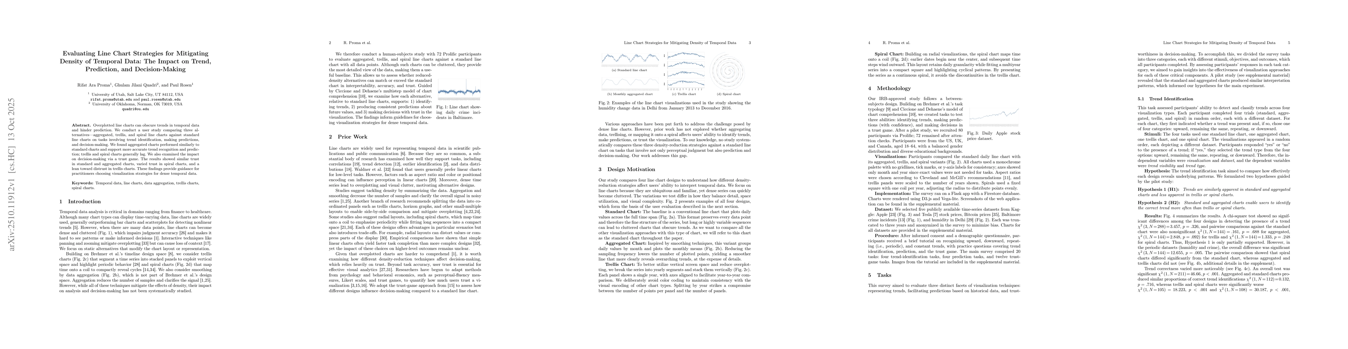
Overplotted line charts can obscure trends in temporal data and hinder prediction. We conduct a user study comparing three alternatives-aggregated, trellis, and spiral line charts against standard lin...
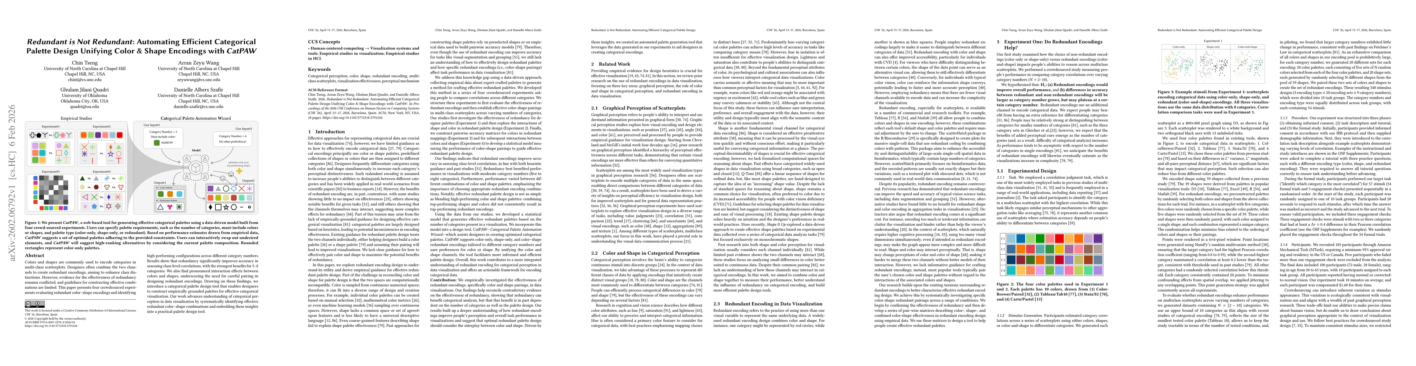
Colors and shapes are commonly used to encode categories in multi-class scatterplots. Designers often combine the two channels to create redundant encodings, aiming to enhance class distinctions. Howe...
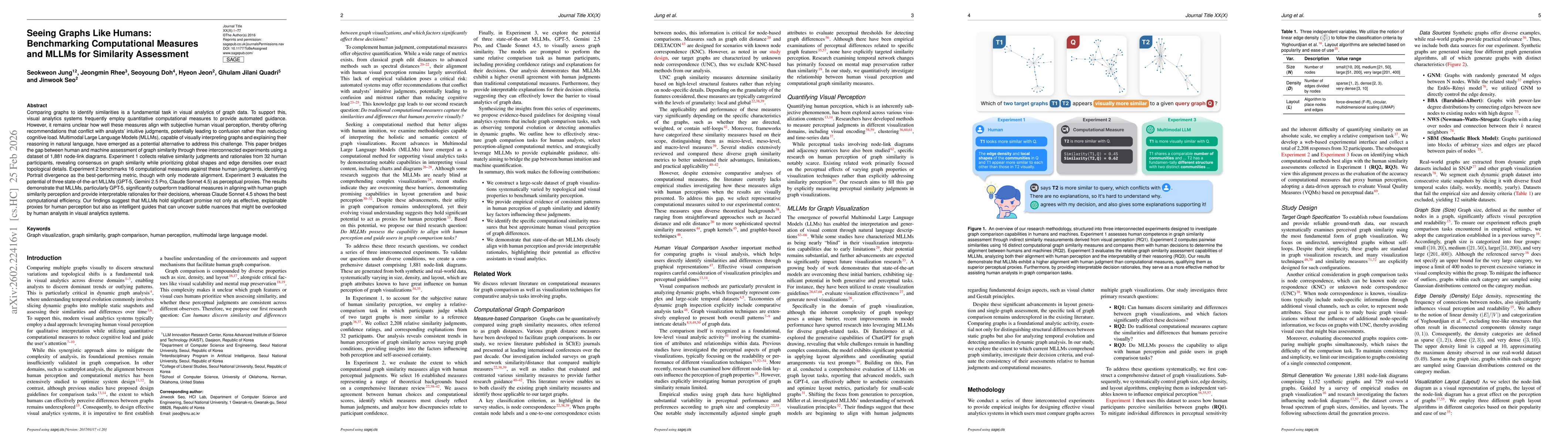
Comparing graphs to identify similarities is a fundamental task in visual analytics of graph data. To support this, visual analytics systems frequently employ quantitative computational measures to pr...
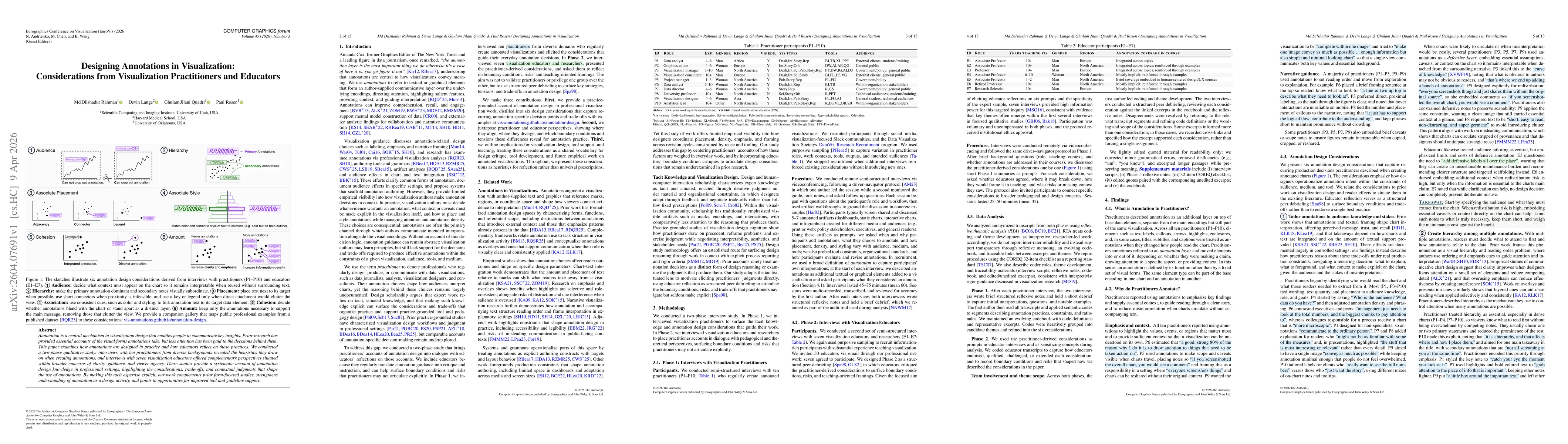
Annotation is a central mechanism in visualization design that enables people to communicate key insights. Prior research has provided essential accounts of the visual forms annotations take, but less...
Designers often create visualizations to achieve specific high-level analytical or communication goals. These goals require people to extract complex and interconnected data patterns. Prior perceptual...