Academic Profile
Statistics
Similar Authors
Papers on arXiv
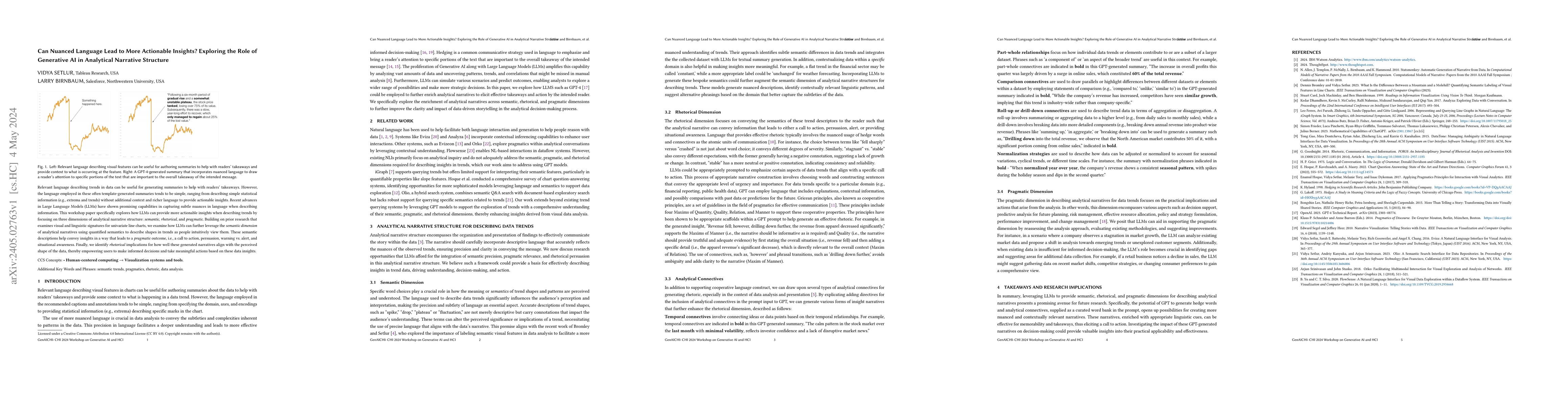
Relevant language describing trends in data can be useful for generating summaries to help with readers' takeaways. However, the language employed in these often template-generated summaries tends t...
Interpreting uncertain data can be difficult, particularly if the data presentation is complex. We investigate the efficacy of different modalities for representing data and how to combine the stren...
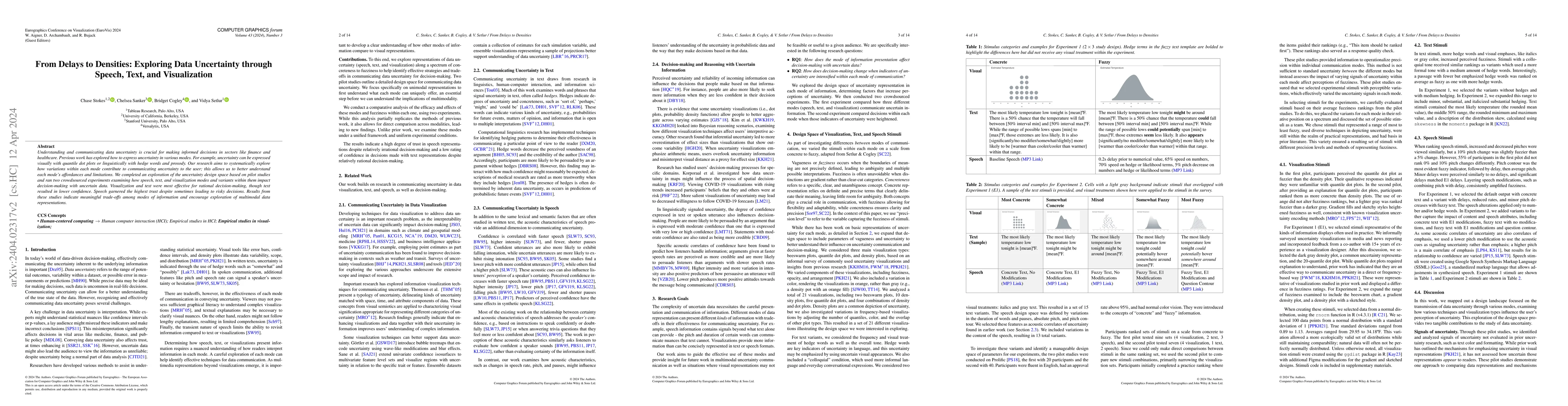
Understanding and communicating data uncertainty is crucial for making informed decisions in sectors like finance and healthcare. Previous work has explored how to express uncertainty in various mod...
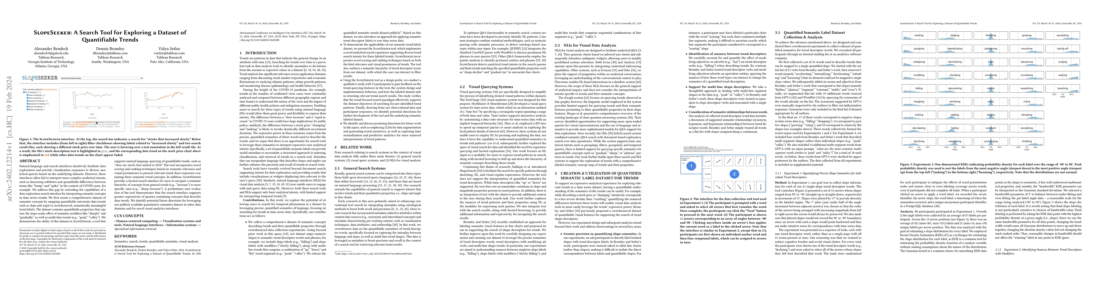
Natural language and search interfaces intuitively facilitate data exploration and provide visualization responses to diverse analytical queries based on the underlying datasets. However, these inte...
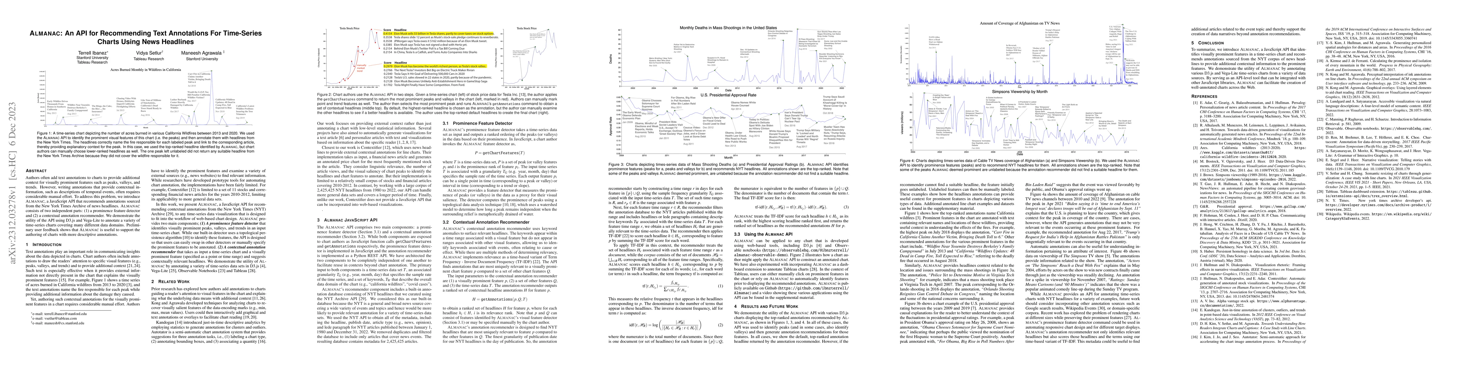
Authors often add text annotations to charts to provide additional context for visually prominent features such as peaks, valleys, and trends. However, writing annotations that provide contextual in...
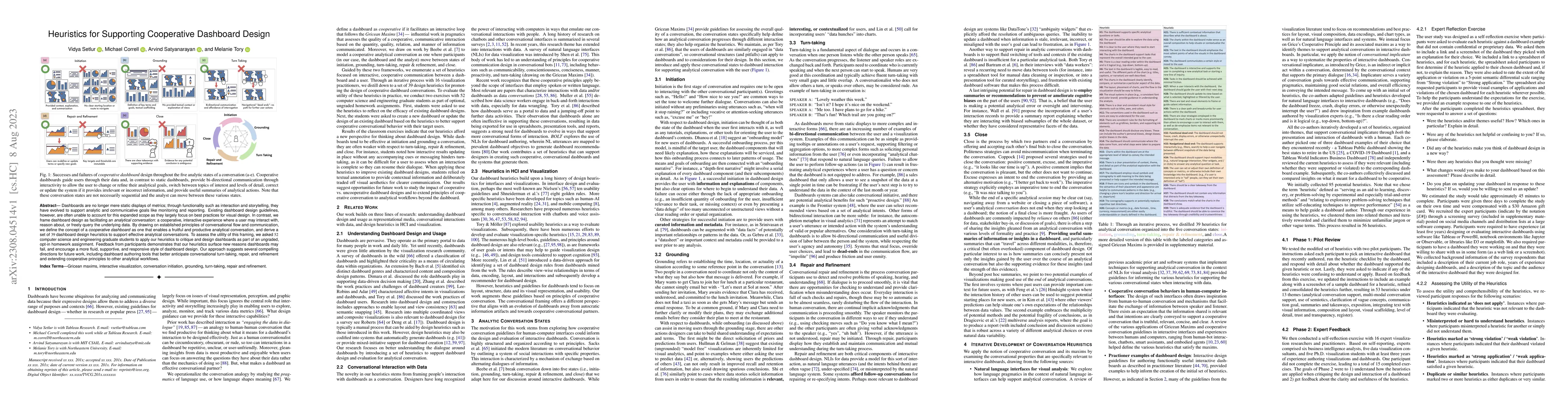
Dashboards are no longer mere static displays of metrics; through functionality such as interaction and storytelling, they have evolved to support analytic and communicative goals like monitoring an...
Relevant language describing visual features in charts can be useful for authoring captions and summaries about the charts to help with readers' takeaways. To better understand the interplay between...
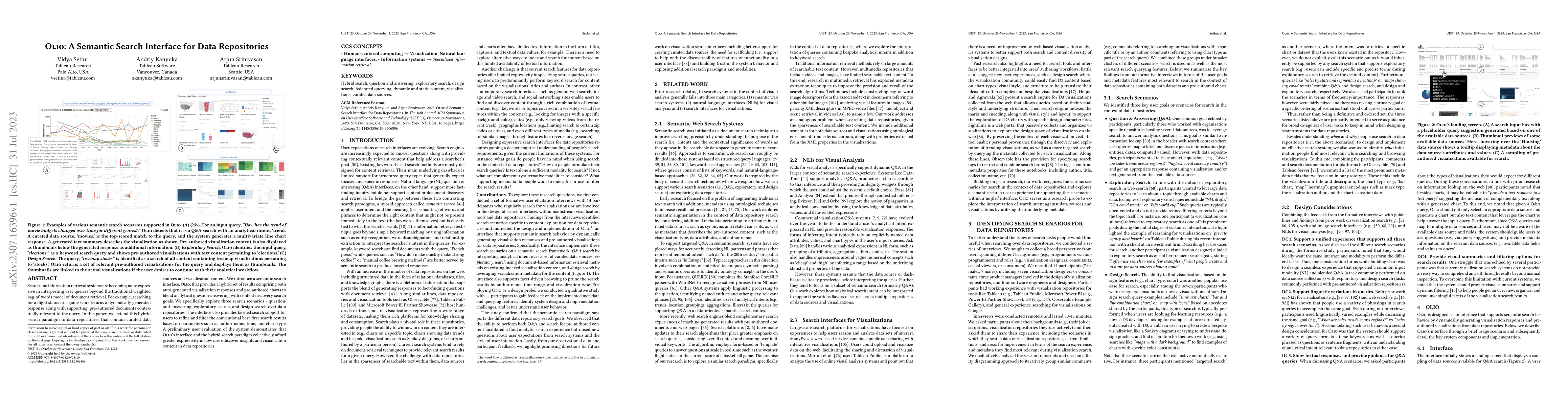
Search and information retrieval systems are becoming more expressive in interpreting user queries beyond the traditional weighted bag-of-words model of document retrieval. For example, searching fo...
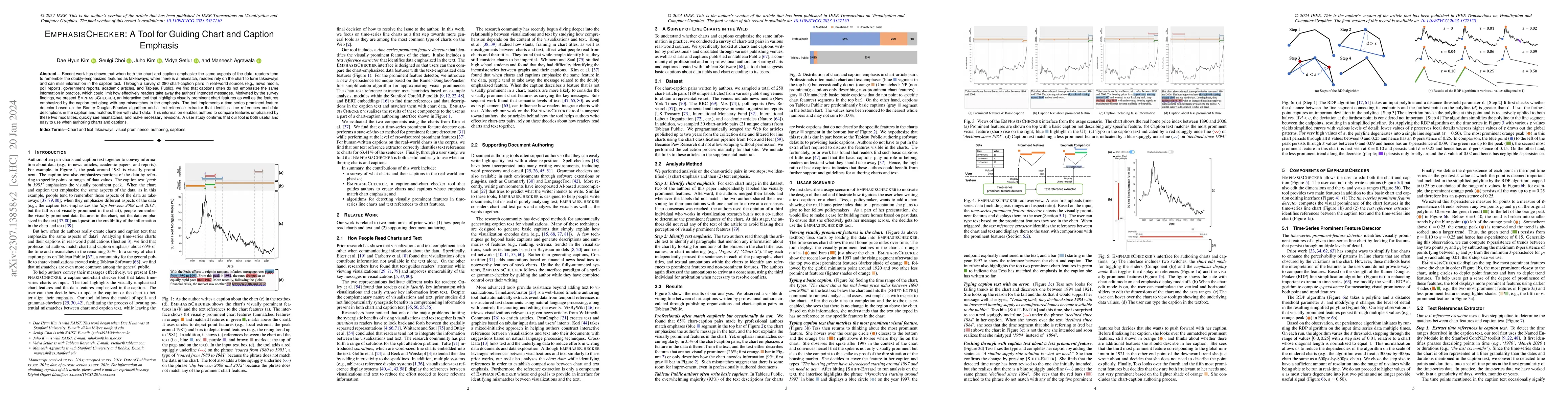
Recent work has shown that when both the chart and caption emphasize the same aspects of the data, readers tend to remember the doubly-emphasized features as takeaways; when there is a mismatch, rea...
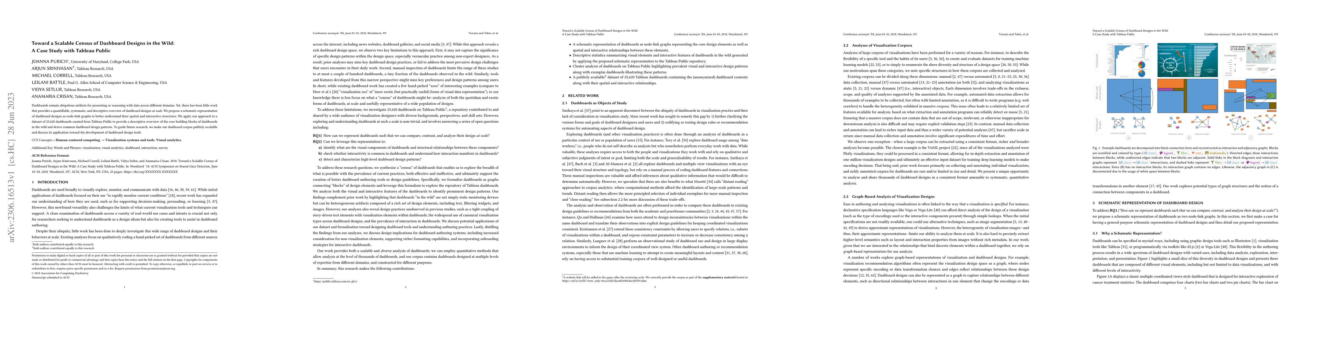
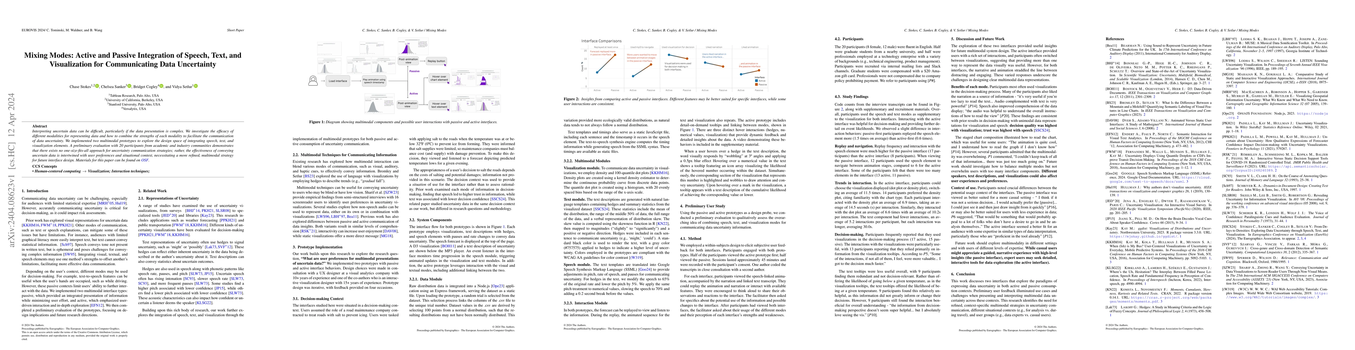
Dashboards remain ubiquitous artifacts for presenting or reasoning with data across different domains. Yet, there has been little work that provides a quantifiable, systematic, and descriptive overv...
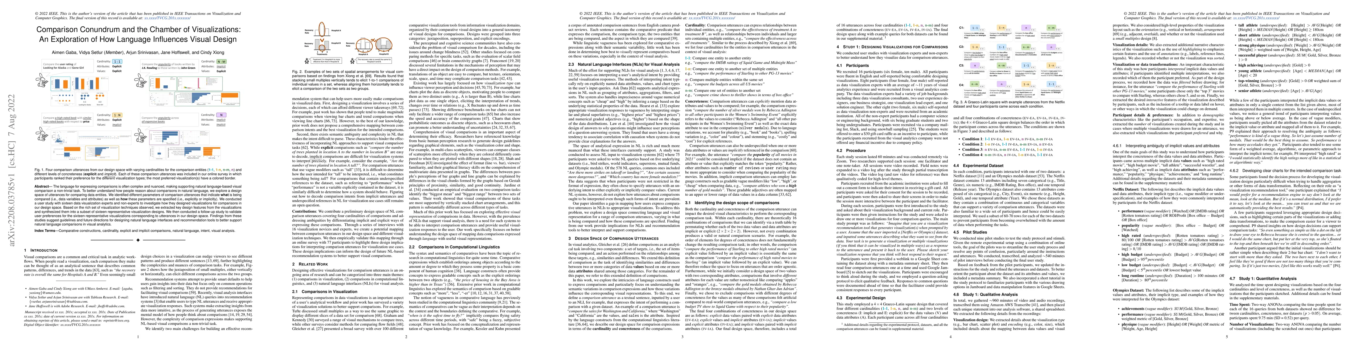
The language for expressing comparisons is often complex and nuanced, making supporting natural language-based visual comparison a non-trivial task. To better understand how people reason about comp...
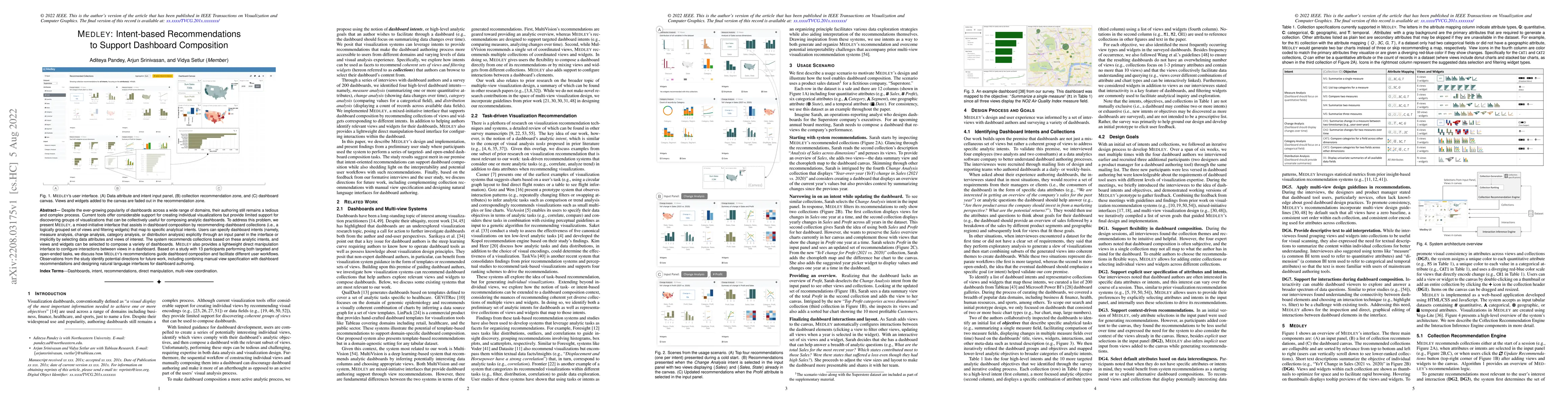
Despite the ever-growing popularity of dashboards across a wide range of domains, their authoring still remains a tedious and complex process. Current tools offer considerable support for creating i...
While visualizations are an effective way to represent insights about information, they rarely stand alone. When designing a visualization, text is often added to provide additional context and guid...
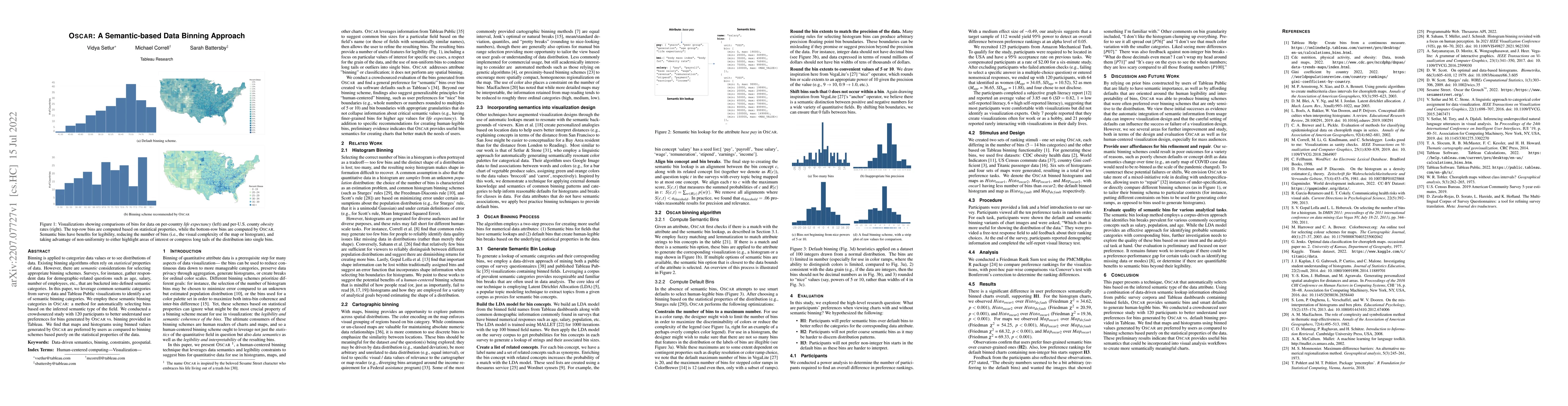
Binning is applied to categorize data values or to see distributions of data. Existing binning algorithms often rely on statistical properties of data. However, there are semantic considerations for...
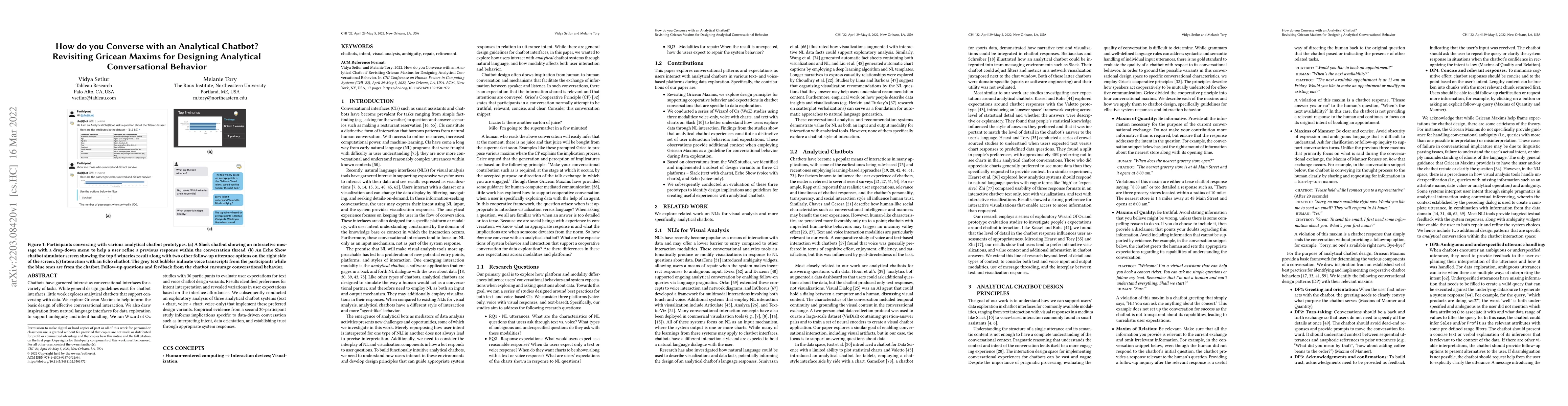
Chatbots have garnered interest as conversational interfaces for a variety of tasks. While general design guidelines exist for chatbot interfaces, little work explores analytical chatbots that suppo...
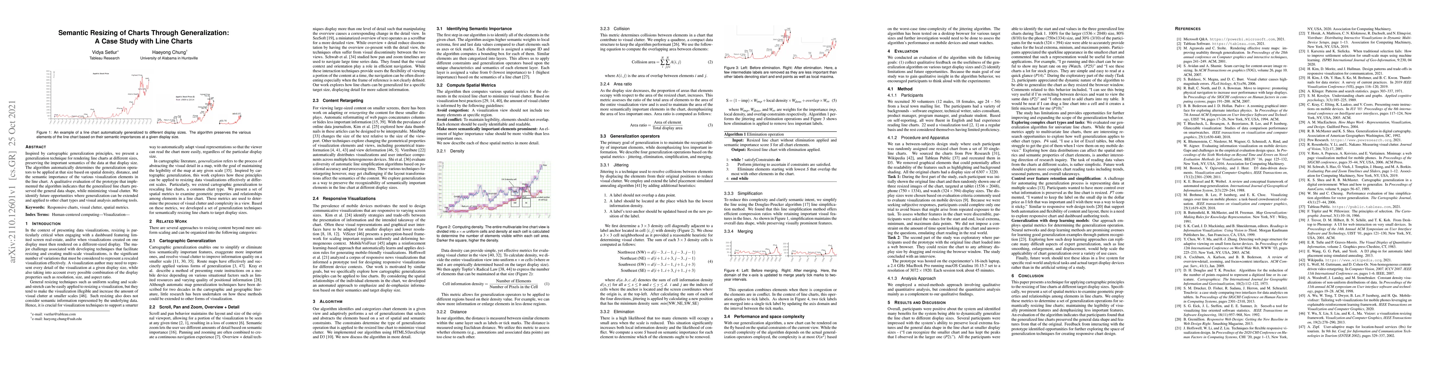
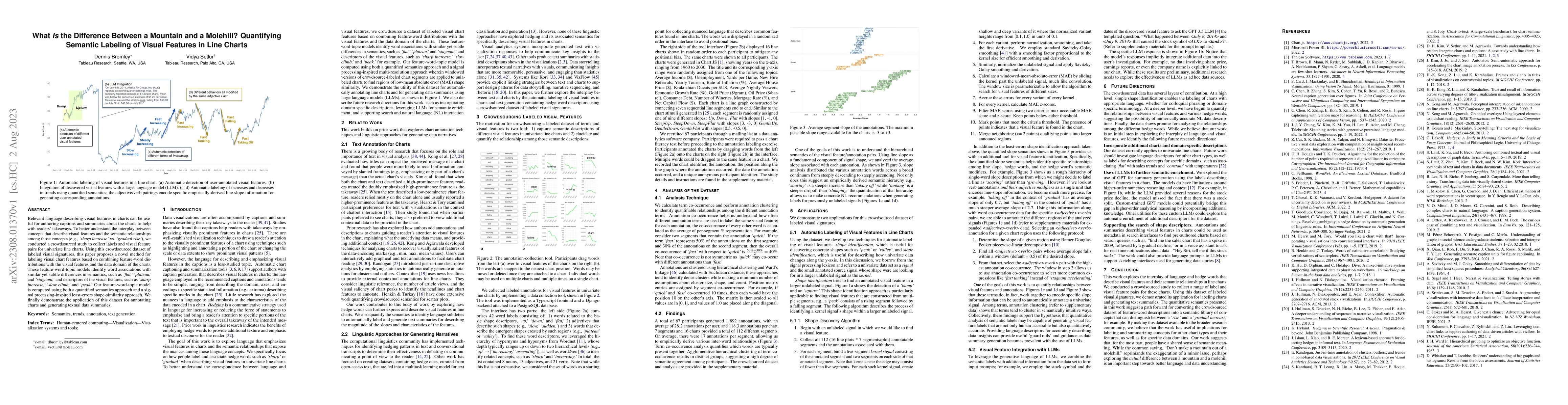
Inspired by cartographic generalization principles, we present a generalization technique for rendering line charts at different sizes, preserving the important semantics of the data at that display...
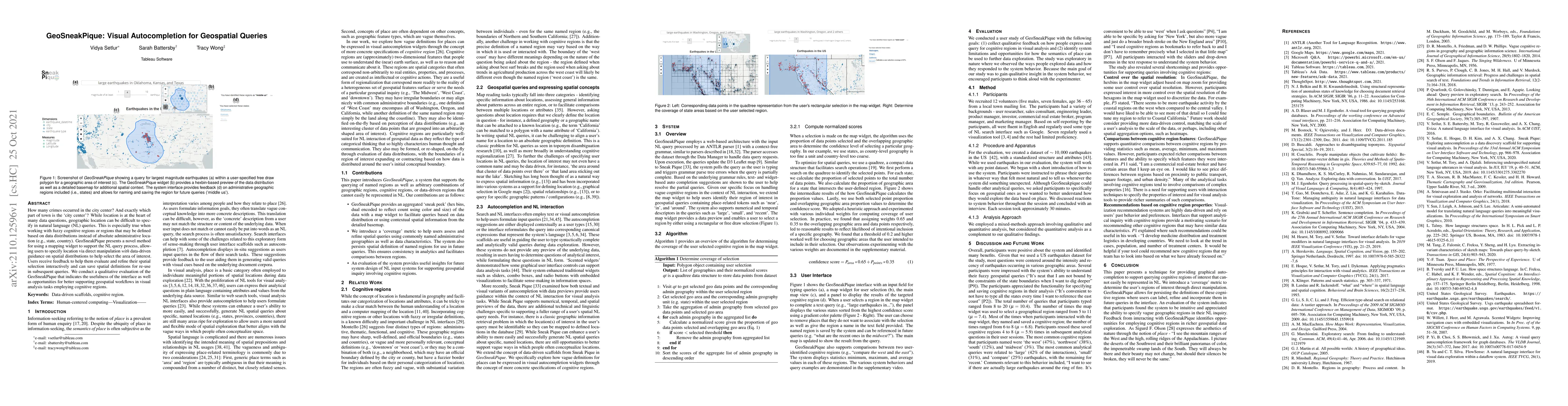
How many crimes occurred in the city center? And exactly which part of town is the 'city center'? While location is at the heart of many data questions, geographic location can be difficult to speci...
Natural language interfaces (NLIs) have become a prevalent medium for conducting visual data analysis, enabling people with varying levels of analytic experience to ask questions of and interact wit...
Well-designed data visualizations can lead to more powerful and intuitive processing by a viewer. To help a viewer intuitively compare values to quickly generate key takeaways, visualization designe...
Visualization recommendation (VisRec) systems provide users with suggestions for potentially interesting and useful next steps during exploratory data analysis. These recommendations are typically o...
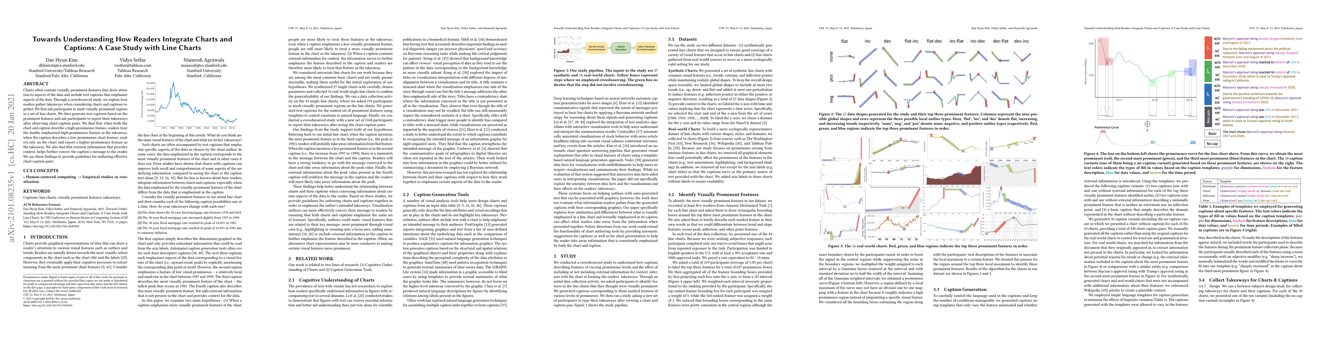
Charts often contain visually prominent features that draw attention to aspects of the data and include text captions that emphasize aspects of the data. Through a crowdsourced study, we explore how...
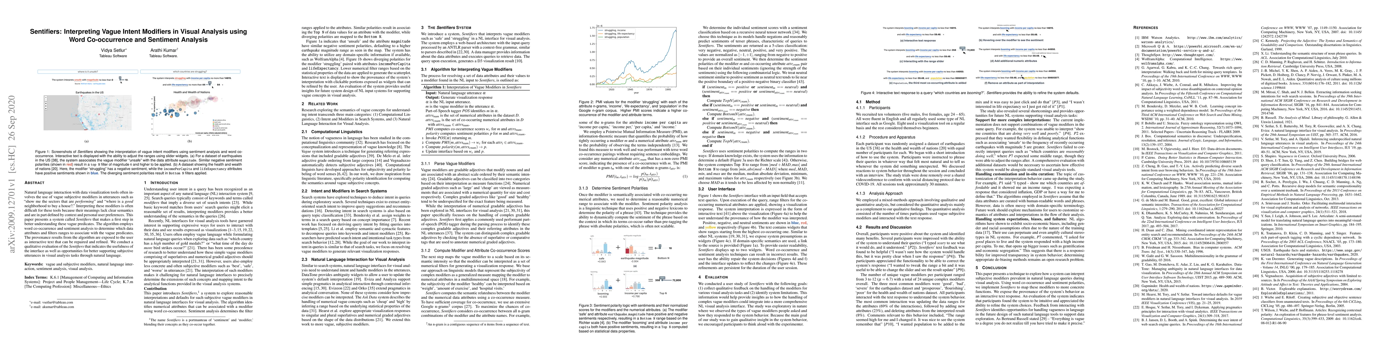
Natural language interaction with data visualization tools often involves the use of vague subjective modifiers in utterances such as "show me the sectors that are performing" and "where is a good n...
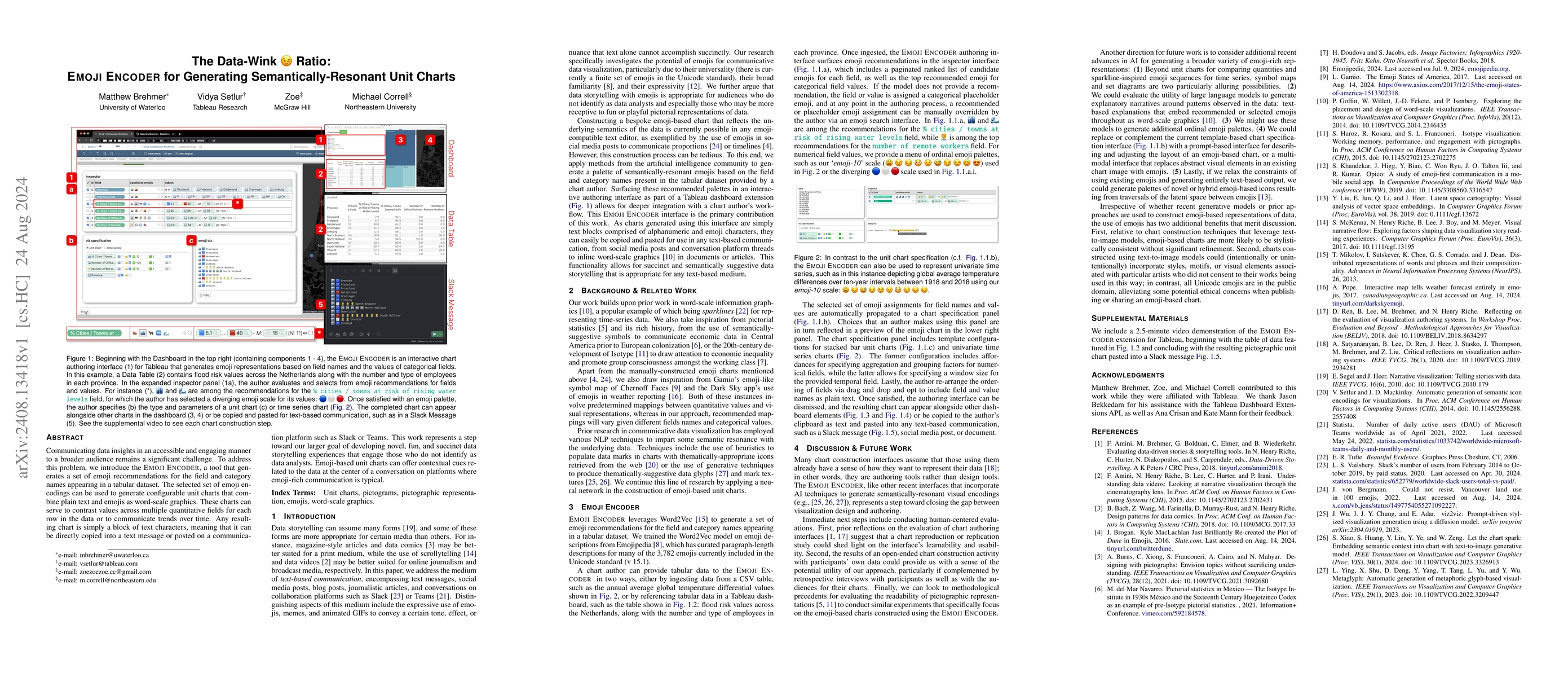
Communicating data insights in an accessible and engaging manner to a broader audience remains a significant challenge. To address this problem, we introduce the Emoji Encoder, a tool that generates a...
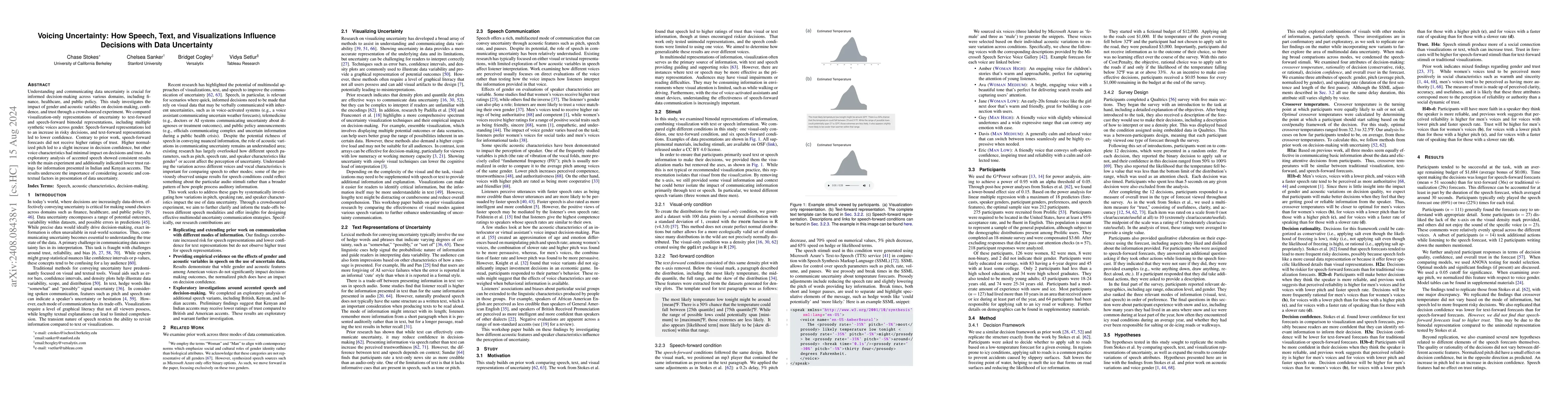
Understanding and communicating data uncertainty is crucial for informed decision-making across various domains, including finance, healthcare, and public policy. This study investigates the impact of...
There is increased interest in the interplay between text and visuals in the field of data visualization. However, this attention has predominantly been on the use of text in standalone visualizations...
Integrating textual content, such as titles, annotations, and captions, with visualizations facilitates comprehension and takeaways during data exploration. Yet current tools often lack mechanisms for...
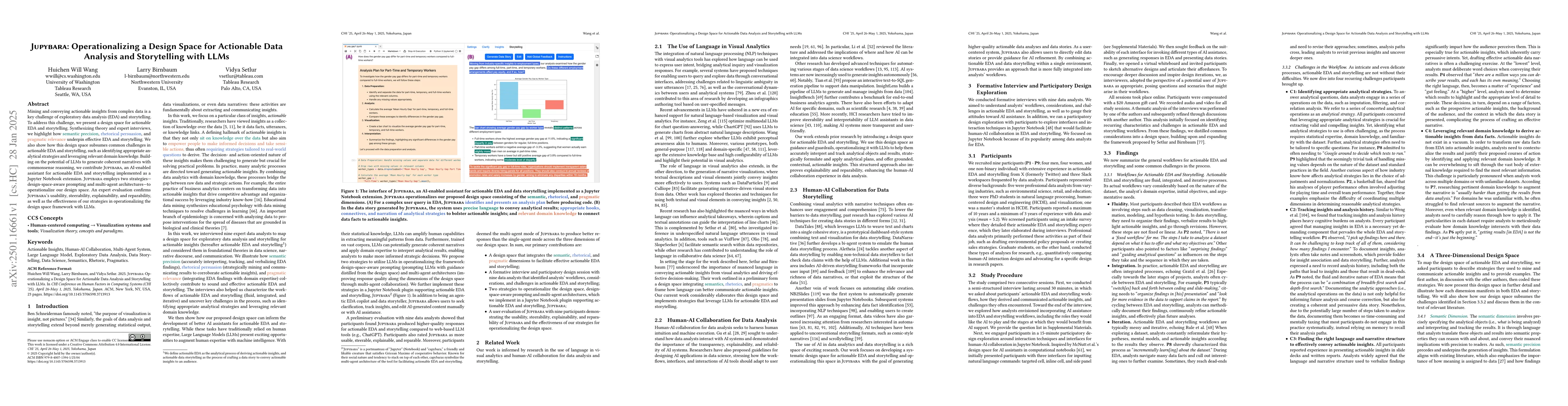
Mining and conveying actionable insights from complex data is a key challenge of exploratory data analysis (EDA) and storytelling. To address this challenge, we present a design space for actionable E...
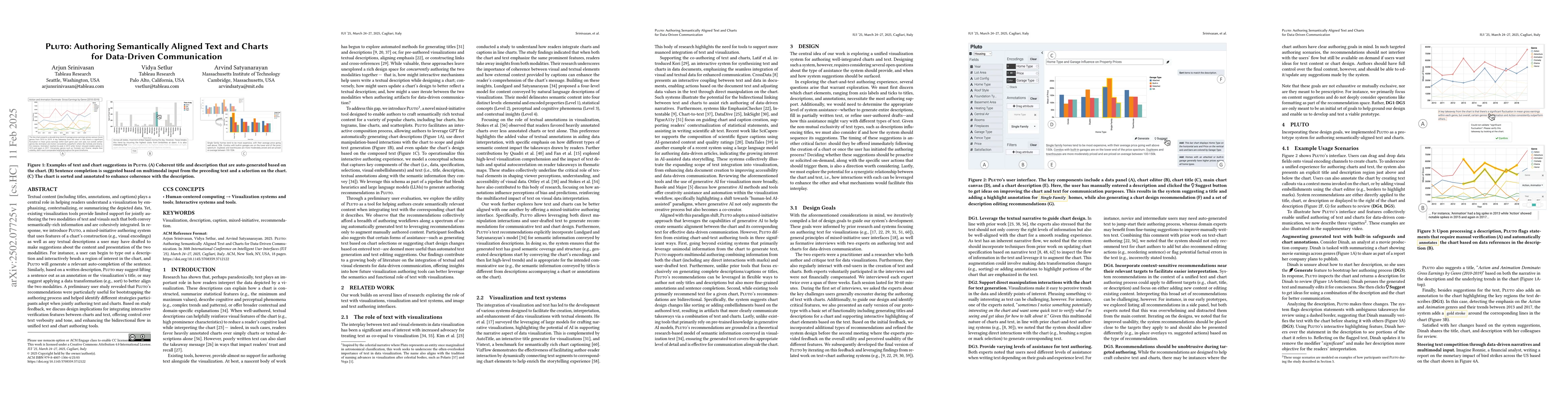
Textual content (including titles, annotations, and captions) plays a central role in helping readers understand a visualization by emphasizing, contextualizing, or summarizing the depicted data. Yet,...
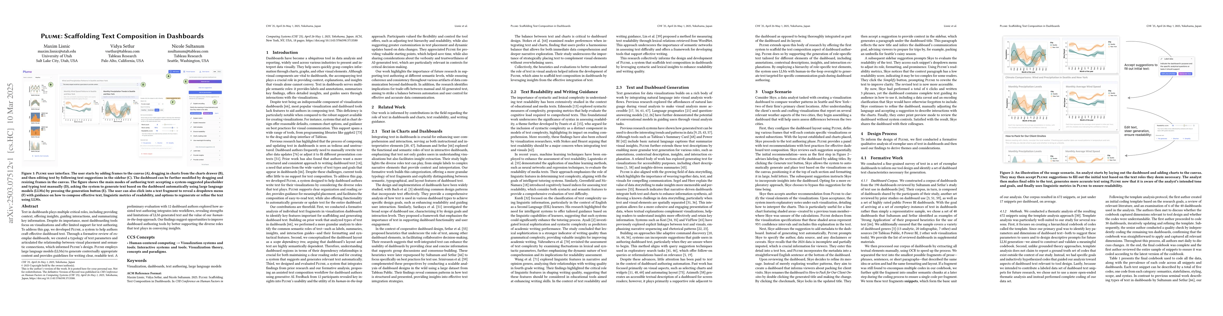
Text in dashboards plays multiple critical roles, including providing context, offering insights, guiding interactions, and summarizing key information. Despite its importance, most dashboarding tools...
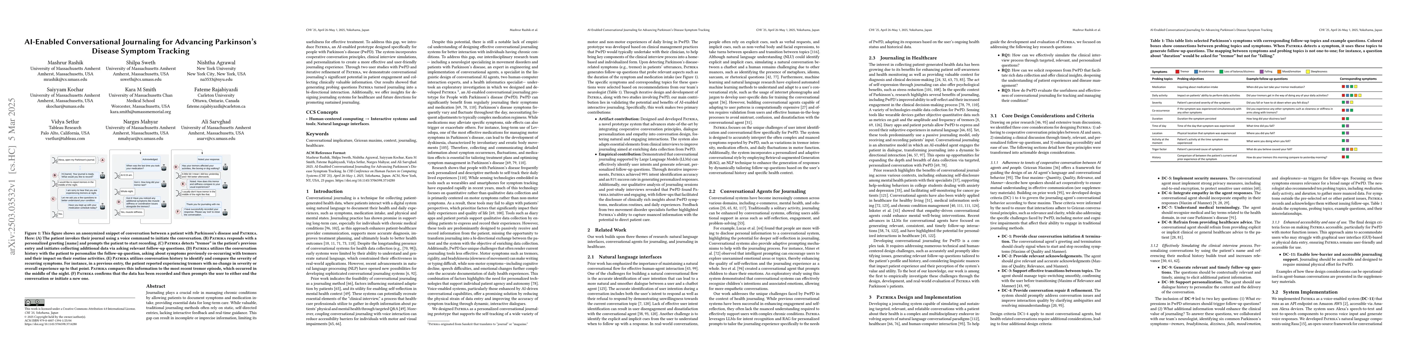
Journaling plays a crucial role in managing chronic conditions by allowing patients to document symptoms and medication intake, providing essential data for long-term care. While valuable, traditional...
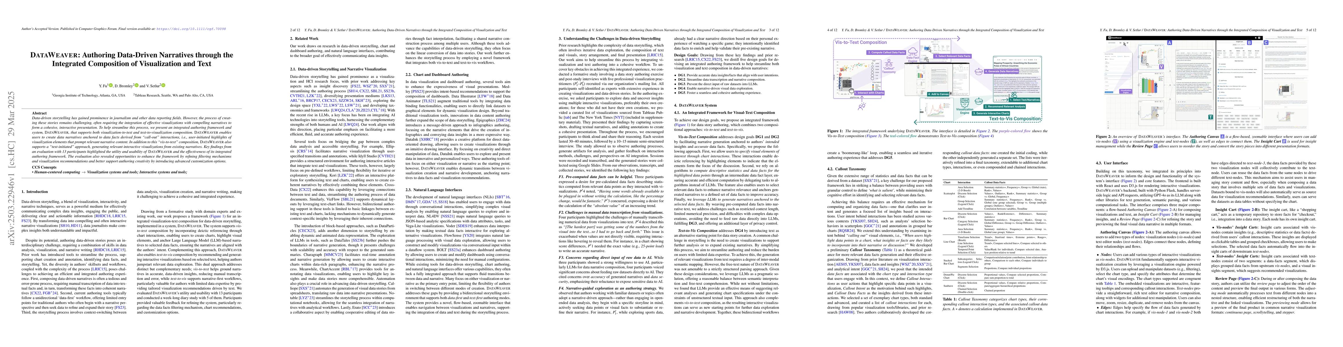
Data-driven storytelling has gained prominence in journalism and other data reporting fields. However, the process of creating these stories remains challenging, often requiring the integration of eff...
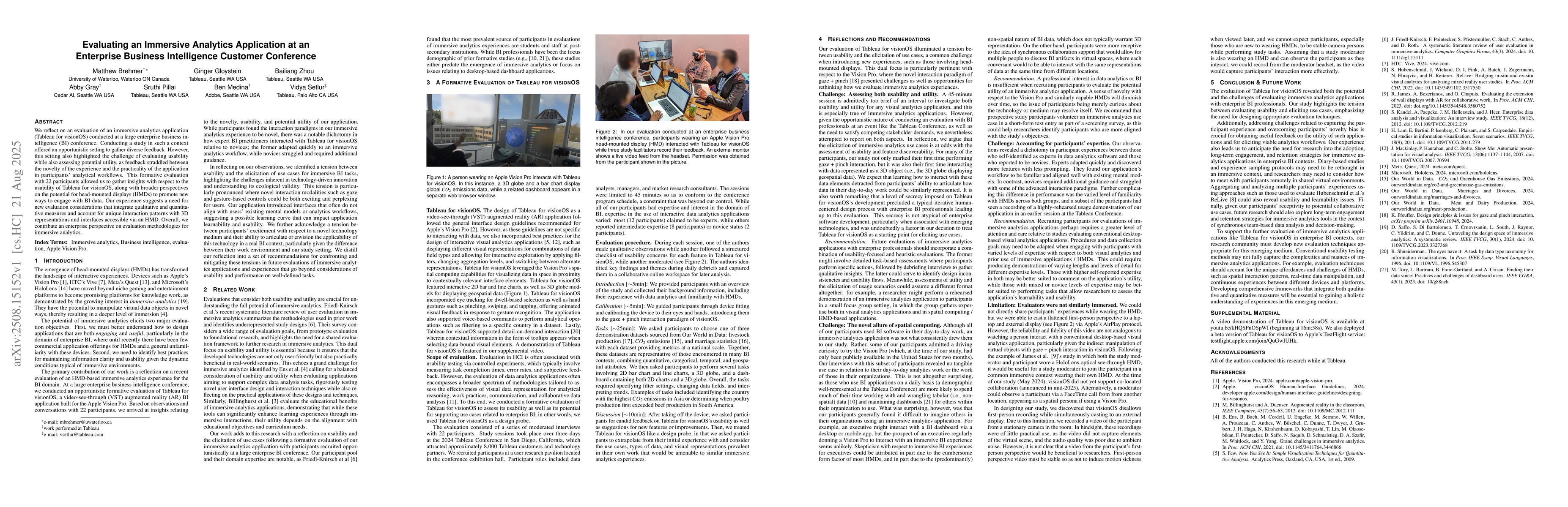
We reflect on an evaluation of an immersive analytics application (Tableau for visionOS) conducted at a large enterprise business intelligence (BI) conference. Conducting a study in such a context off...
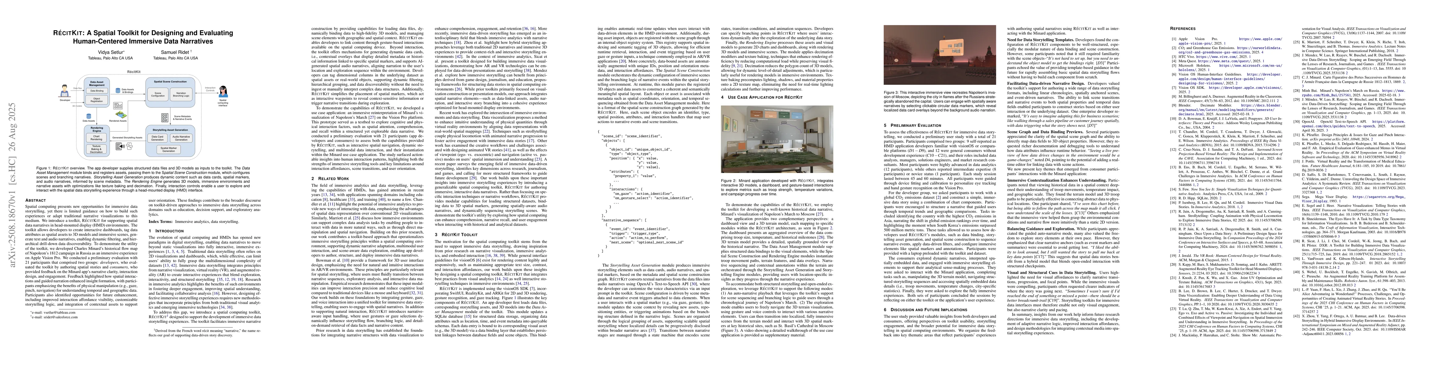
Spatial computing presents new opportunities for immersive data storytelling, yet there is limited guidance on how to build such experiences or adapt traditional narrative visualizations to this mediu...
Conversational interfaces are increasingly used for data analysis, enabling data workers to express complex analytical intents in natural language. Yet, these interactions unfold as long, linear trans...
Large Language Models (LLMs) are transforming Conversational Visual Analytics (CVA) by enabling data analysis through natural language. However, evaluating LLMs for CVA remains a challenge: requiring ...
Modern data exploration tools often struggle to capture the subtleties of analytical intent, especially when users seek patterns that are difficult to specify using traditional query methods or natura...